Project B / JUMA Architects
Project B / JUMA Architects
Description
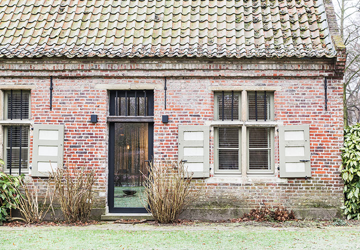
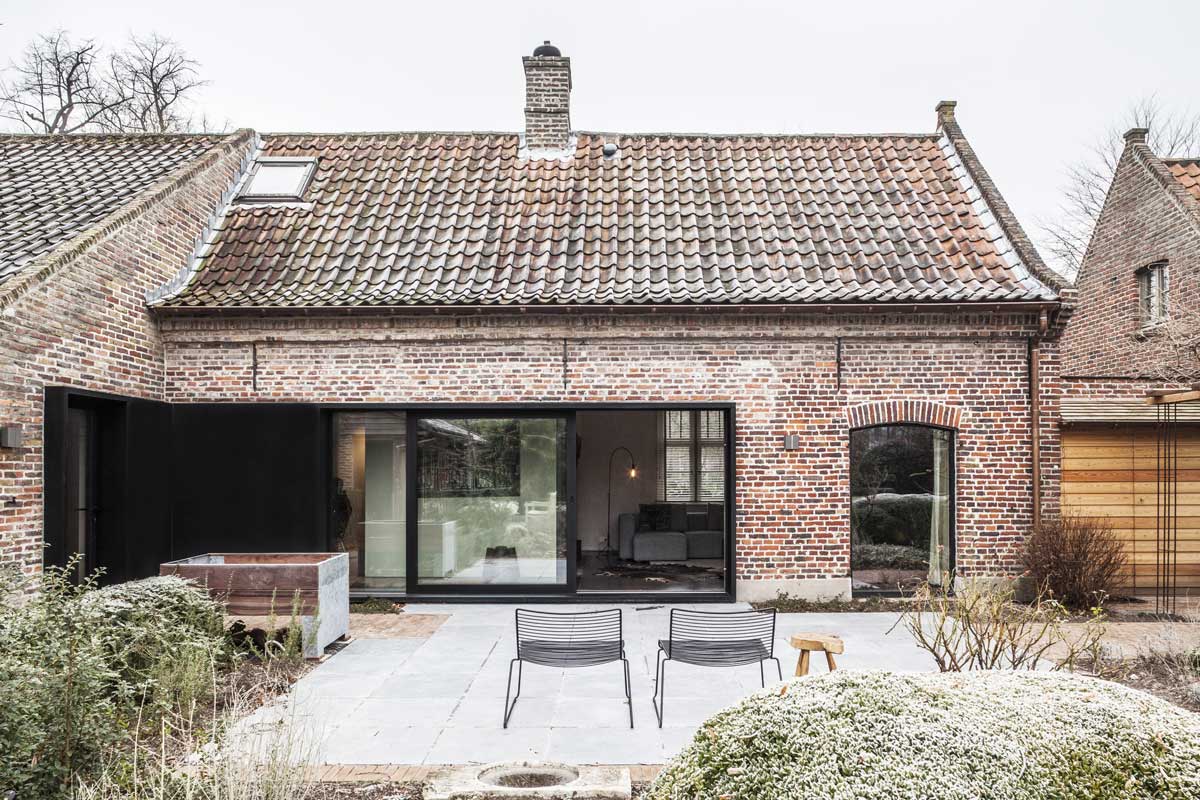
For the thorough renovation of an old farm, JUMA architects set out in search of the perfect balance between old and new. In its previous state, the house – which did have a cosy feel – was entirely lacking in terms of spaciousness, light and vision.
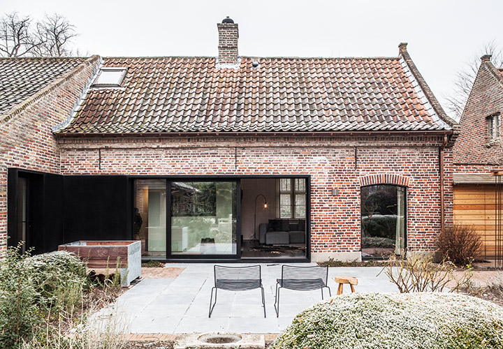
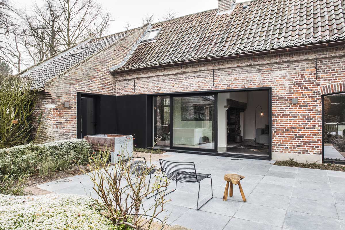
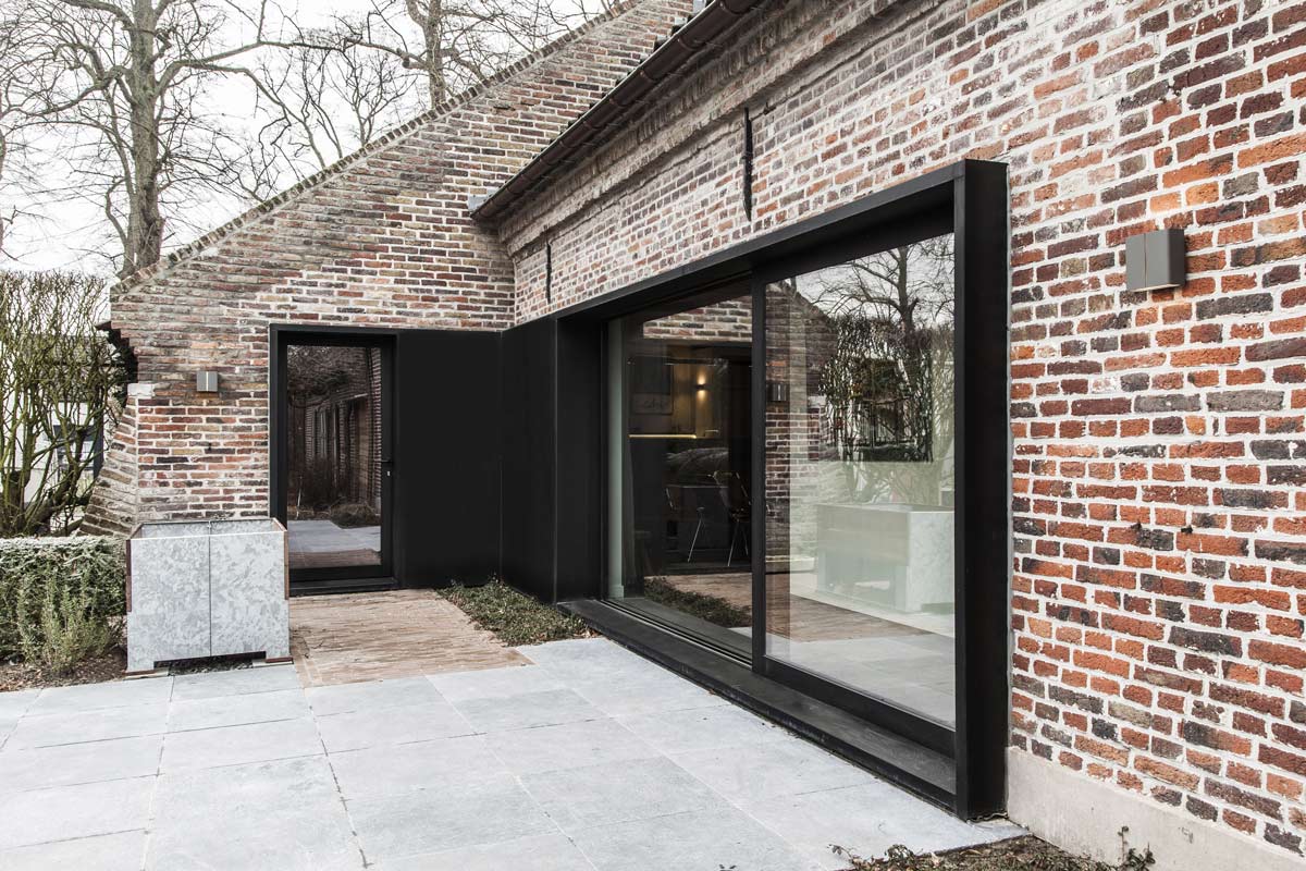
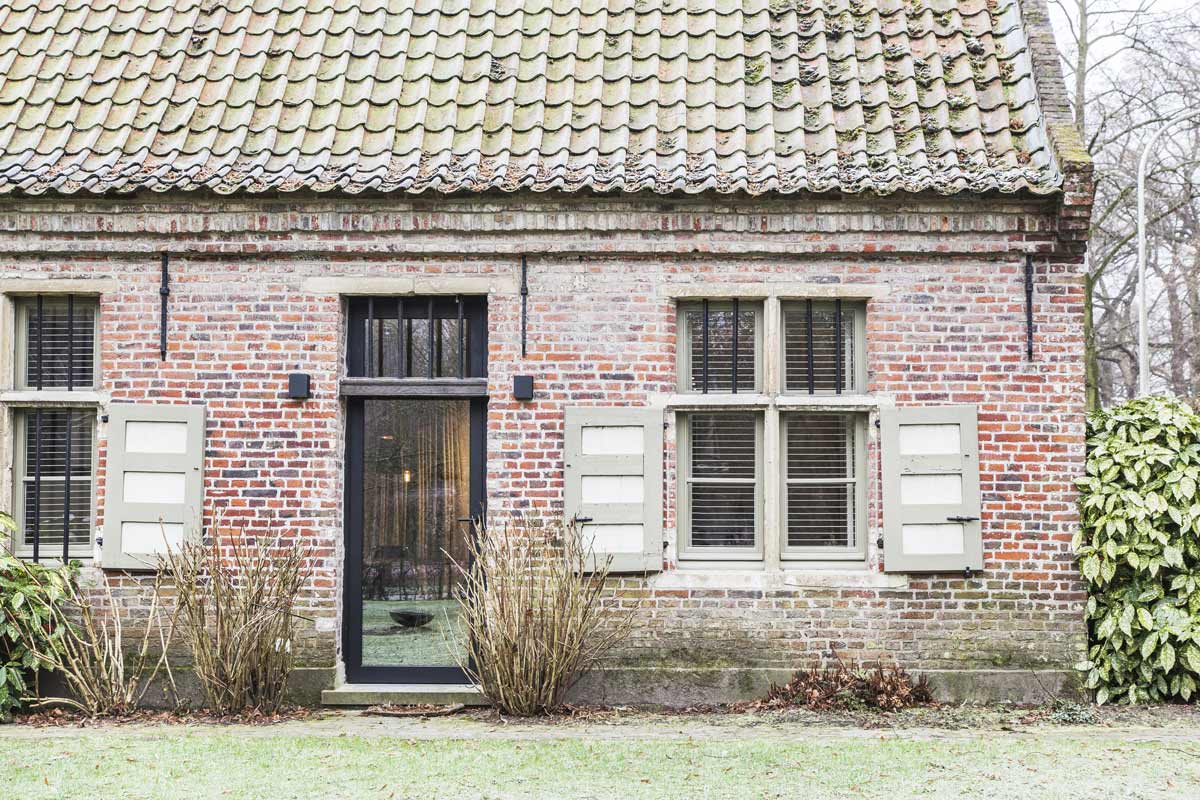
To remedy this, the new design planned for a huge window opening in the rear elevation that would create a view on the beautiful garden and at the same time draw in plenty of natural light. The new joinery clearly distinguishes itself from the existing window openings through the use of a black, simple framework, eliminating all possible confusion about which parts are authentic, and which are not.
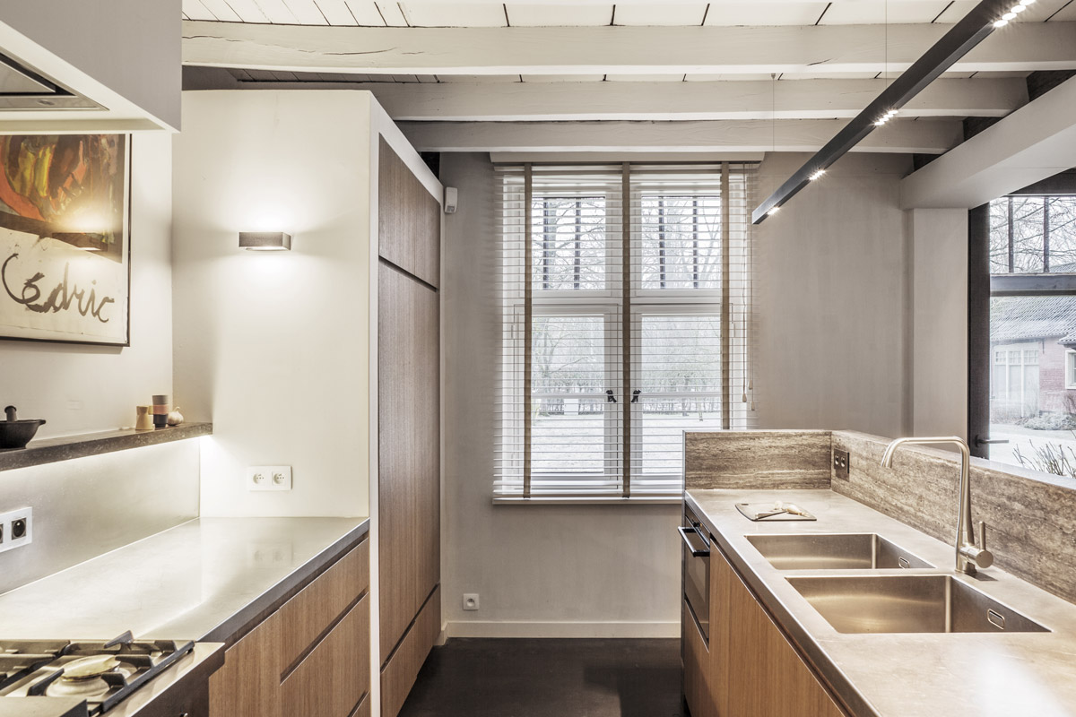
The existing mezzanine and the access to the wine cellar were also demolished to create a large open-space kitchen with an eye-catching island finished in natural stone. The traditional range fits perfectly with the farmhouse style and inspired us to execute the entire worktop in maintenance-friendly stainless steel. A shelf, also executed in natural stone and fitted with indirect track lighting, is placed above the range. The cabinet fronts finished in oak veneer give the kitchen a warm atmosphere.
The space that used to house the kitchen was made into a small desk area, which also doubles as an informal second entrance, mainly used by the family. The old kitchen space now also houses a cool storeroom.
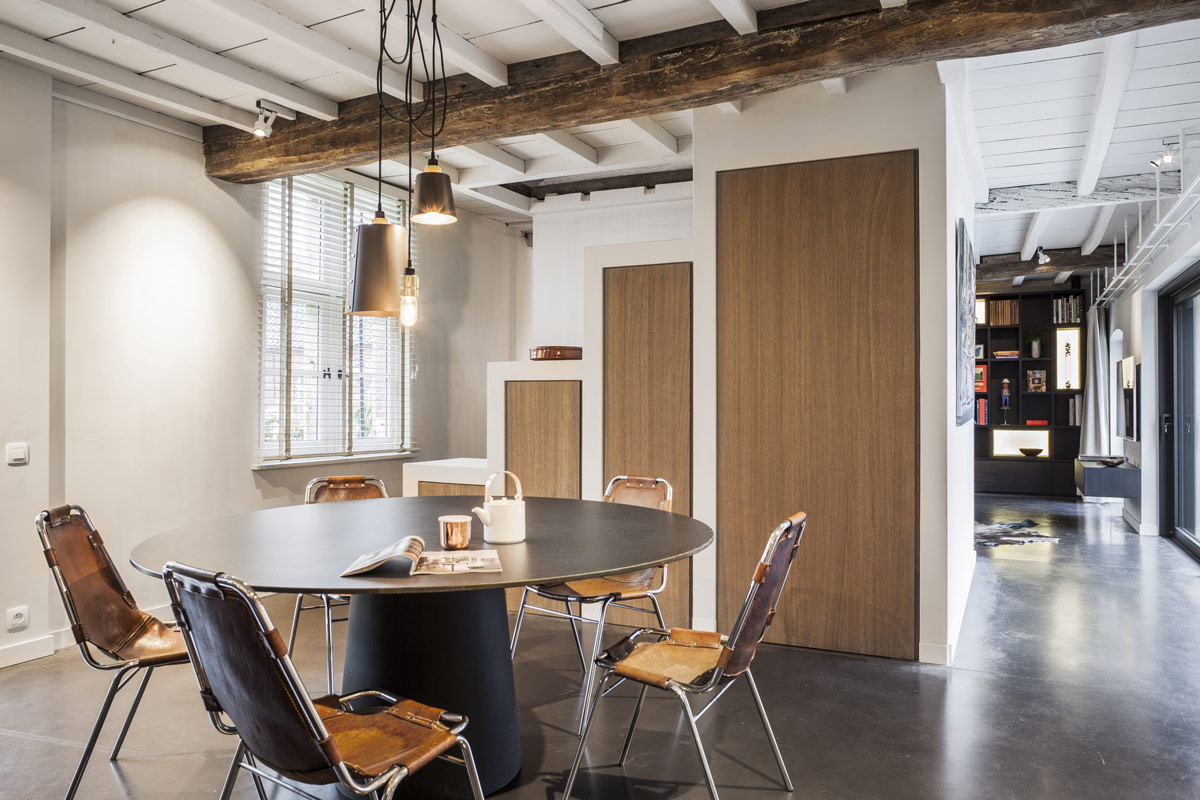
Next to the dining room is the fully renovated staircase. A special tier-shaped storage closet runs along the stairway. Its height follows the flow of the stairs and increases every 3 steps. Here too, it was the desire to keep the space as open as possible that inspired the design of this stairway/closet. Yet there was also a practical reason. The open character of the staircase makes it possible to simply and easily move larger pieces of furniture to the upper floor.
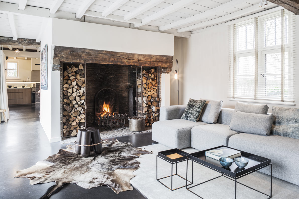
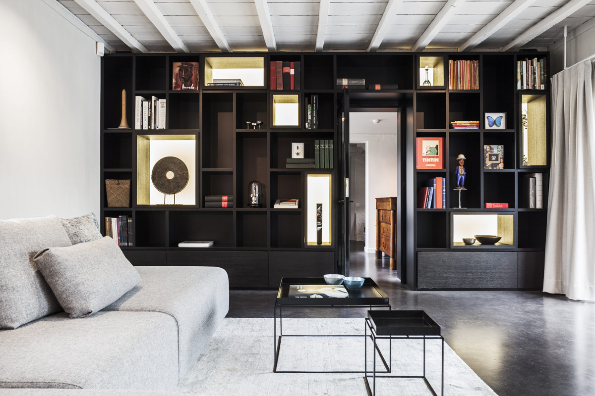
The sitting area further features a large wall closet, in which books and personal items can be exhibited. These small trinkets turn the house into a real home. The valuable elements, such as the impressive fireplace, were retained. The old heavy beams were sandblasted so as to accentuate their character while the rest of the wooden ceiling was painted white to contrast the new dark polished concrete floor (with underfloor heating). Together, the purposeful and precisely lined-out design and the subtle uses of colours and materials turn the house into a much more tranquil space, and bring out the great charm of the fireplace. Given the many wooden ceiling beams, the choice of light fixtures was rather limited. For the kitchen island we opted for a fine suspension track light that casts ample light on the countertop. The client had specific wishes with regard to the lamp above the dining table. It had to be very flexible and adapt to the number of guests and the table arrangement. JUMA architects opted for a combination of three lamps that can either be hung together in a beautiful whole or be pulled apart to illuminate a larger area in the event of a party. In terms of general lighting, we opted for discreet white directional spotlights.

