Residenza le Stelle / Buzzi studio di architettura
Residenza le Stelle / Buzzi studio di architettura
Site
Landscape
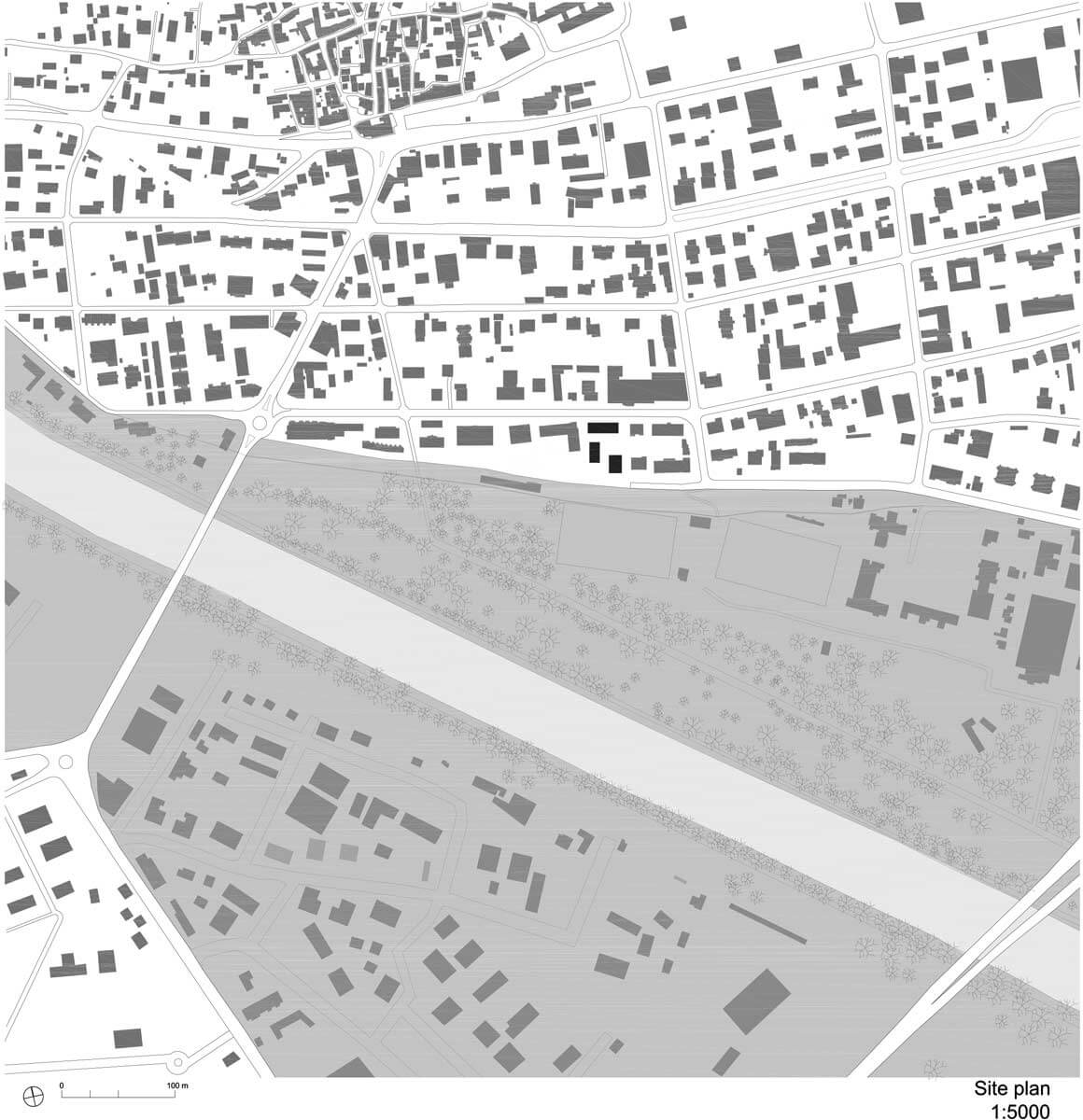
Solduno is a neighbourhood on the outskirts of the historical centre of Locarno, southern Switzerland. I grew up a few steps from here, in an area of eclectic early 20th century bourgeois mansions and brick condos from the 1960s. Today most of those early-to mid 20th century buildings, have given way to more recent anonymous edifices. The engineer that commissioned us, was persuaded that even in this rather dull context, a distinguished project would not be out of place. We have embraced the idea, cherishing the opportunity to build a modern residential and commercial estate, in tune with the luster of a recent past, and yet merging in the fabric of the neighbourhood. City projects are for us an act of reconciliation, a mediation between past and present. The interpretation of a site, its form and atmosphere.
The city and the delta
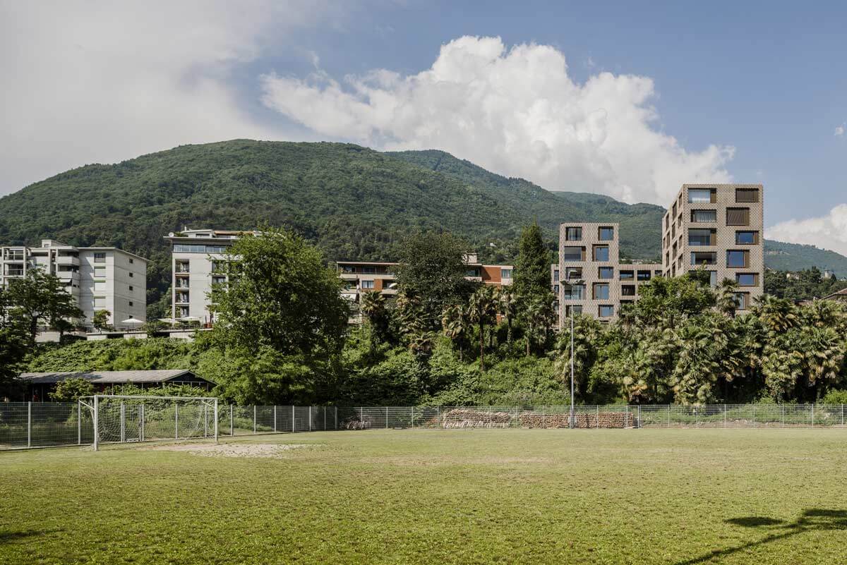
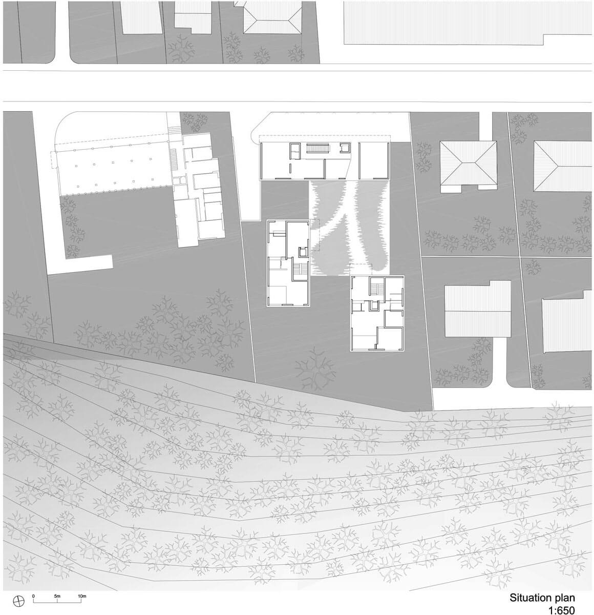
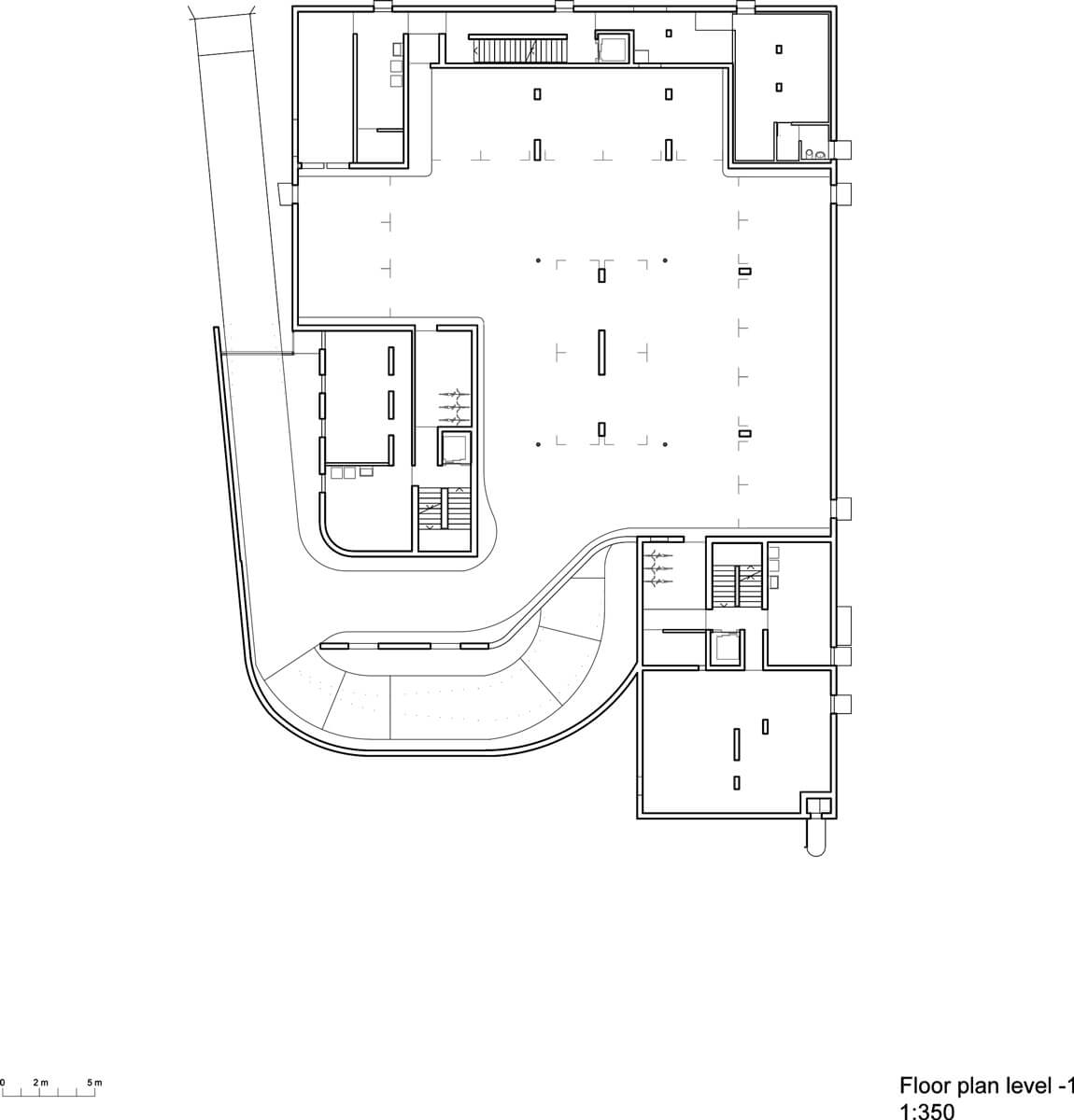
The plot is between two distinct and contrasting fronts. On one side open nature, on the other the city. Facing south the sloping grounds leading to the groves of the Maggia river delta, on the north a busy street with heavy traffic. This is the last lot where two rows of buildings can be inserted on both sides, therefore a transition space. Our concern was to create an open complex, integrating in its design the empty spaces and fronts of the adjacent edifices, in particular the Rino Tami building.
A neighbourhood
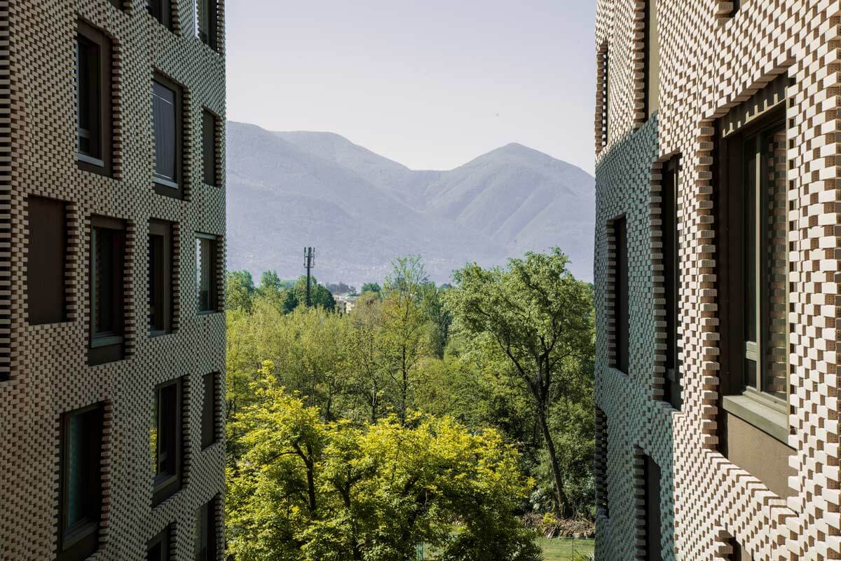
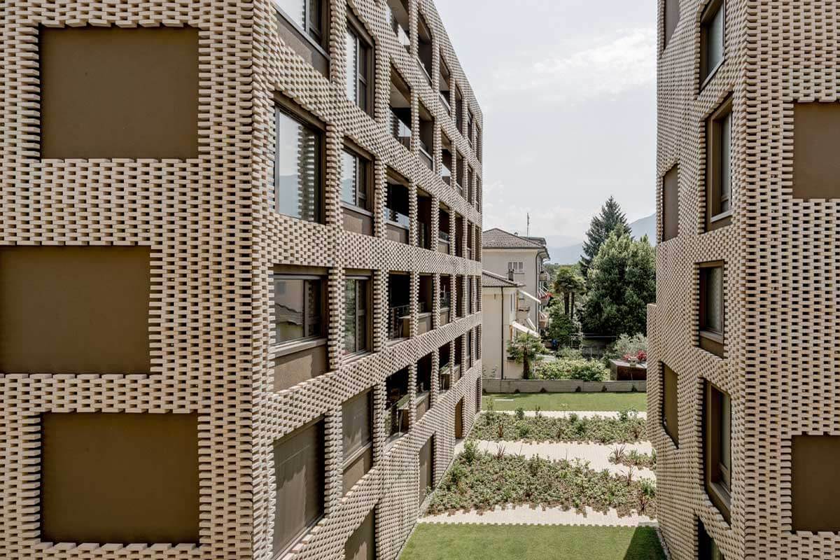
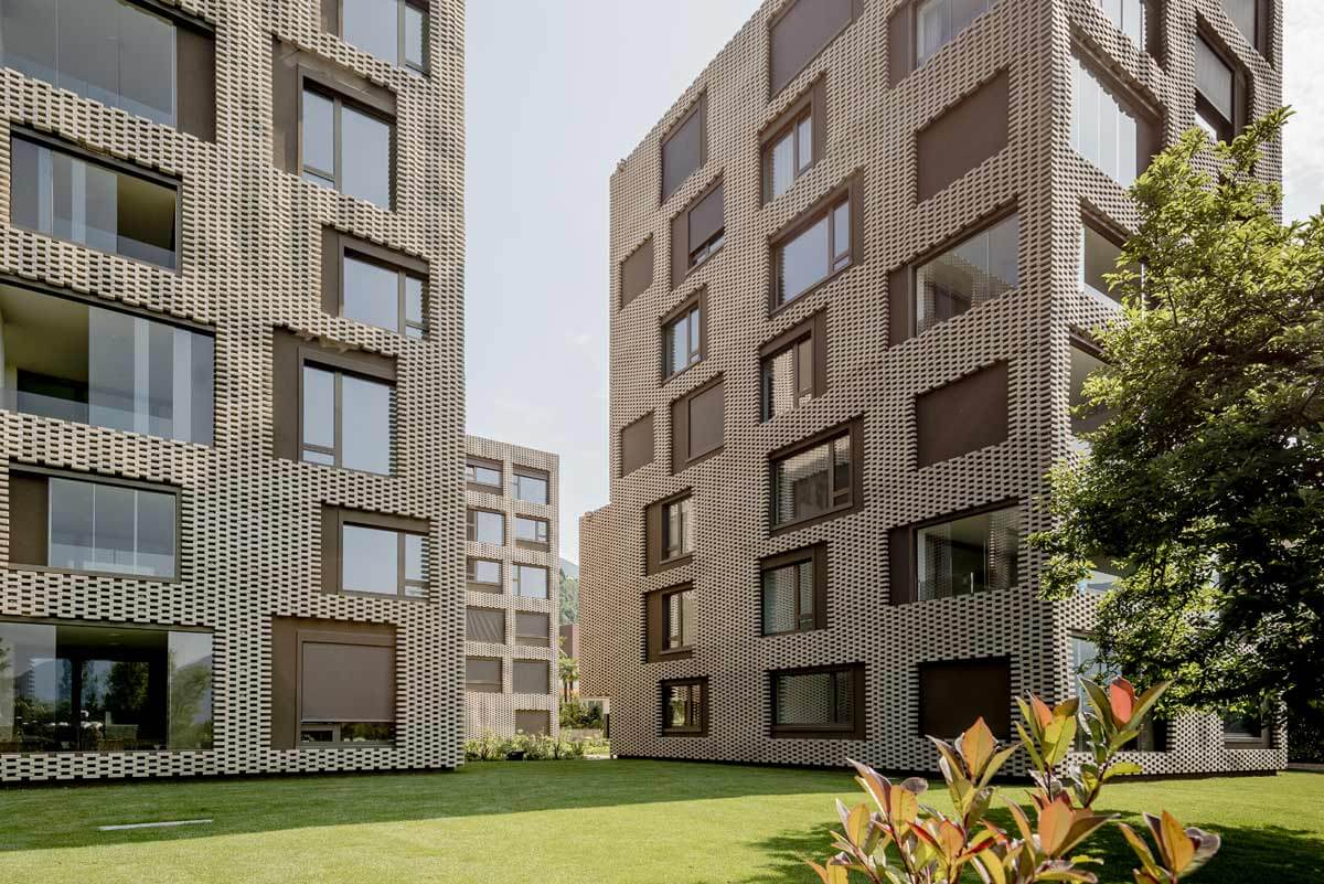
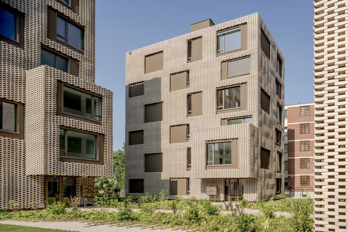
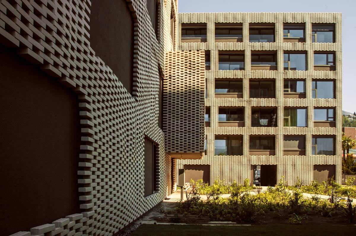
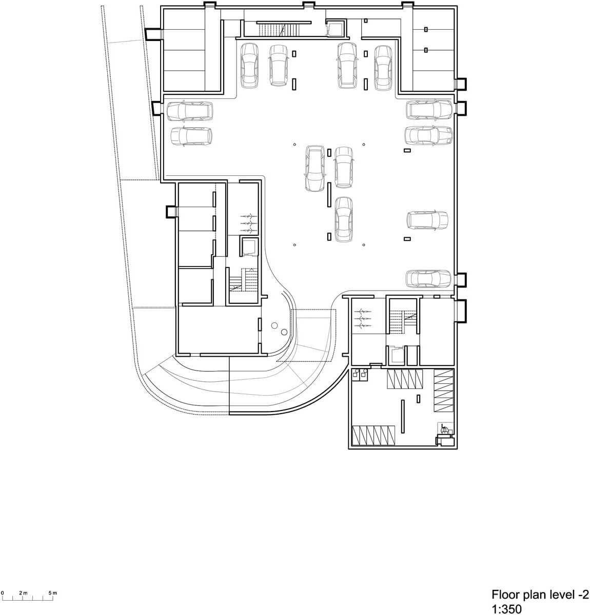
We envisioned three buildings: an urban block on via Varenna, and two freestanding minute towers facing the Maggia river and the mountains. The interstices and empty spaces between the buildings, connect the complex to the panorama, Tami's brick construction and the enclosed gardens of the adjacent buildings.
Plans
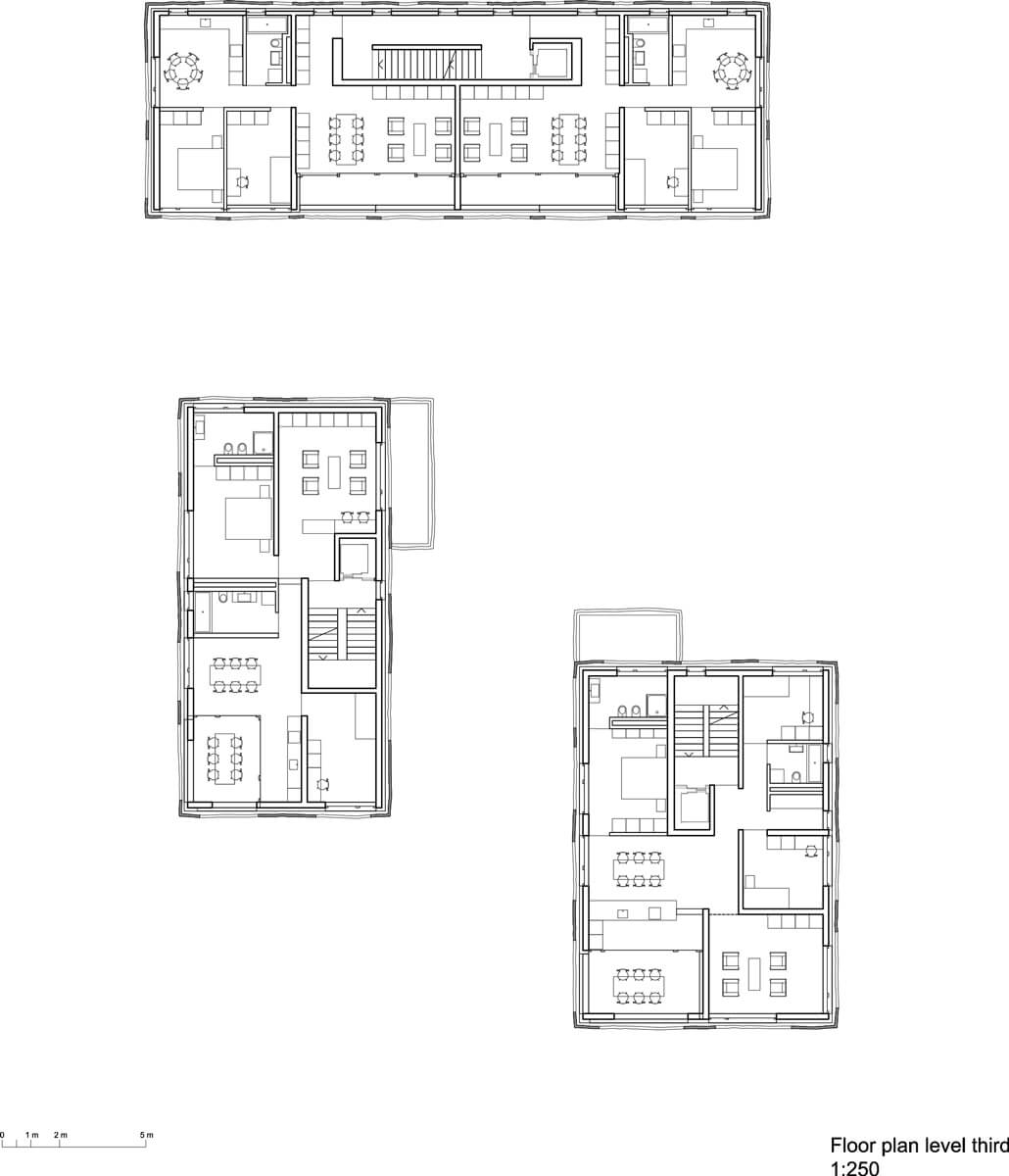
Typical floors 3rd floor
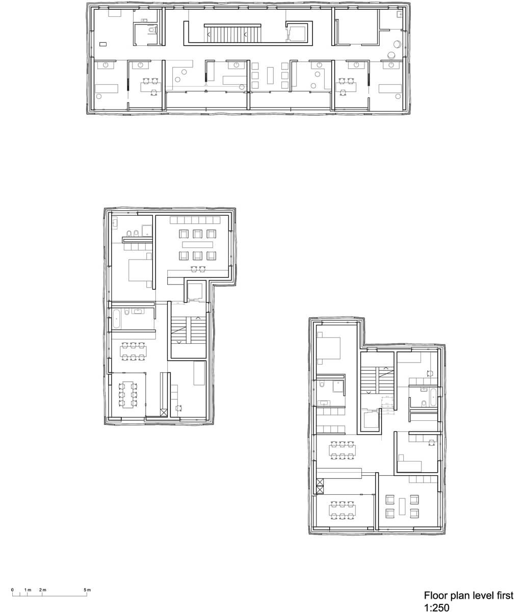
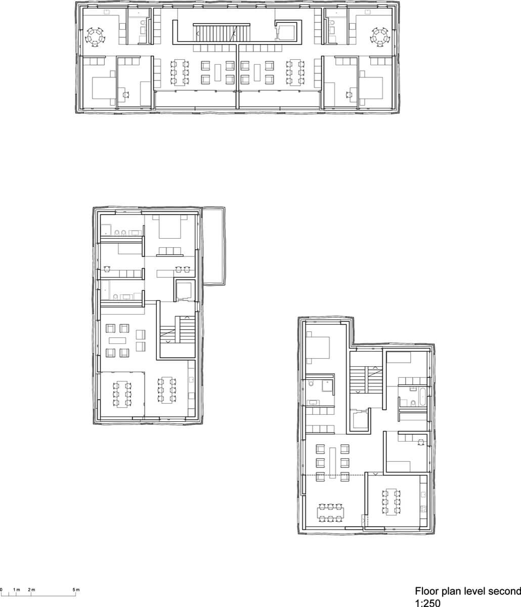
The spatial character of the estate was inspired by the few still existing old villas in the area, and the memory of the ones that were demolished. We did set to realise two narrow towers with one flat on each floor, reminiscent of the typology of the villa a piani (villa on floors), characteristic bourgeois apartments in early 20th century Milan. This approach granted river and mountain vistas to the building facing via Varenna, turning a transitional space into a unifying complex.
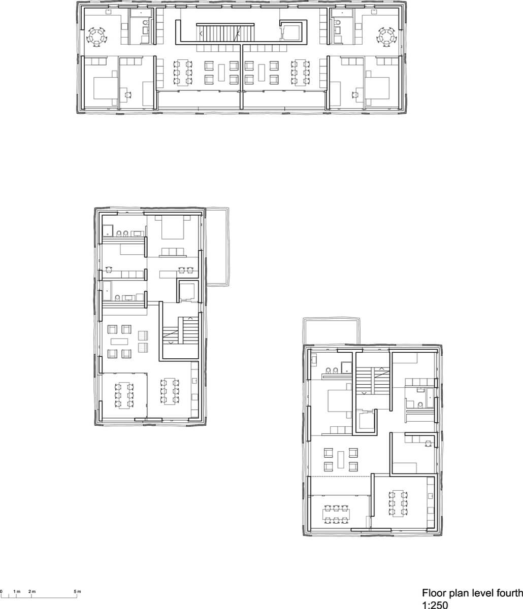
Typical floors 4th floor
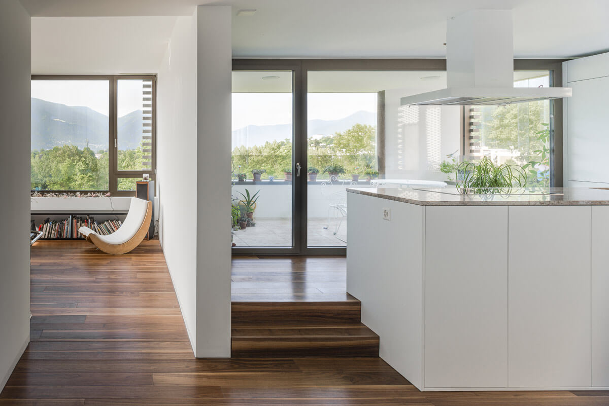
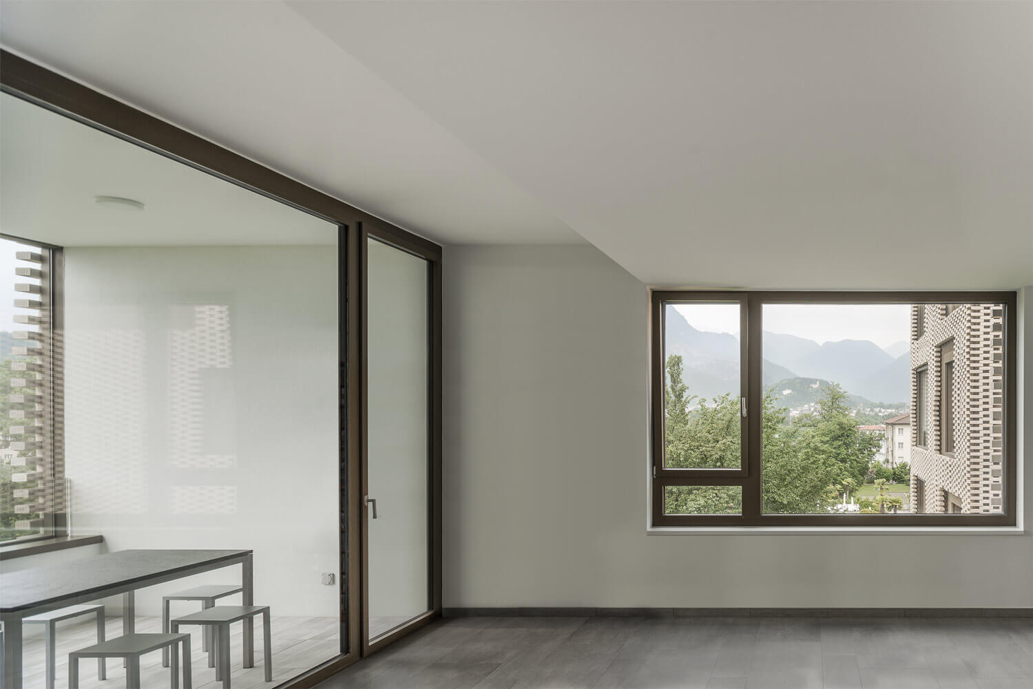
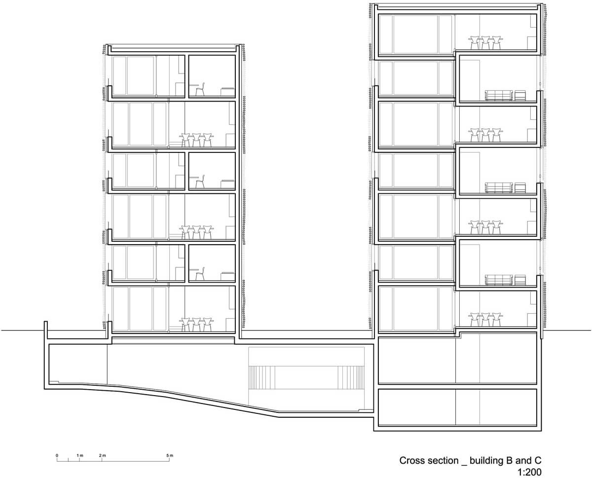
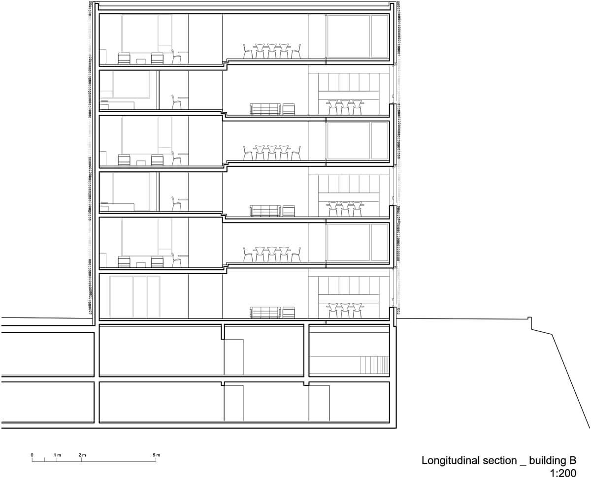
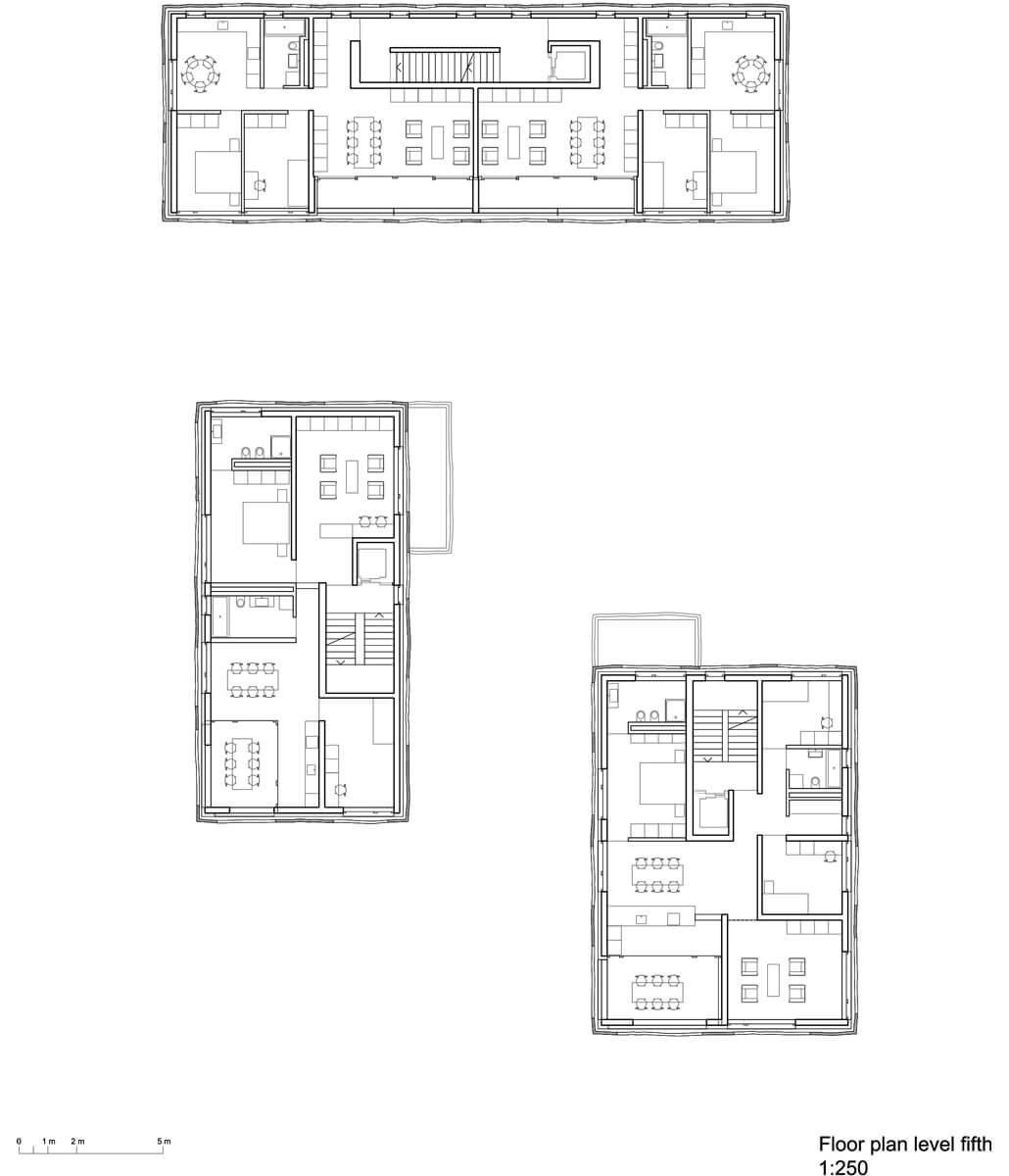
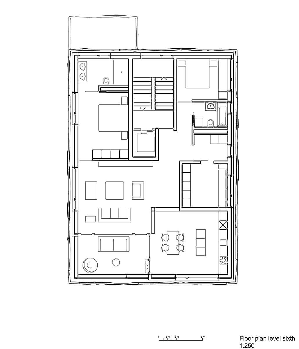
Instead of beginning the project working on the floor plans, we started with the section, planning three varying heights encasing into each other from floor to floor; 2.31 m for the kitchens, 2.62 m for the bedrooms and 2.93 m for the reception rooms. Each flat features varying configurations, both in floor plan and section, creating diversified individual environments. Some reception rooms are facing the internal court, others the river; some are placed inside the conservatory, and others offer studio space facing the delta.
Cross section
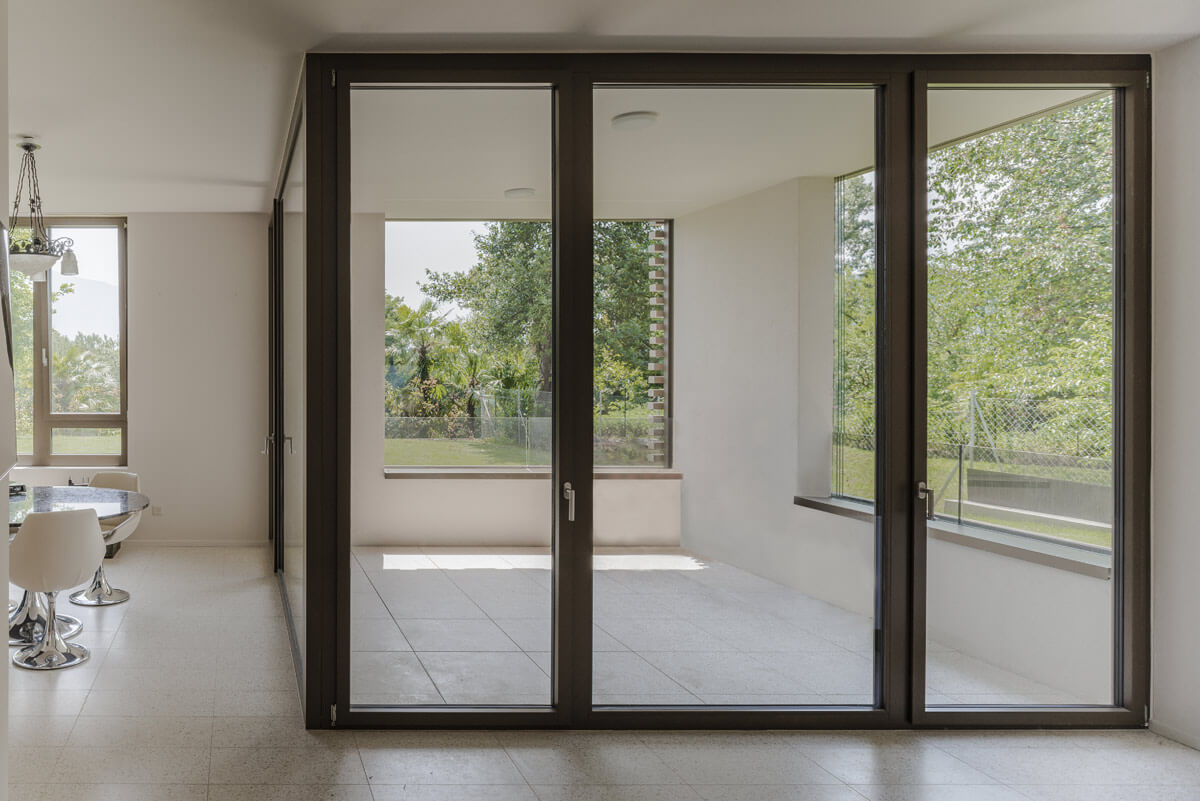
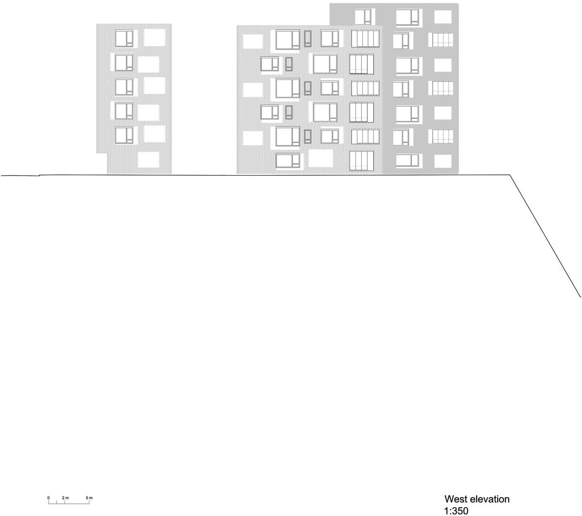
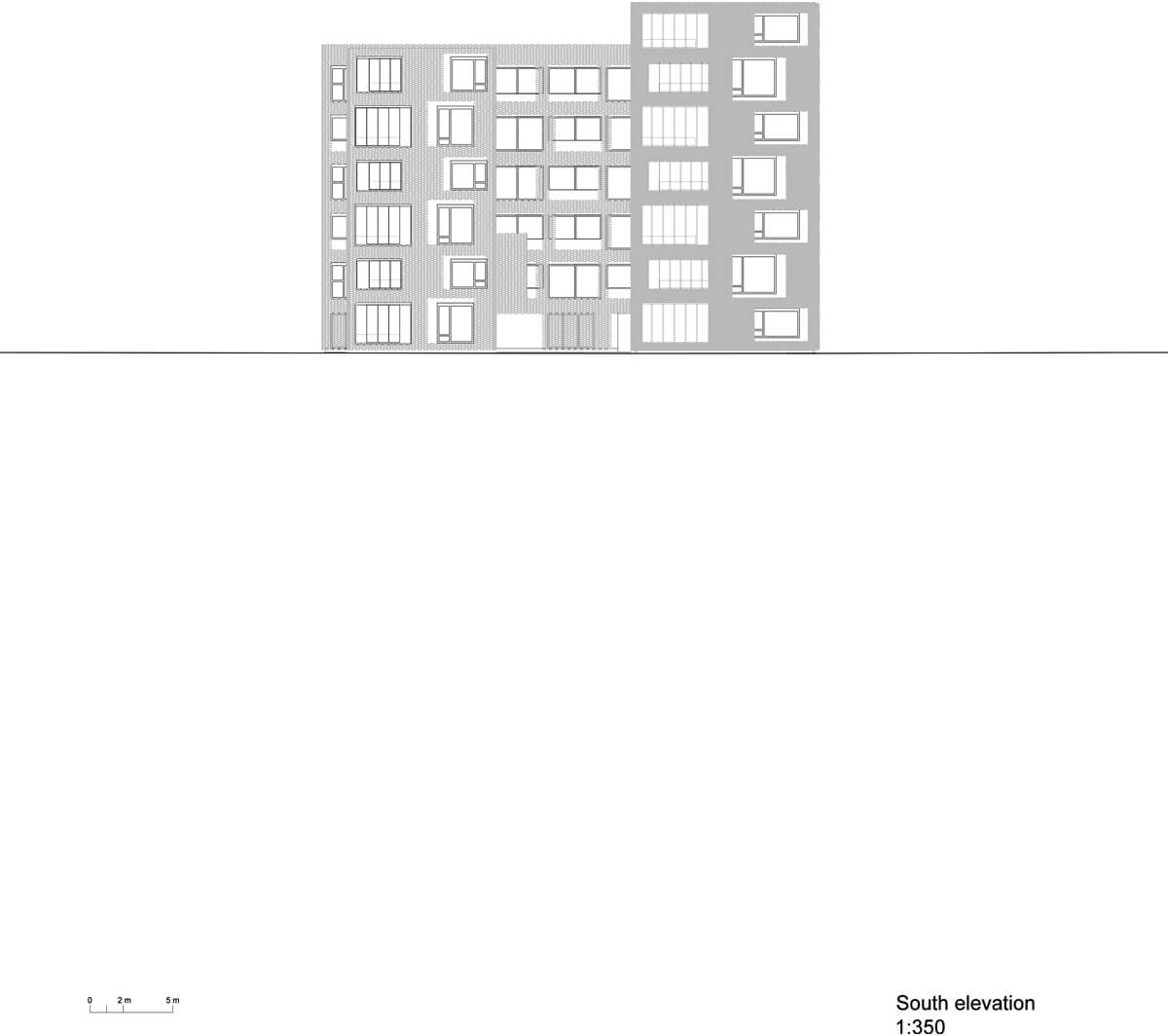
The fluid spatiality given by a total lack of hallways, allows to live the flat from one pole to the other, fully perceiving from the inside the true dimension of the building. Even the loggias, which were conceived as external space, can be turned into a conservatory in the fashion of old villas. The facades of the buildings facing the river, hint at the articulated interior organisation of space (the modulation in floor plans, spaces and heights) without being its mere photocopy.
Longitudinal section
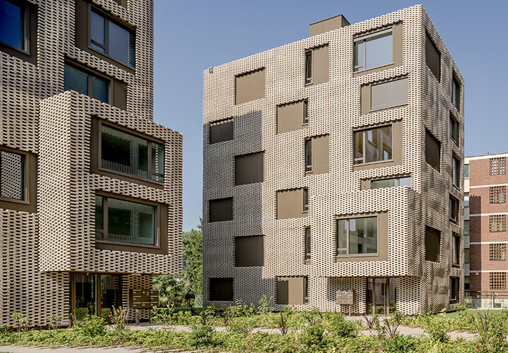
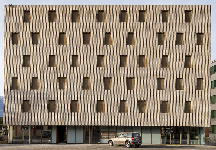
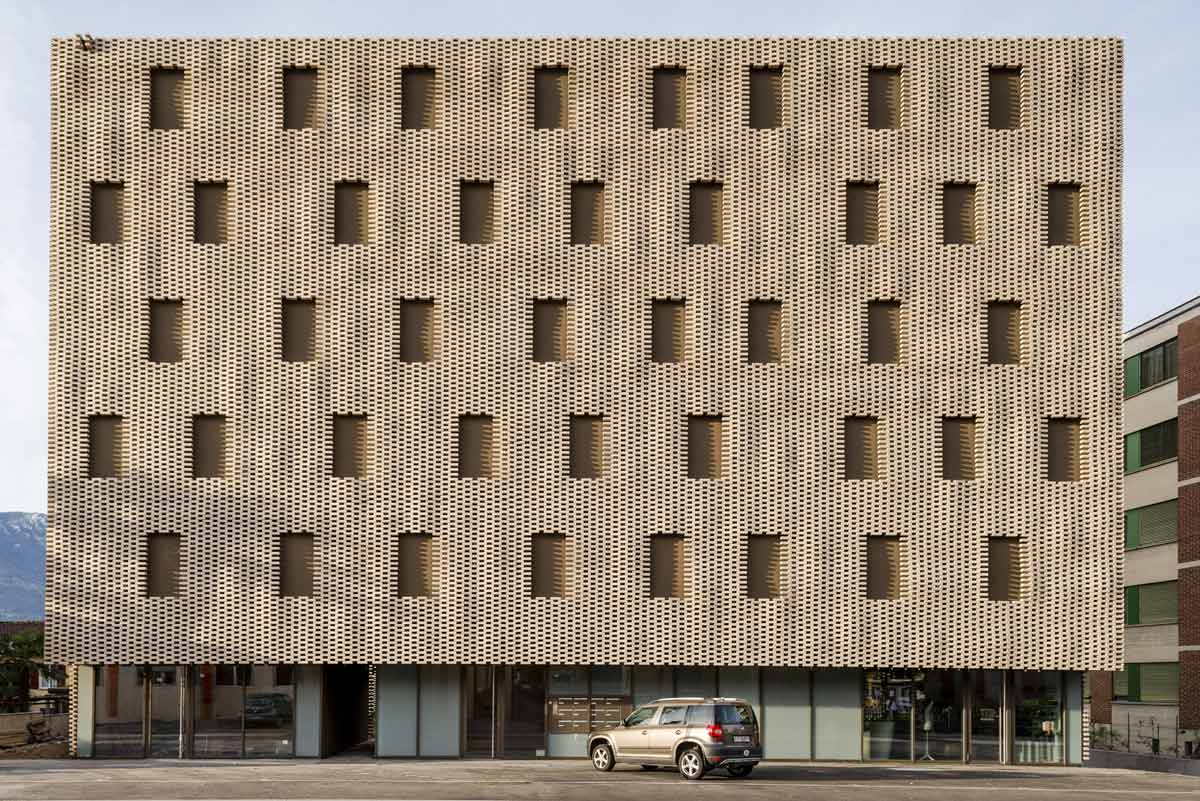
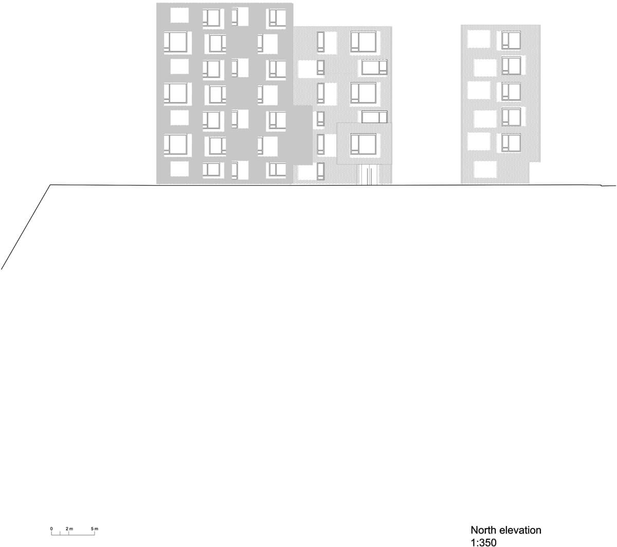
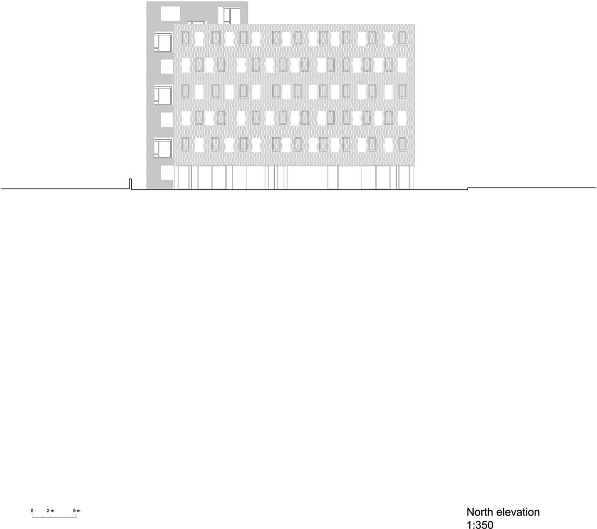
Thanks to the rational use of only three window types and dimensions, we achieved an expressive unity, despite the great variety of situations. The urban street facing construction instead, presents a more linear structure in bands, both in floor plan and facade. This was our conceptual response to the street flow, given by the one-way system of via Varenna. Over a fully glazed ground floor, we developed a totally closed street facing prospect, like a monumental screen.
Facade concept
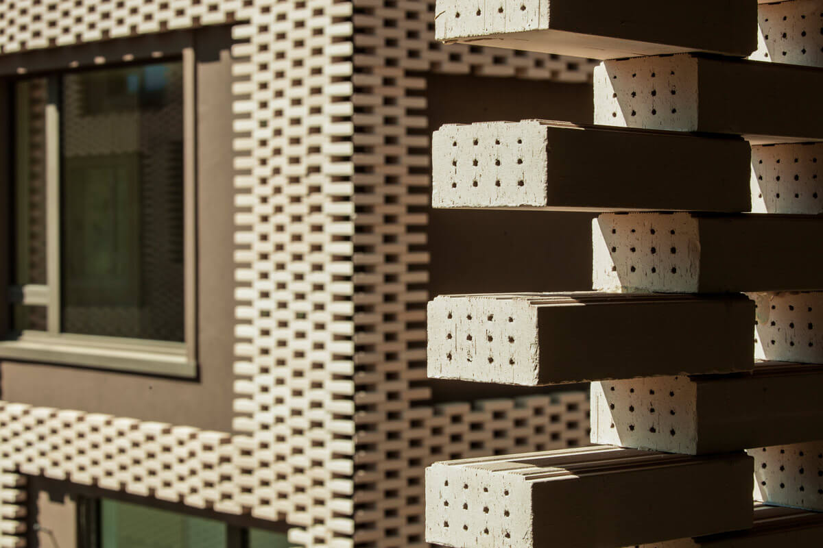
We wished to use brick to reinforce the link to the adjacent Rino Tami building, but with the help of 21st century technology delivered a contemporary reinterpretation. In collaboration with ROB AG -a ETH spin off responsible for digital programing- and the firm Keller AG from Pfungen, Switzerland, we developed a robot assembled modular facade. The bricks of each module bend inwards or outwards, reminiscent of bossage.
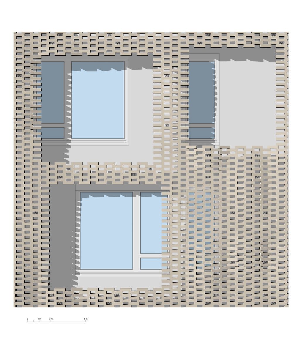
Brick solid bossage elevation “Pixel patchwork“
Super brick blocks reminding of pixels, form the facade's image. Their scale was chosen carefully to enable combinations adaptable to the proportions of each of the building's faces. ROB mathematically parameterized the modules for the production, while Keller developed custom bricks in a desert sand shade, using clay from Jura. Applying the randomly generated combination of panels on each of the three building's faces, we created a brick patchwork regardless of windows and loggias.
Cutting the frames in the solid facade
From this solid facade we then cut the already planned openings, following a different logic, namely the one determined by the alternation of frames and windows. Being the two processes independent from each other, the resulting facade pattern and relations were totally unpredictable.
Assembly drawings with single bricks weaving the panels
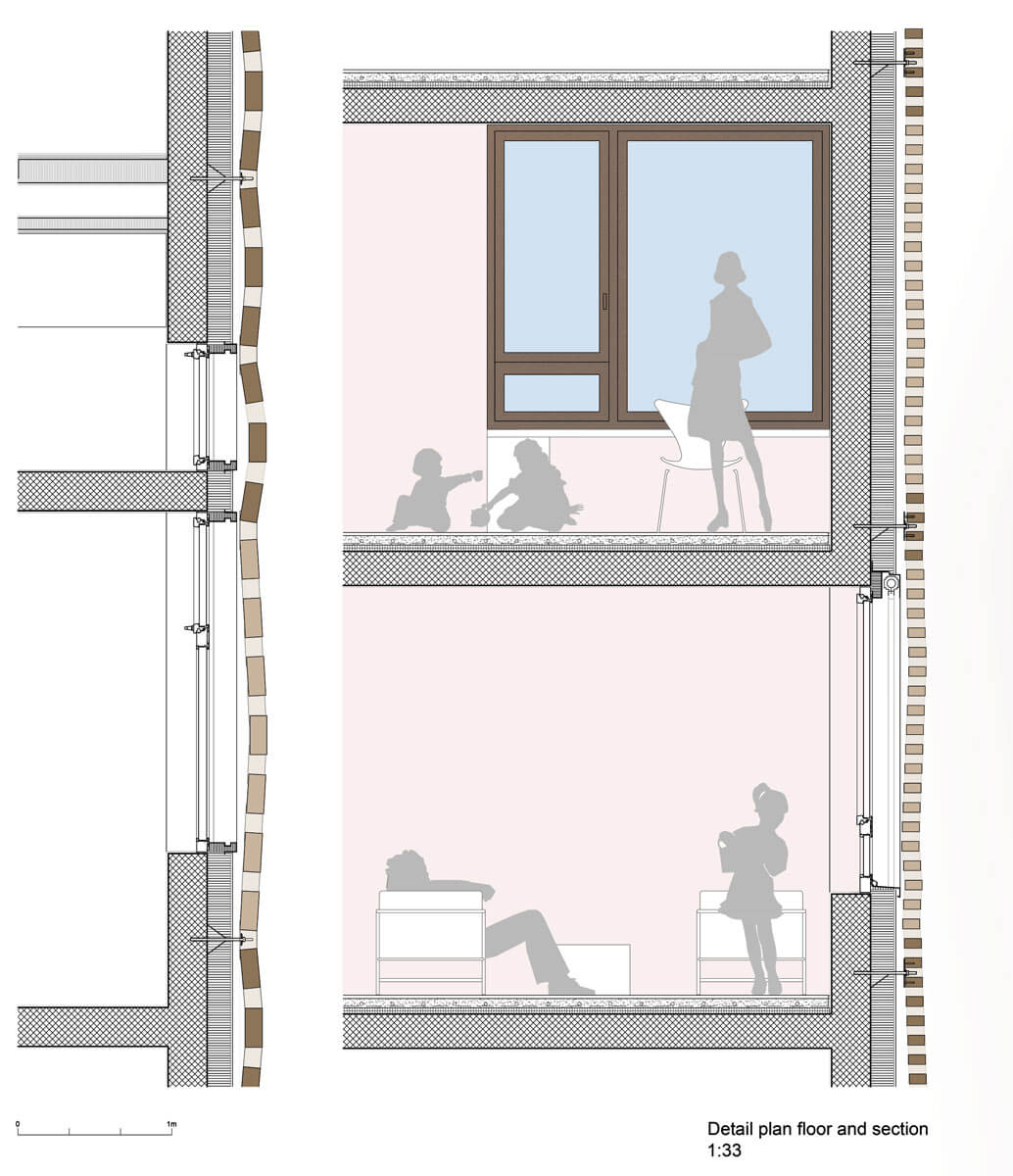
The firm Keller finally subdivided the various elements in further panels of varying shape and size, following a further montage logic. Among the various panels, there are junction bricks that weave together the patchwork brick layer. Finally the whole facade sits on stainless steel brackets and hooks, a process never explored before.
3D Bossage elevation simulation study
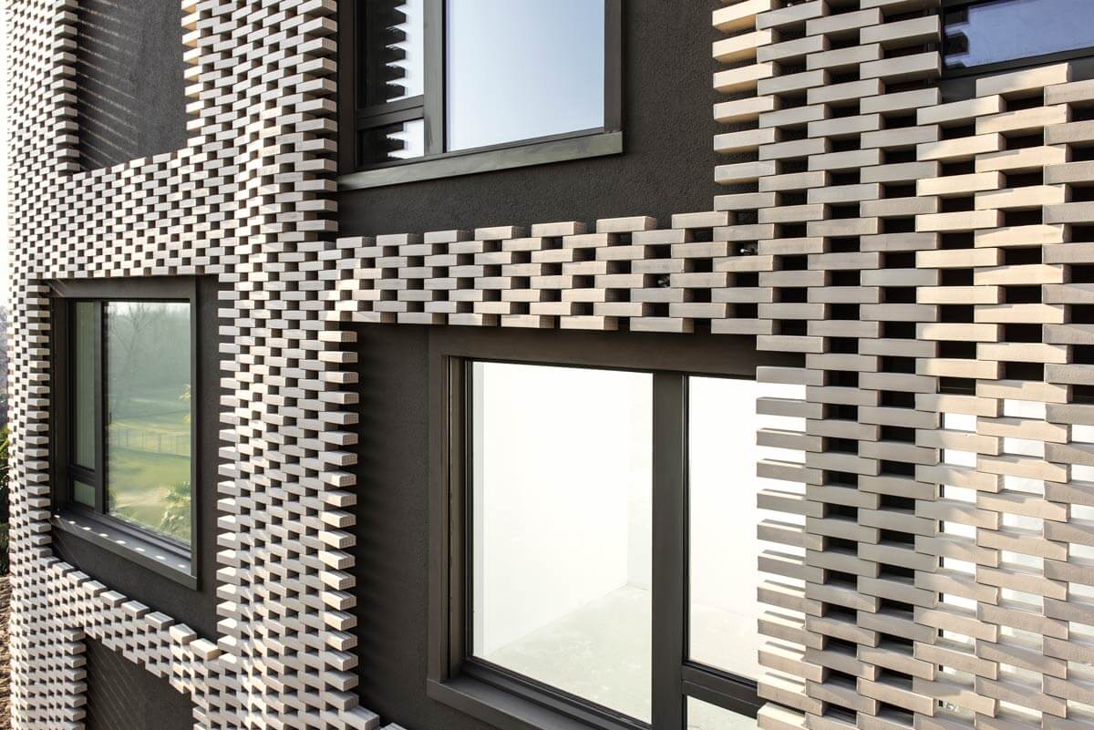
The final appearance has textile ornamental qualities, like fraying fabric where the bricks have been cut to accommodate the openings for the windows. The whole building reminds of a curtain swelling and contracting in the breeze.
Conclusion
This project was born parallel to Cà Bianca, but they could not differ more. If one thematises the precision of an ordering grid, the other explores the possibilities of imprecision and lack of alignments as expressive potential. The growing economical pressure determines shrinking deadlines, and a compression in construction costs; is also cause of a growing loss in manual accuracy, in spite of highly prized Swiss precision. We turned the adversity of the market situation into a creative tool, assimilating in our design the imprecisions connected with manual skills on the building site. Execution difficulties were to define details and anti-details in the project. Walls, openings and levels are never in alignment. Even the brick encasement is not coplanar, at times protruding over the windows. In fact there is no linear correspondence between interior and exterior. The facade could be considered totally arbitrary, picturesque and mannerist in the style of a decorated shed. The brick grid covers or reveals what lays beneath, disregarding whether plastered wall or window.
Cà Bugnada proved that a project undergoing rational developments and logical processes, can produce informal, unanticipated and astonishing results.
Drawings
Extra info
Project Team:
Francesco Buzzim, Britta Buzzi – Huppert, Marta Comaschi, Matteo Inches, Luca Nocerino, Davide Scardua, Mattia Martinelli
Project year:
2015
Size:
500,000 sqft - 1,000,000 sqft
Budget:
$10M - 50M

