The Interlock / Bureau de Change
The Interlock / Bureau de Change
Description
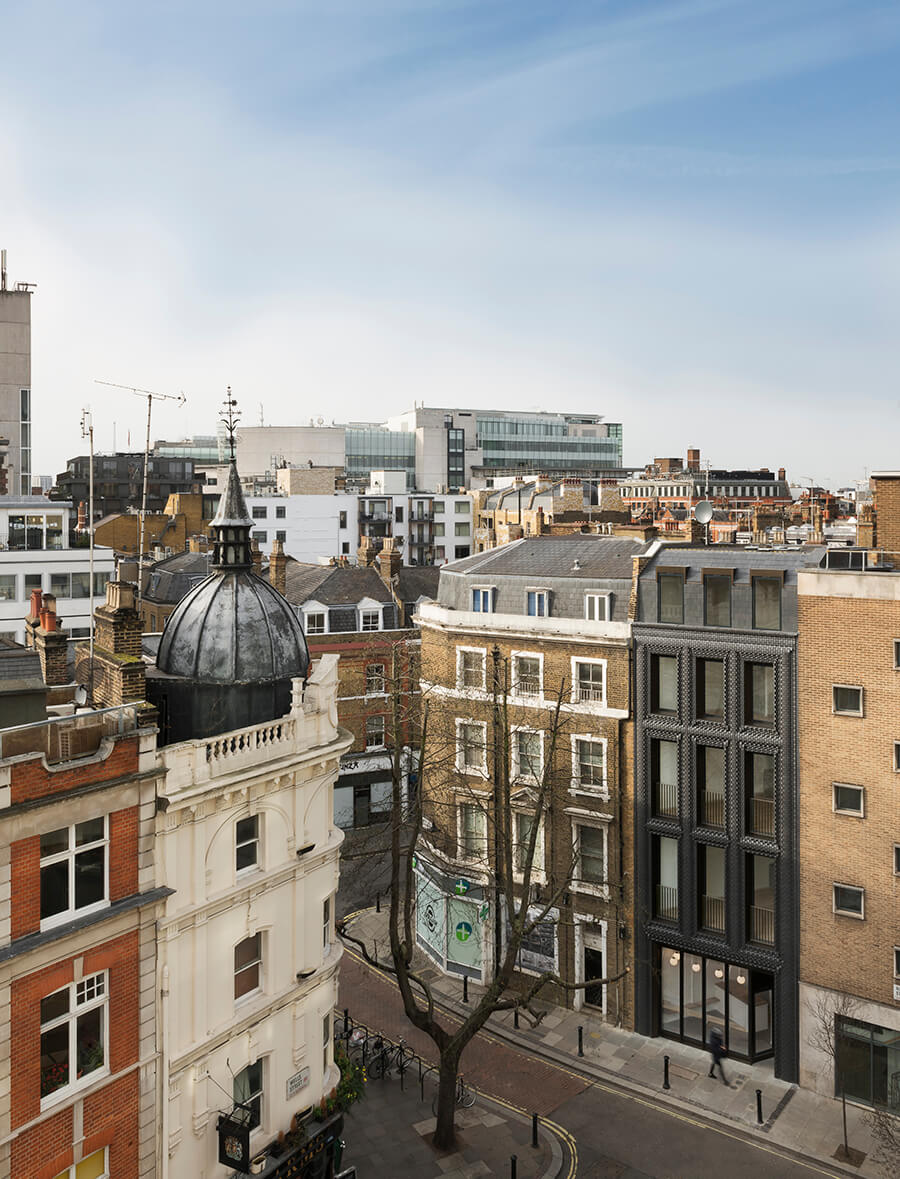
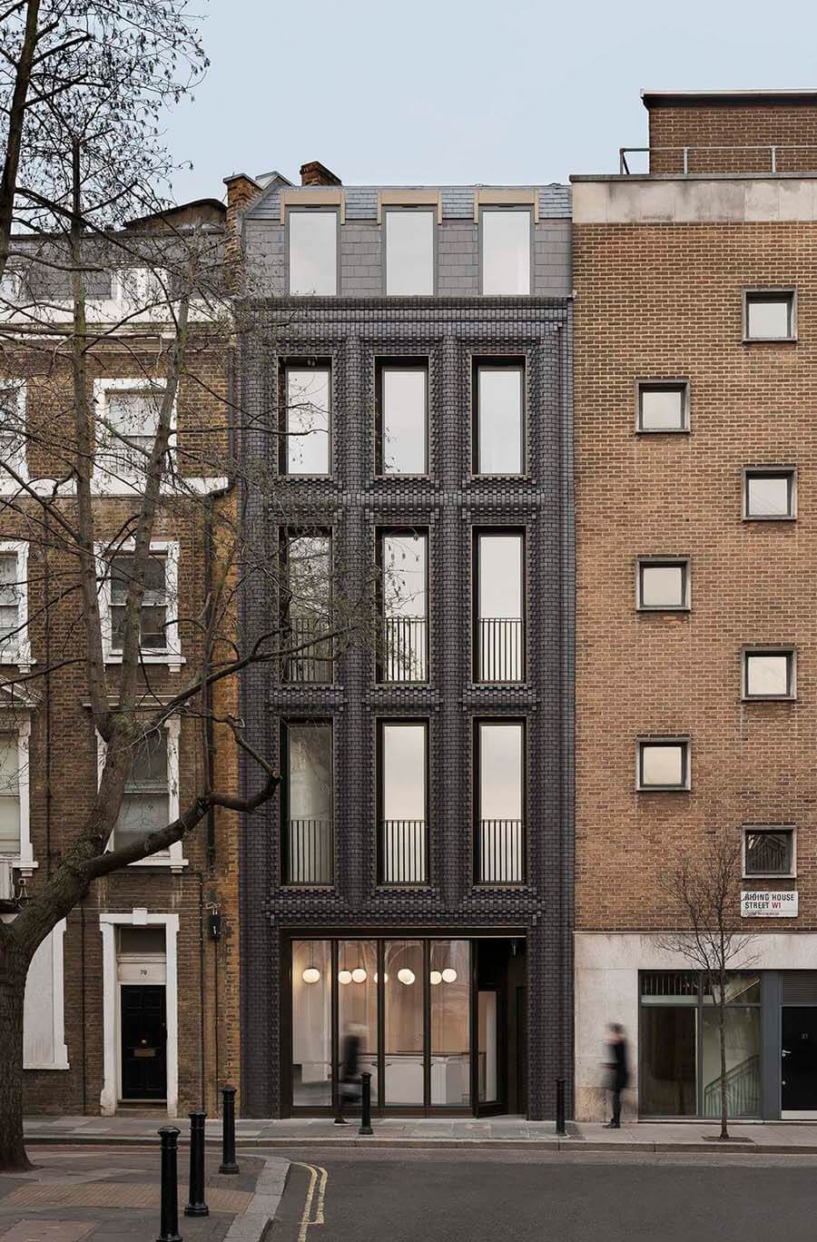
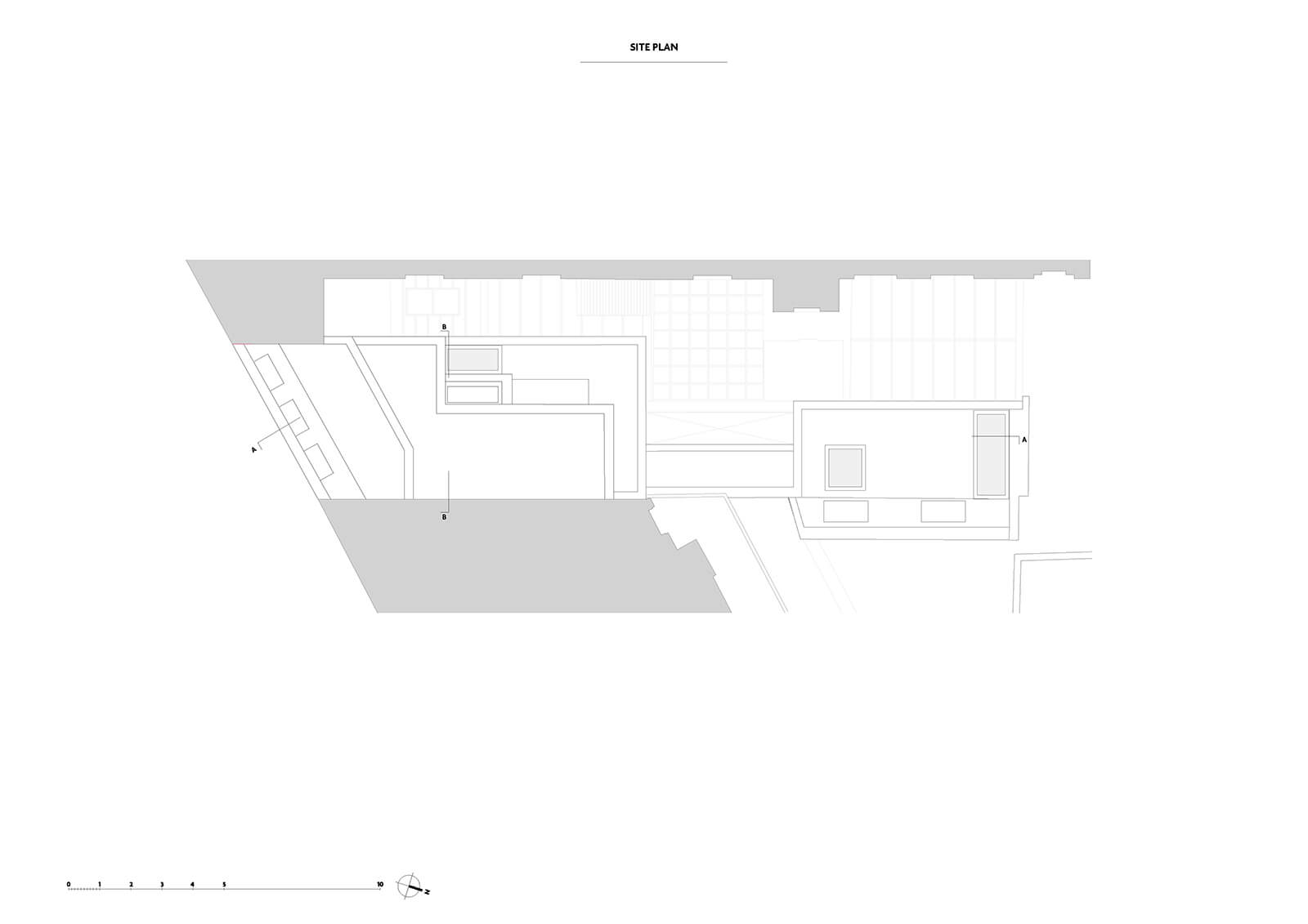
Riding House Street hosts an extraordinary breadth of architectural styles. From John Nash’s All Souls church at its most easterly point, the street skips haphazardly from 19th Century terraces to post war commercial buildings; concrete slab structures and 20 th Century apartment blocks. The street’s piecemeal aesthetic is unified by the use of brickwork which serves as the façade material of choice, at times so abundant that it forms the road surface.
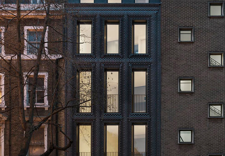
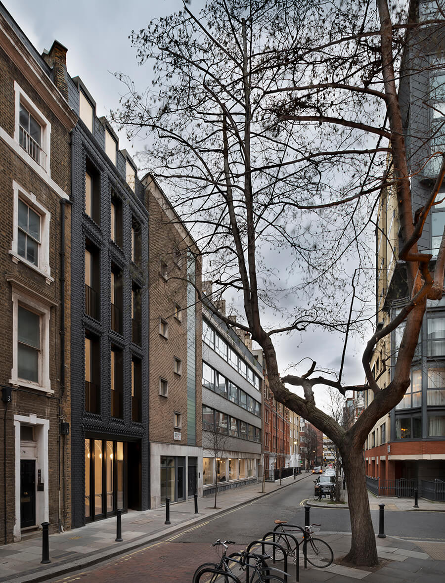
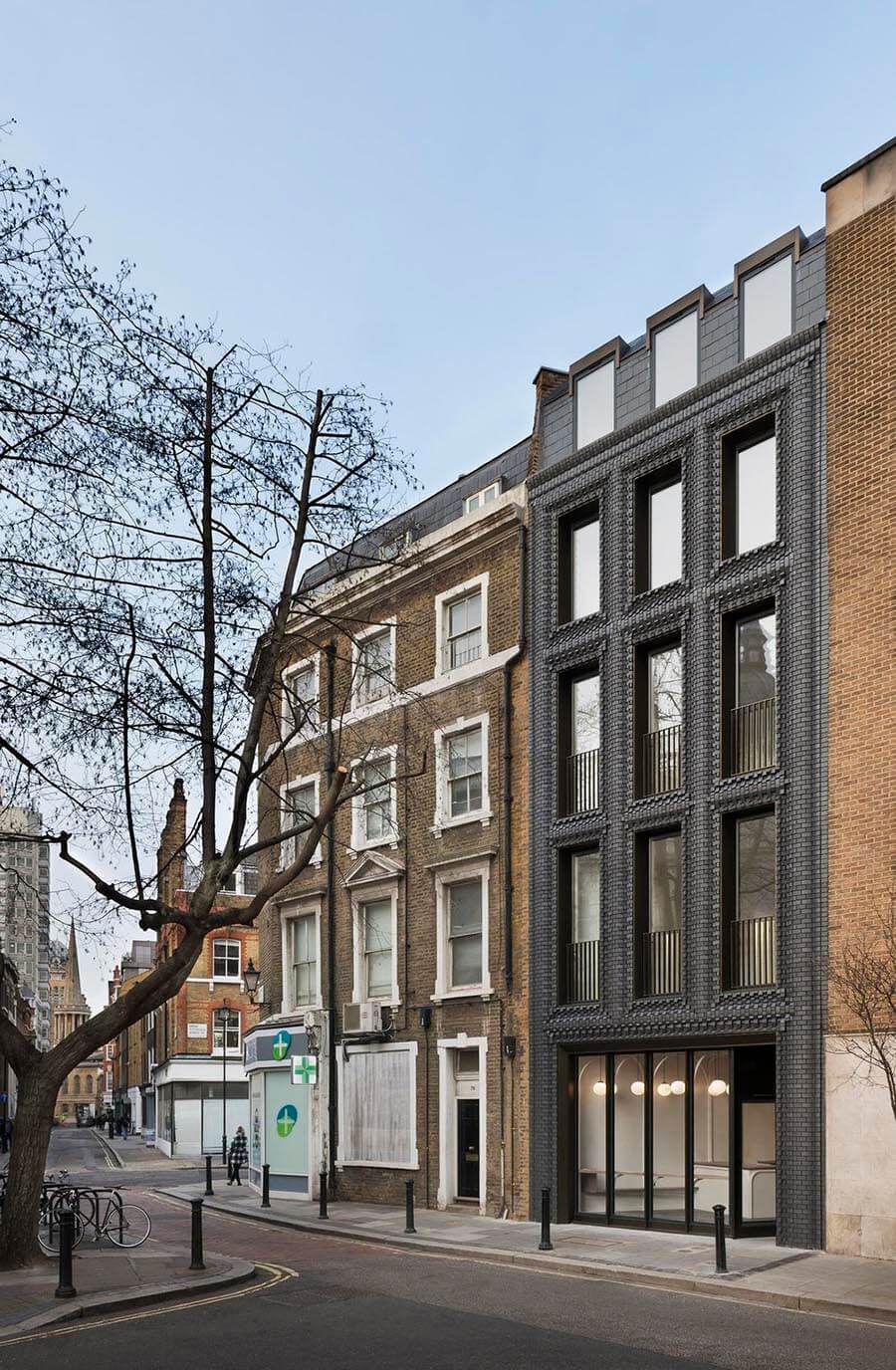
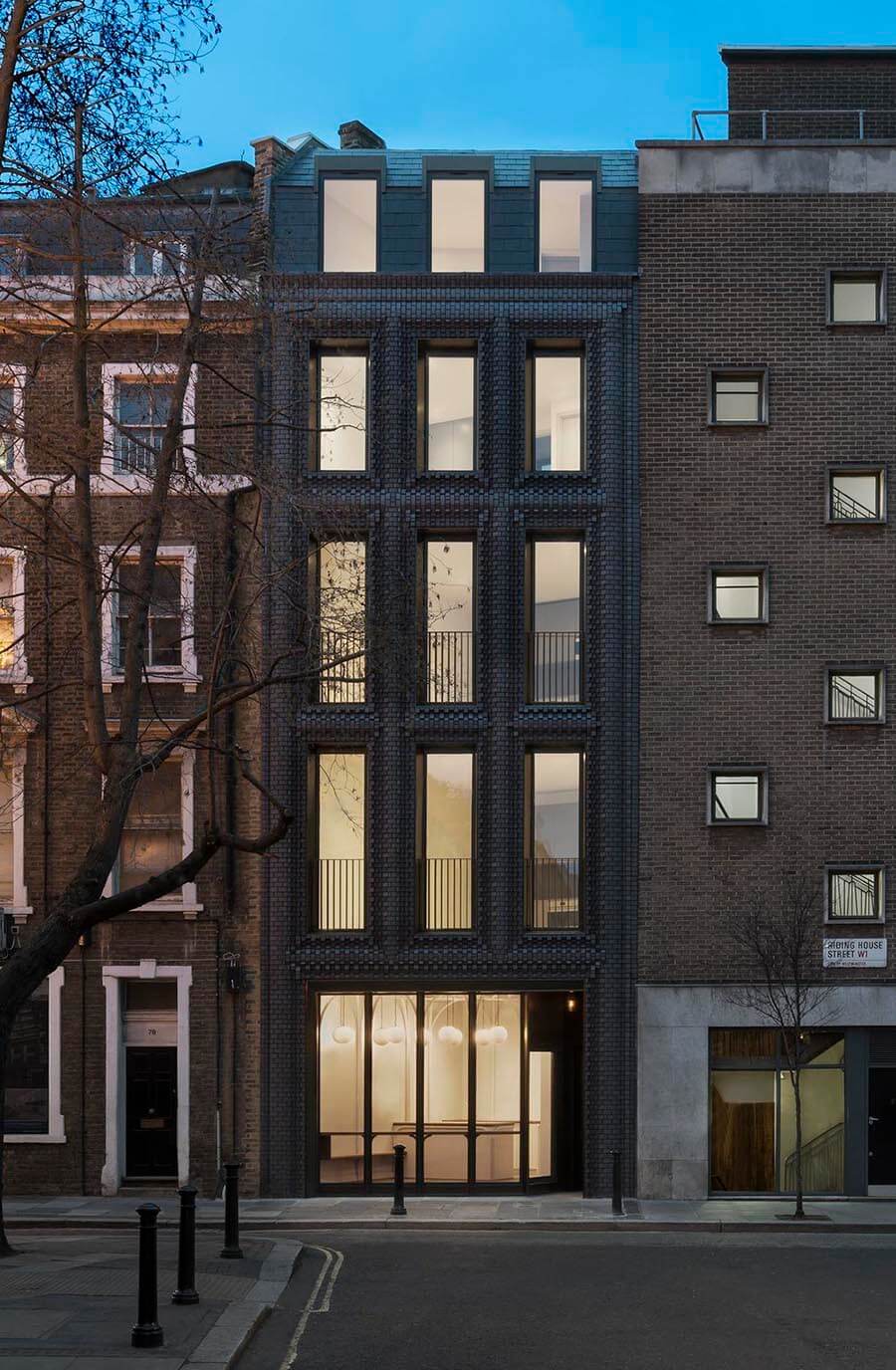
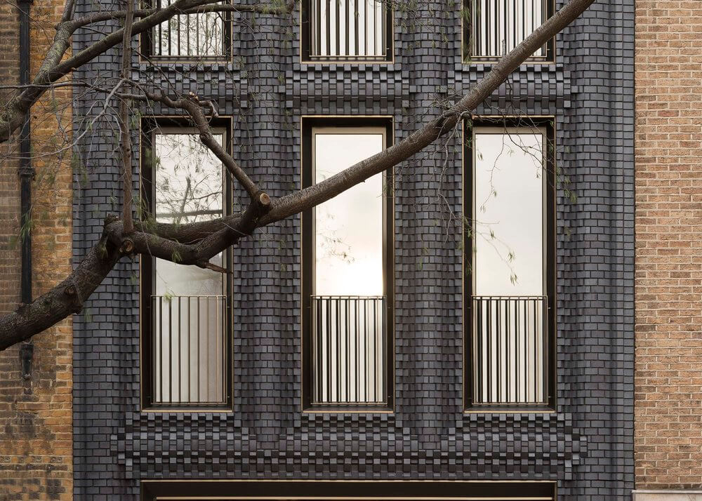
The Interlock absorbs this history and responds by taking the proportions of the neighbouring 19 th Century terrace, and recasting its brick façade to create a building of uncertain heritage – one that is simultaneously historic and contemporary, familiar yet foreign.
Why brick?
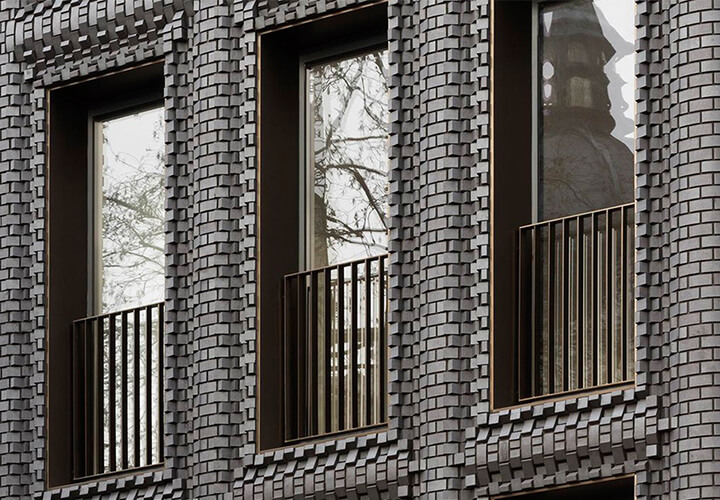
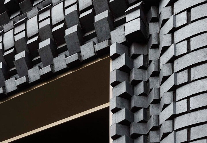
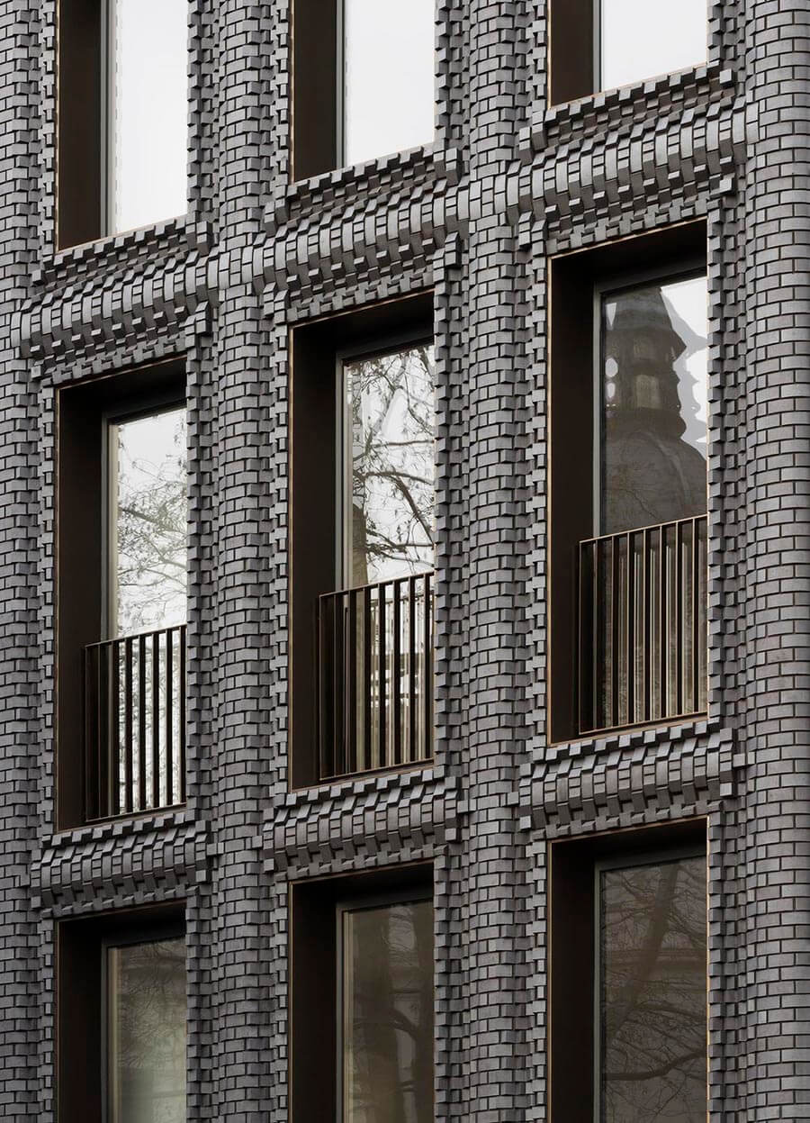
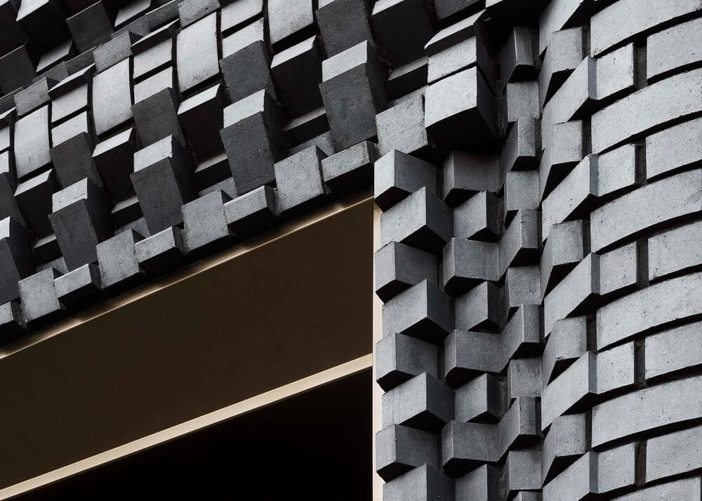
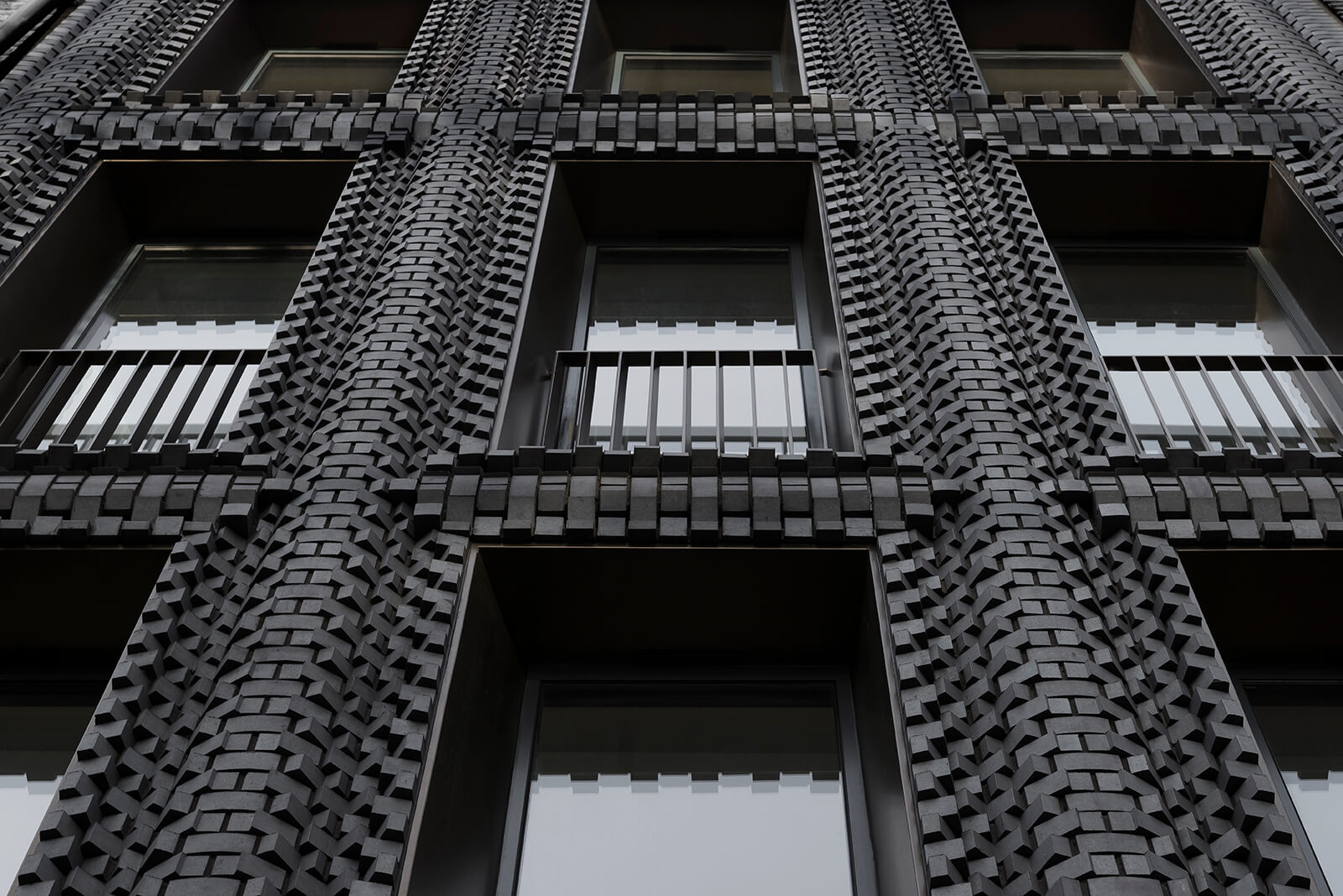
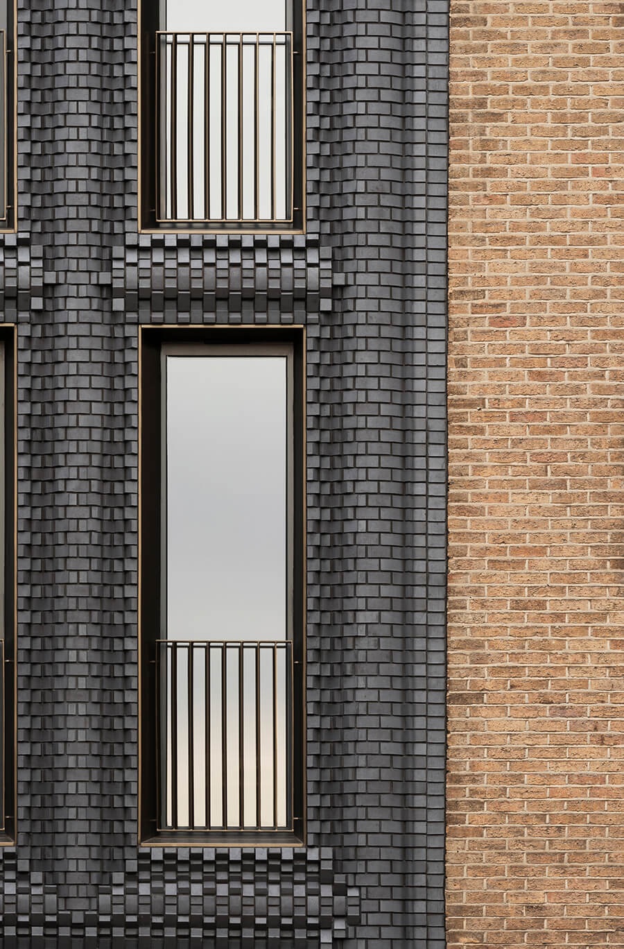
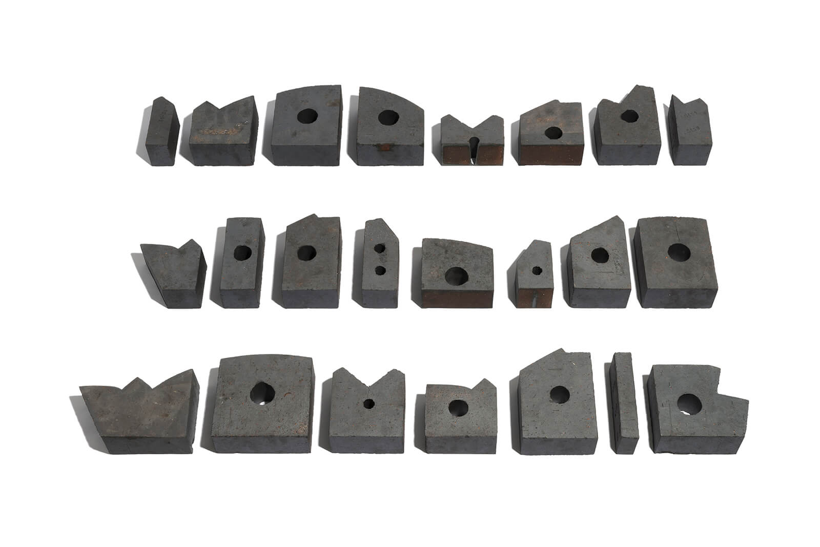
Abandoning the traditional dimensions of London brick, a collection of 44 misshapen and seemingly un-stackable clay blocks were developed. The patterns visible across the surface are informed, in part, by the interactions between materials and structure.
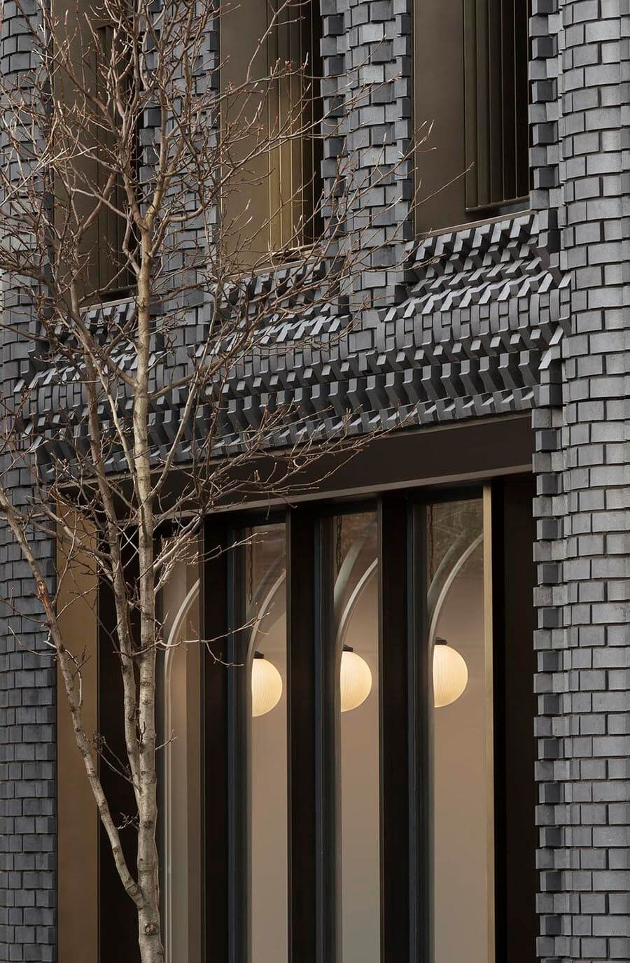
The bricks appear to lap up against glazing, swell and bow between floors and are inset frame-like to denote the building’s perimeter. For passers-by, the bricks appear to morph and twist like cogs.
By modelling the facade in 3D, each facet could be individually adjusted to meet structural and fabrication requirements without diluting the integrity of the surface form.
Exterior
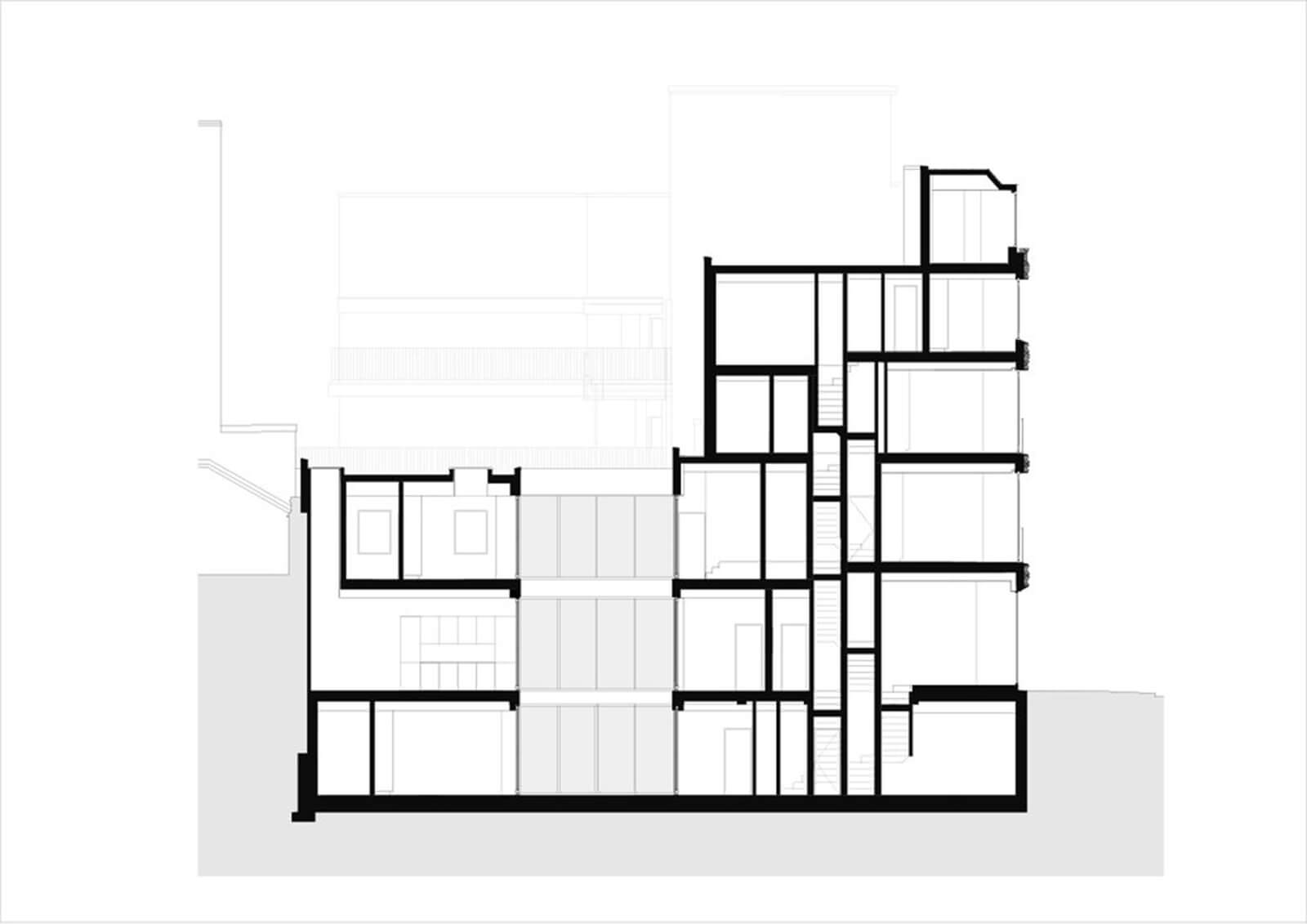
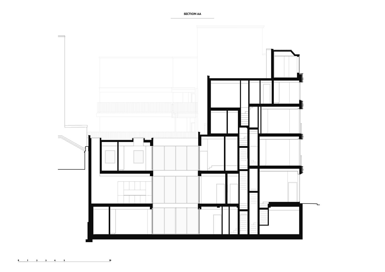
Behind the façade, sit three new residential units and a café at street level with gallery beneath. The regularity of the façade’s proportion and fenestration belies the complexity of the building’s volume and massing.
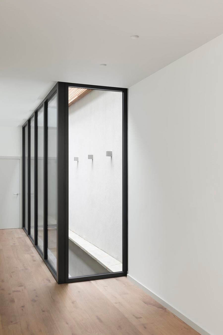
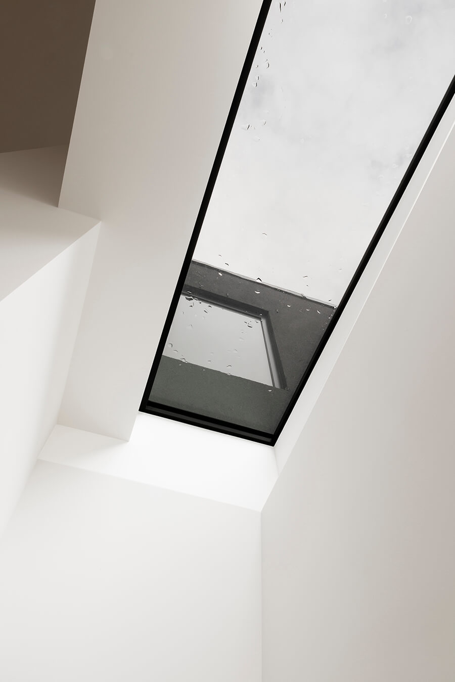
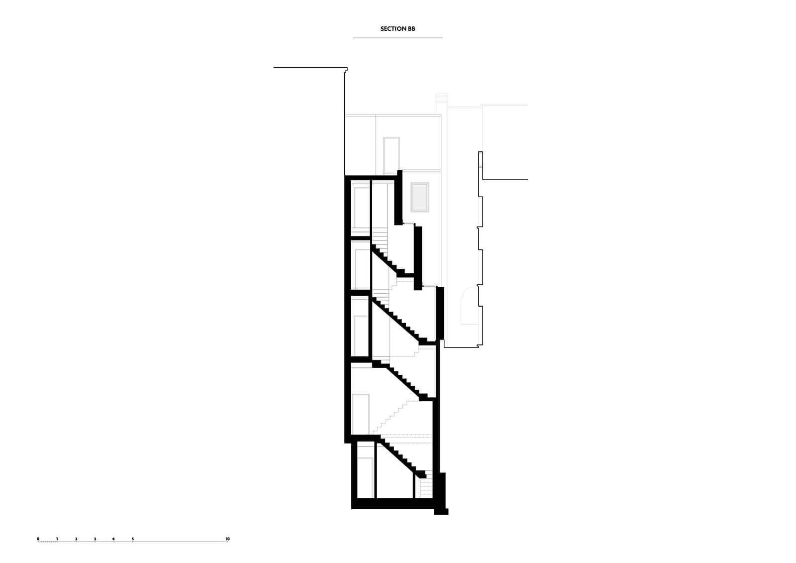
At the rear, the building is set out as a series of stacked boxes of varying form and size. Each floor is shallower than the last with the deepest floorplan at the bottom and the smallest at the top. Within this stepped form sits a series of deep light wells and skylights that track daylight in to the centre and edges of the building, creating internal patios on the lowest floors and light wells on others.
Interior
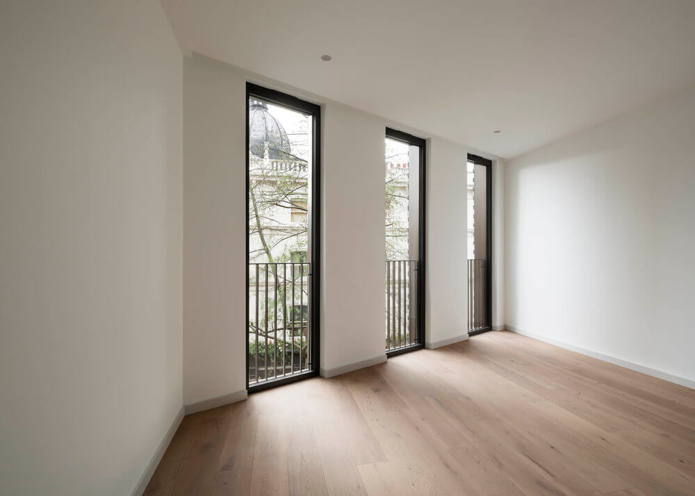
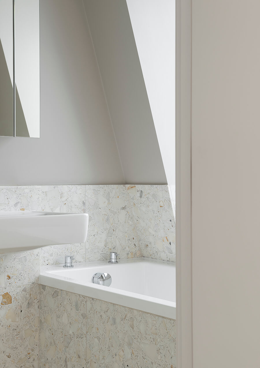
Inside, the units are finished in a simple elemental palette – terrazzo bathrooms, natural stone worktops, sprayed-timber kitchens and oak floors.
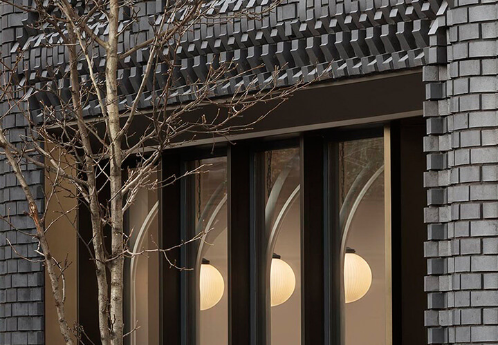
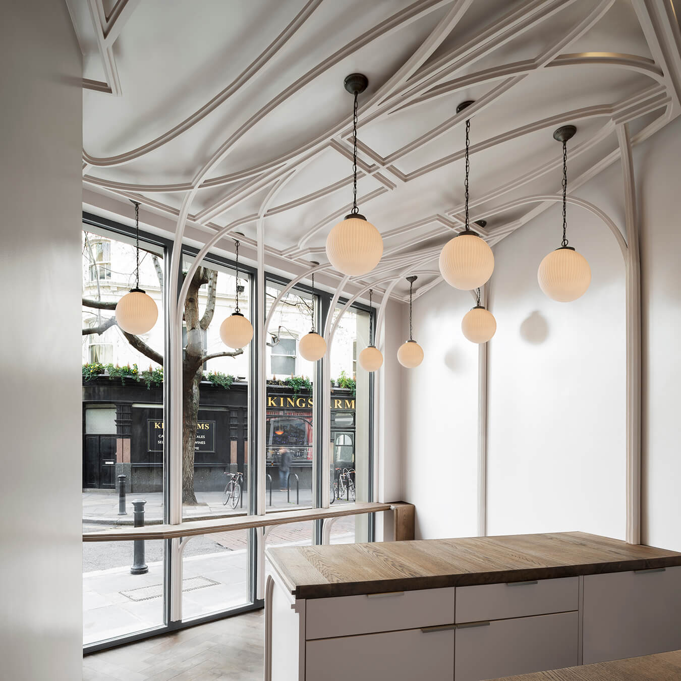
The light-filled café at the base of the building offers a counterpoint to the weight and inkiness of the façade. With every surface washed in white, the heavy-set mullions are halved and extruded from their frames to form ribbons that curve and fold over the ceiling in a style reminiscent of ornamental plasterwork. The monochromatic palette is broken only by cuts of oak that line the floor and counter tops.
The project represents a shared vision between developer and architect to taking London’s architecture and re-approaching it in a way that brings something new to the streetscape.

