The Rock / Design band YOAP
The Rock / Design band YOAP
STEADY ON THE ROCK
Location
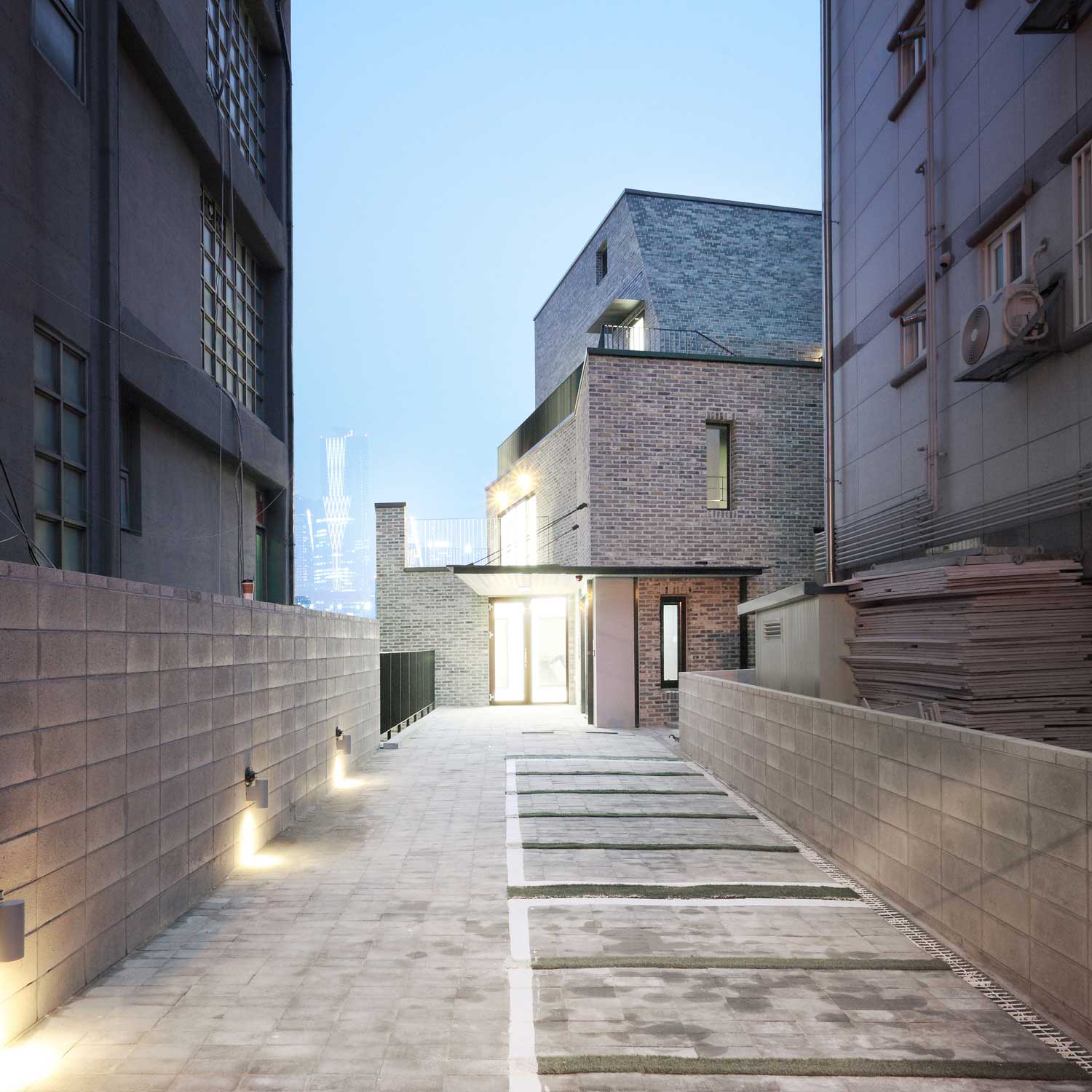
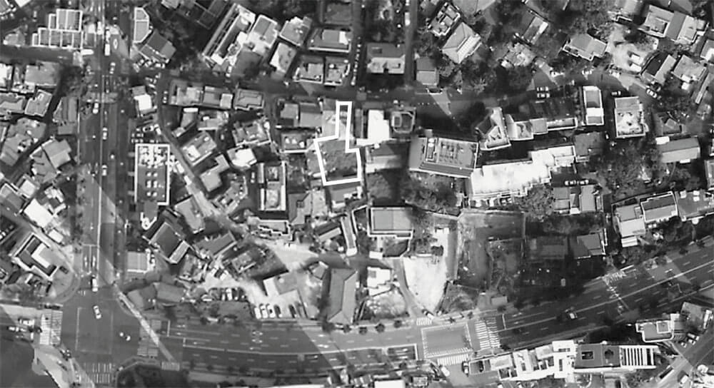
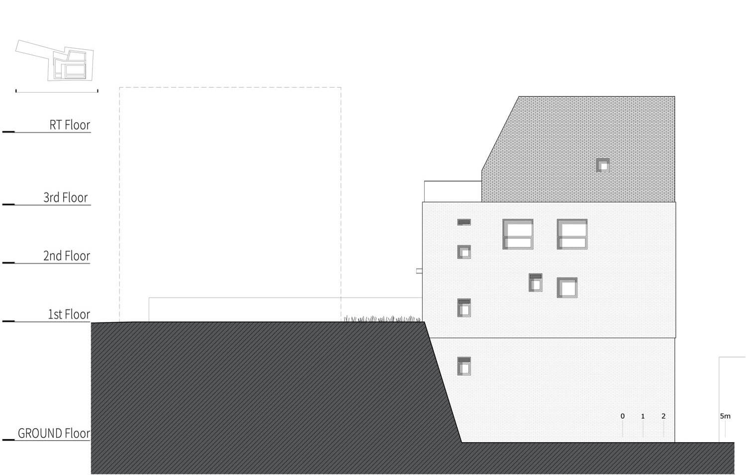
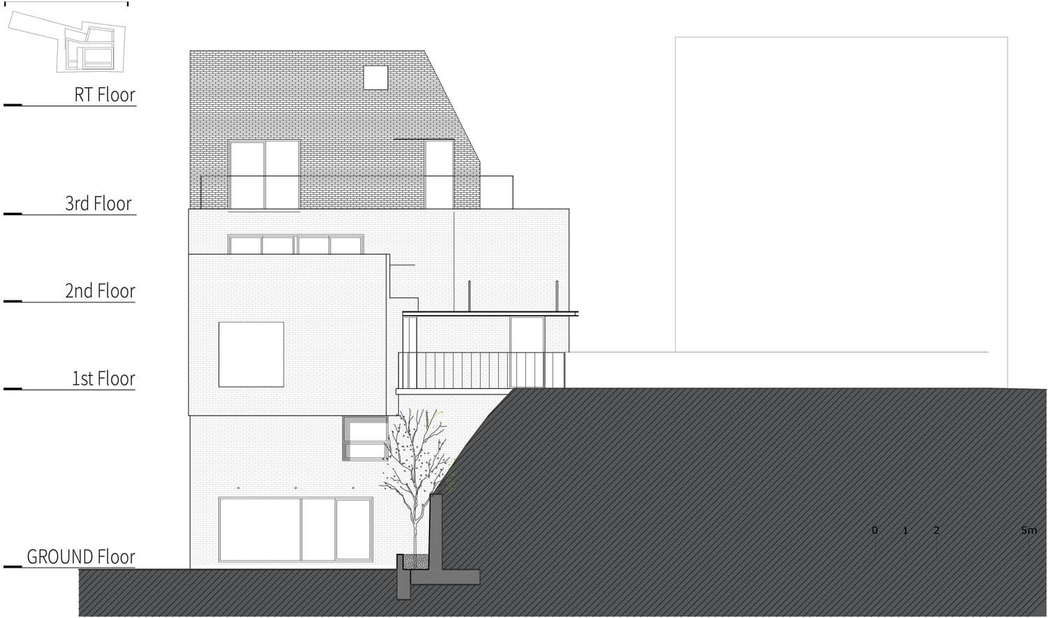
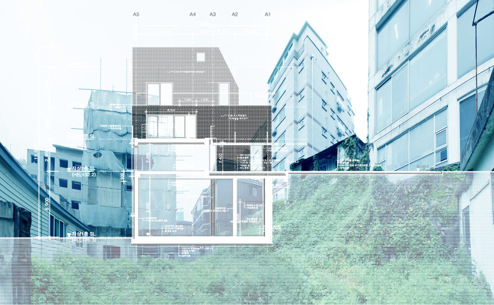
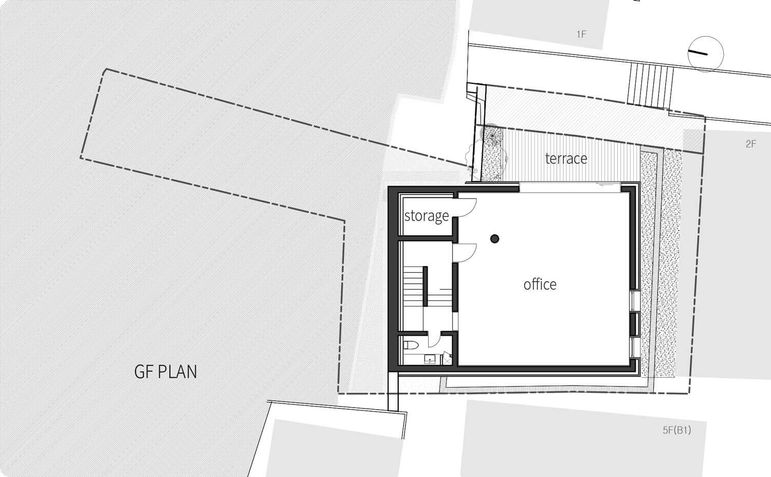
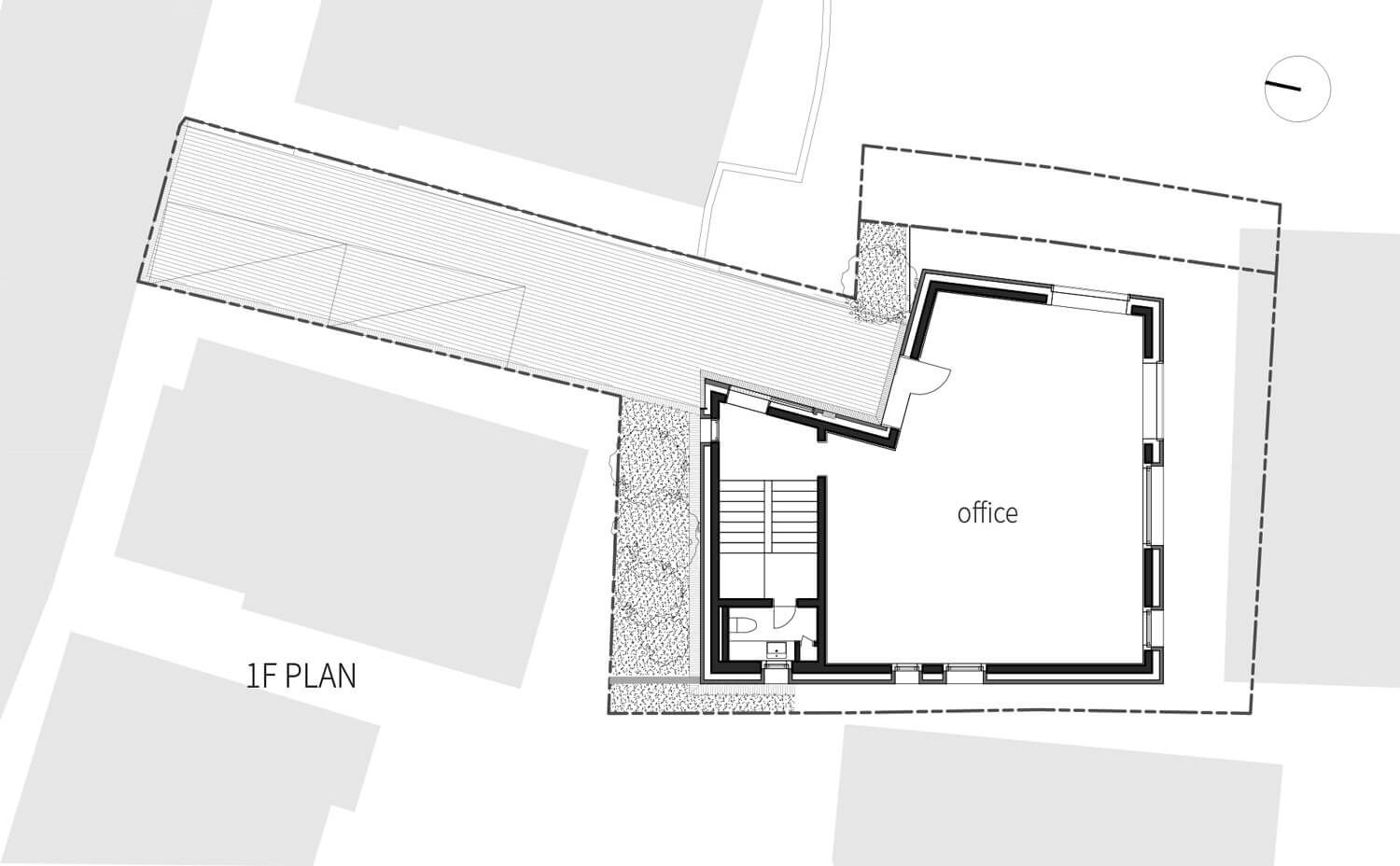
The ground of ‘a pointing hand’ form is seated on the top of the hill in Sangsu-dong area, Seoul. Just as like the name of the region meaning ‘the town above the river’, it is looking down Han River from the top. A cliff of 6m height is dividing ‘the pointing finger’ part above and ‘the hand part below. These differences of narrow/wide and above/below parts in one small ground worked as obstacles from the initial phase of designing already, and the architects should have walked through.
The site
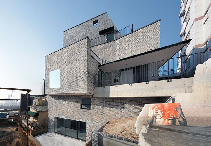
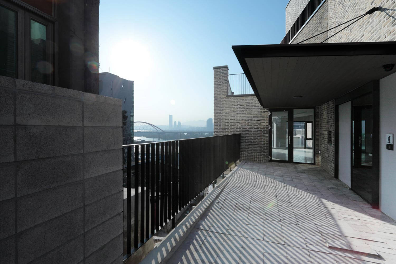
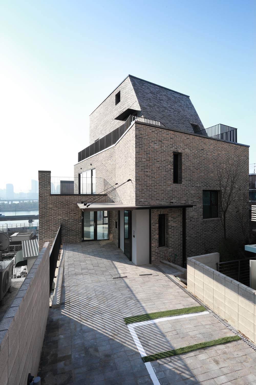
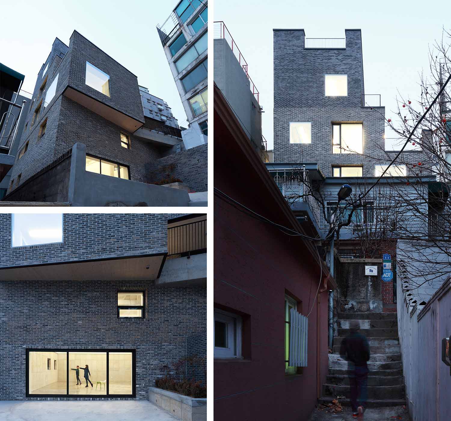
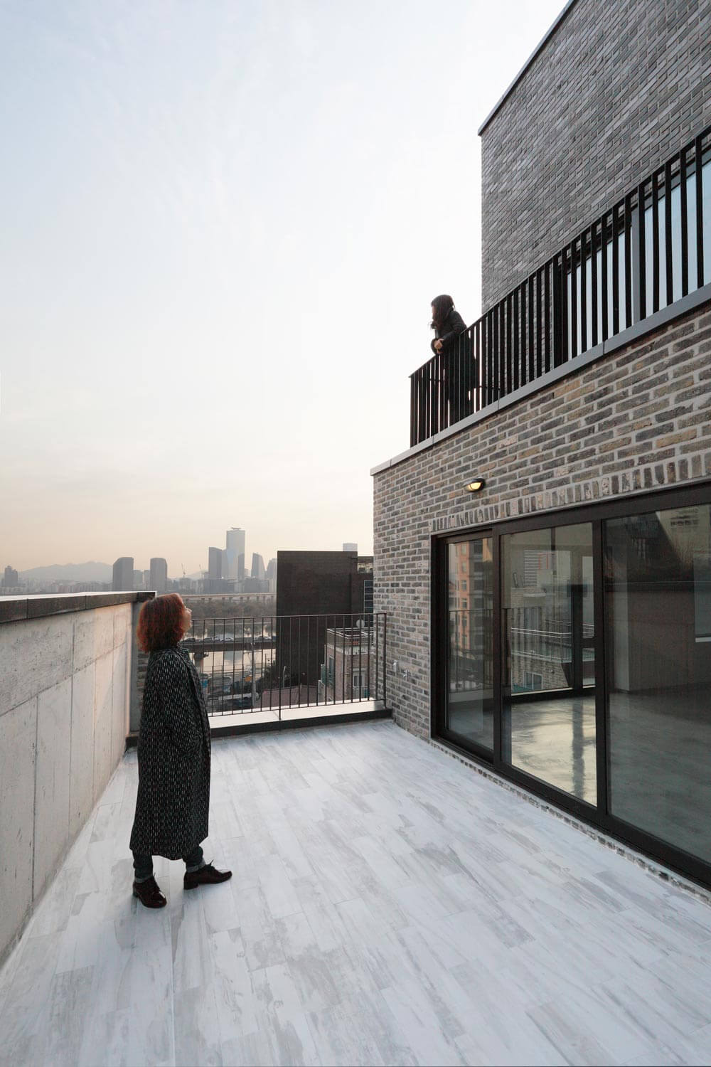
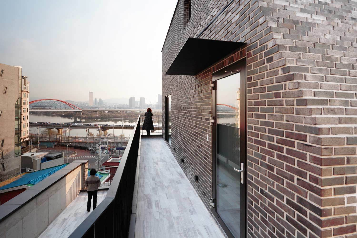
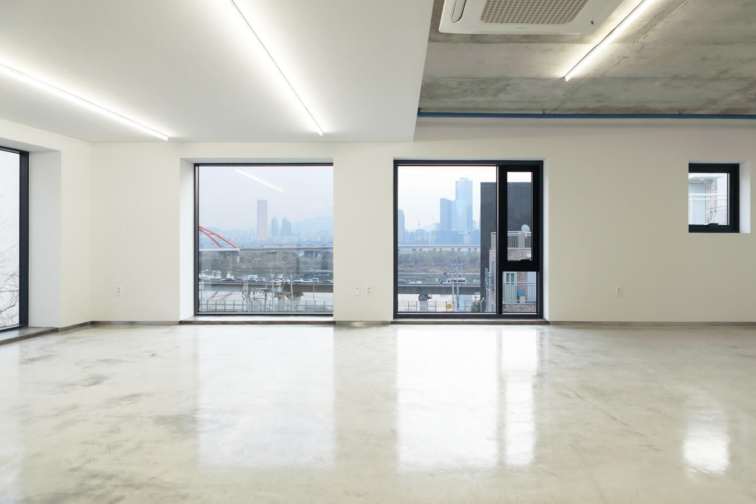
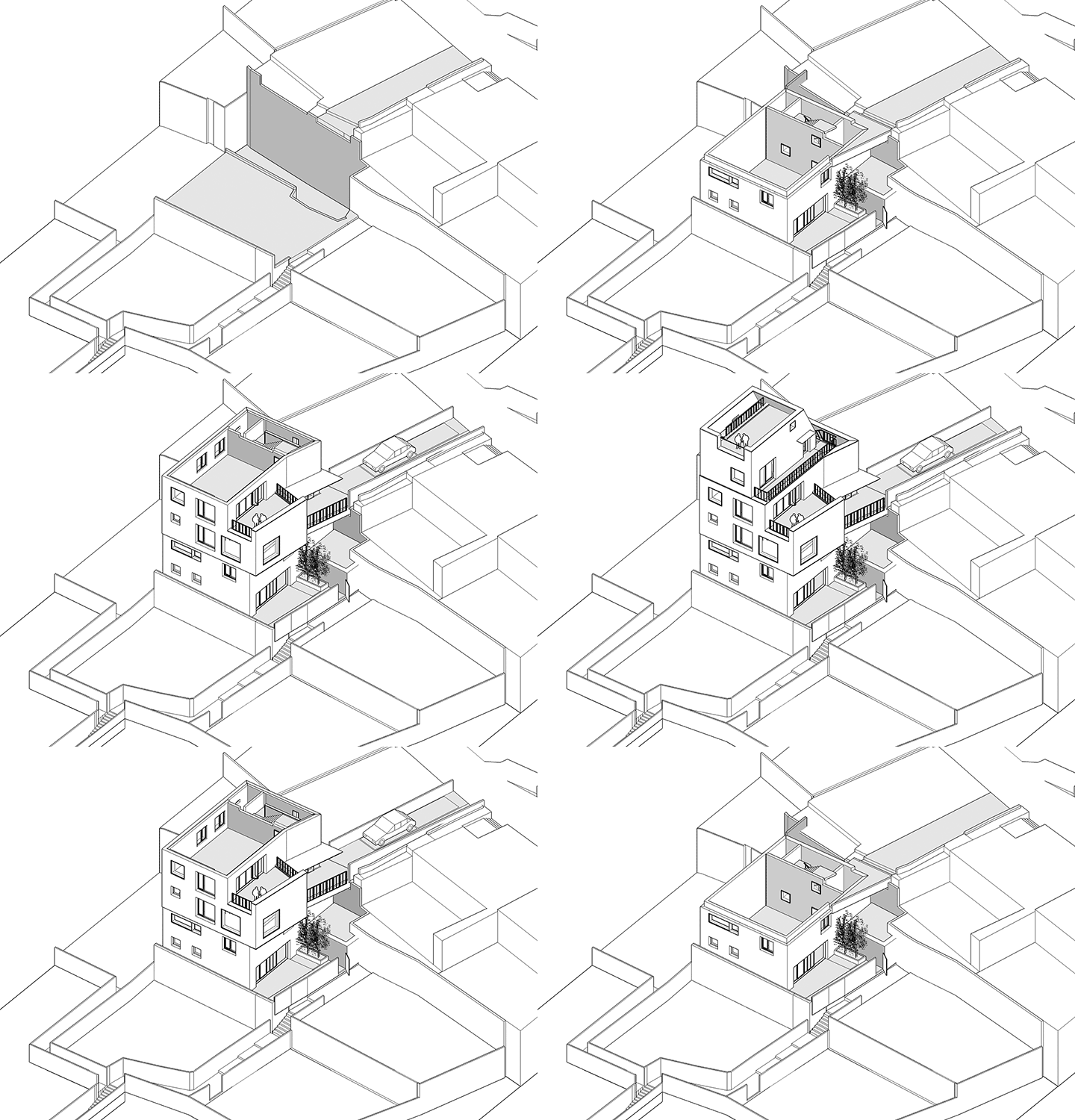
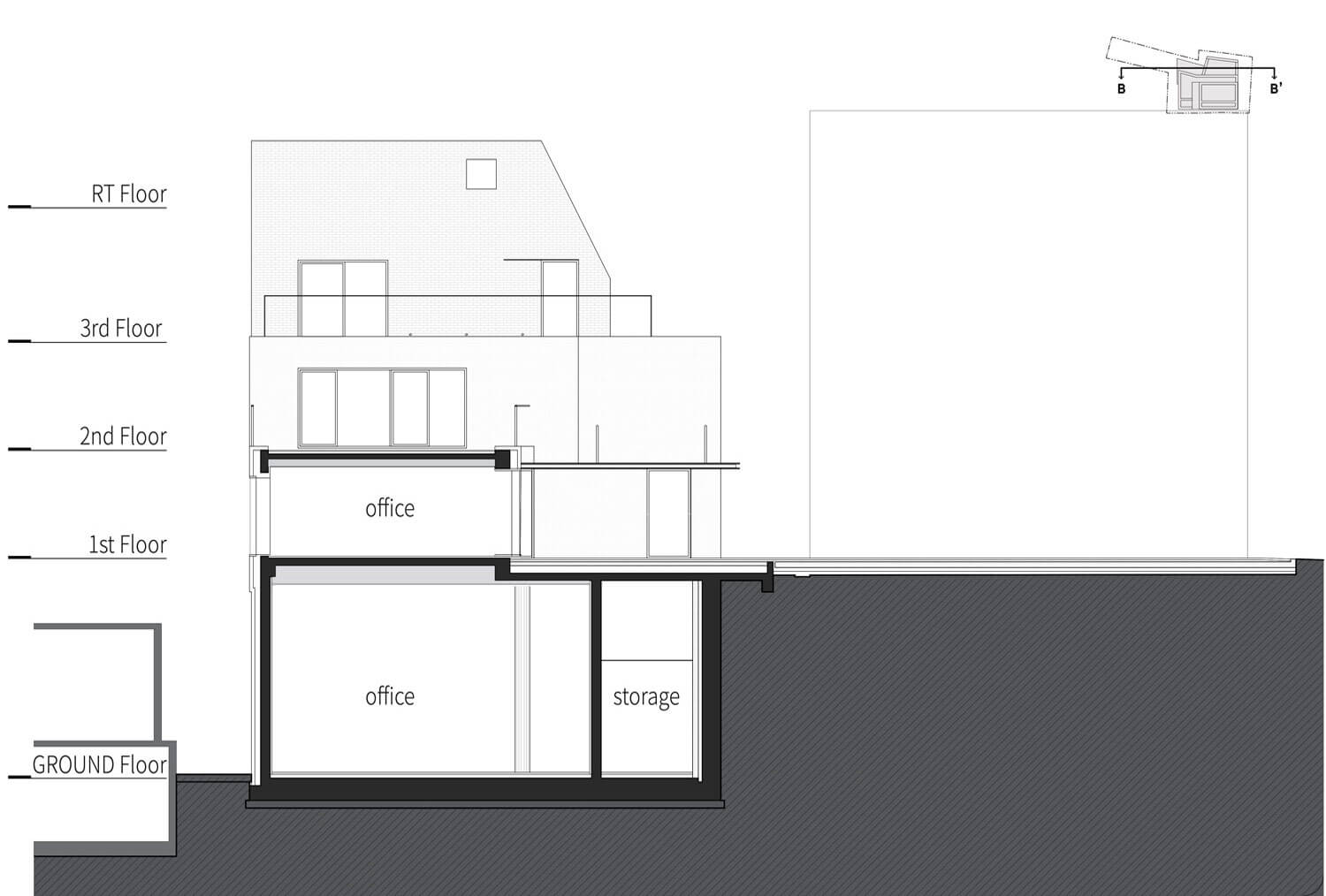
The site is accessible from both upper and lower levels, but the later is possible only by walk. The upper level with both vehicle and pedestrian access was selected as the main entrance, but the narrow width of ‘pointing finger’ part made another obstacle. The architects decided not to locate any mass on the narrow part, and pushed the building to the edge of the cliff instead. This placement of a heavy mass onto the cliff resulted a kind of strange tension and the strong viewpoint to Han River.
Description
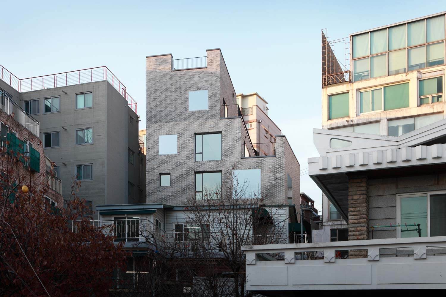
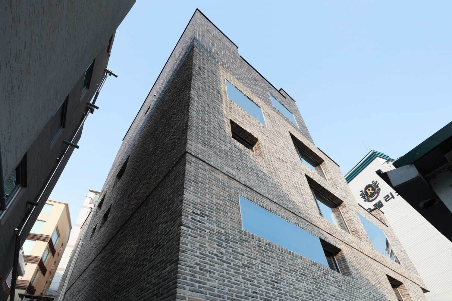
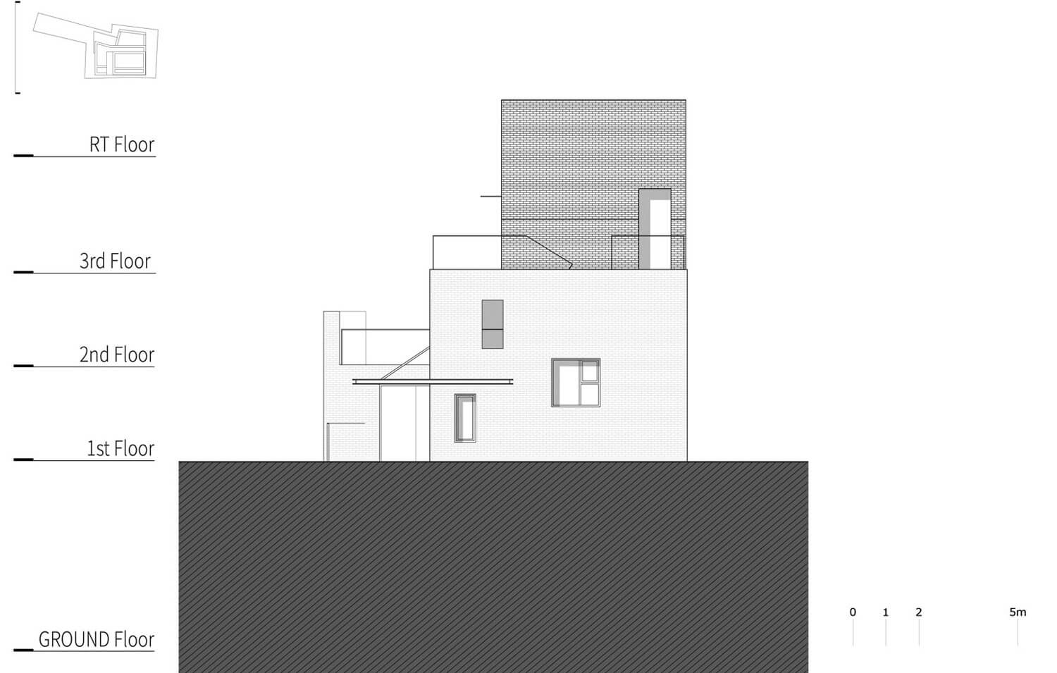
This finally formed the main image of the building, ‘the heavy rock on the cliff’. The rocks stacked from 6m below the cliff reveals itself above the hill and build another rock on the hill after all. ‘The rock’ settles itself steadily onto the ground, but without overwhelming the scale of its surroundings
Brick
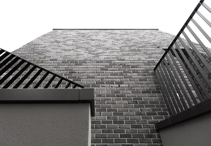
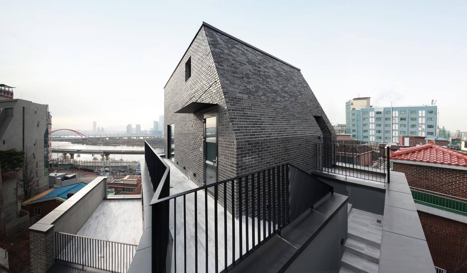
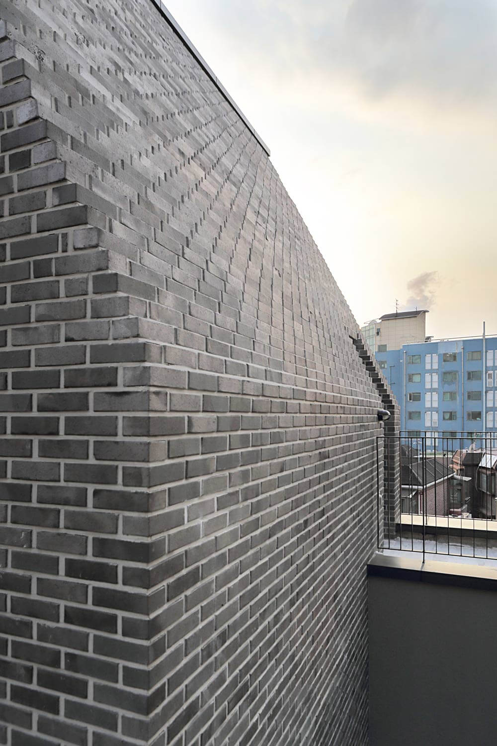
The selected main material to reveal the concept of ‘the rock’ was brick. Aged bricks with rough surface were primarily used for the overall facades. Reflective coated-bricks were selected for the upper part of the building, and it helped highlighting the image of steep rock by actively keeping or reflecting sunlight.
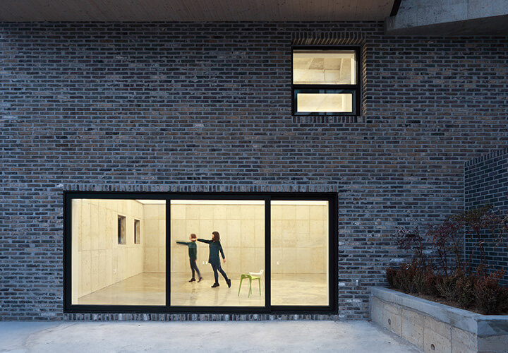
Openings also serve to emphasize the heavy façades. Two kinds of glazing were used. Clear glazing is aligned to the inner face of walls and takes the deep shadow on it. Reflective one is aligned to the outside surface and makes a fake hole on the façade by reflecting surroundings. These two types of openings make rich inner space with various depth to the outside as well.
Interior
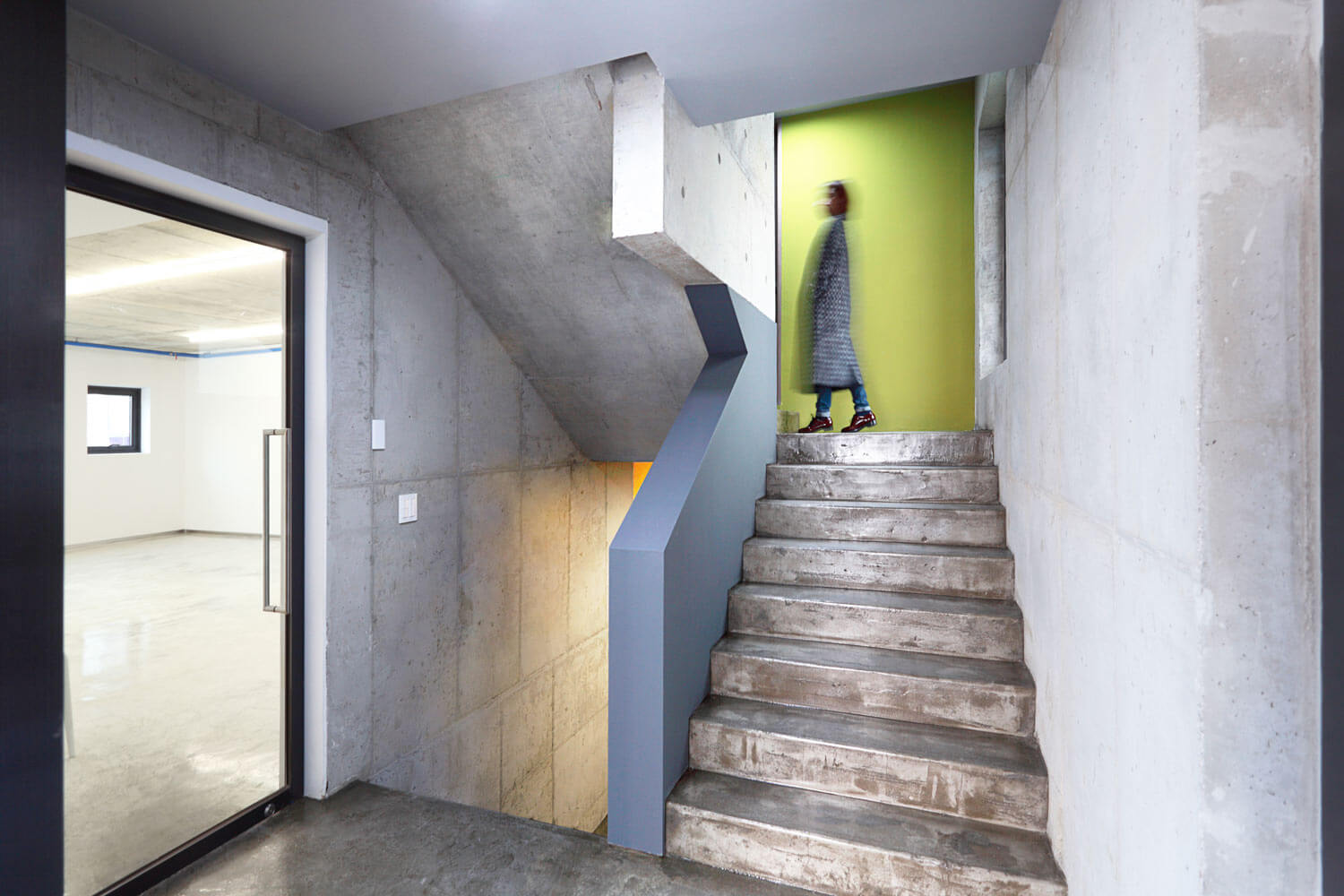
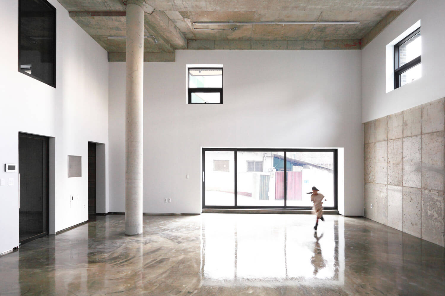
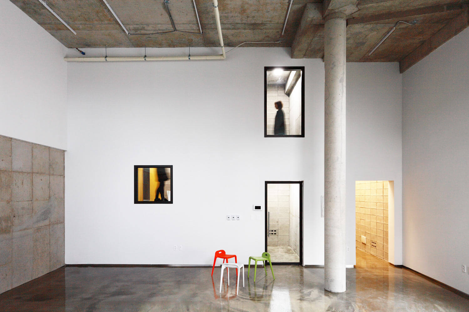
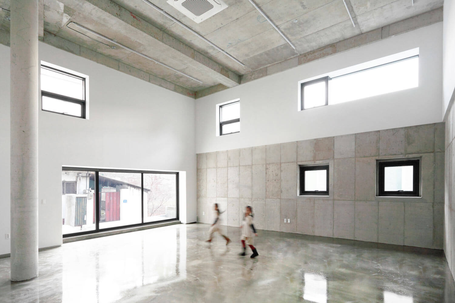
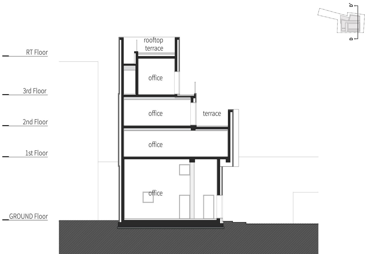
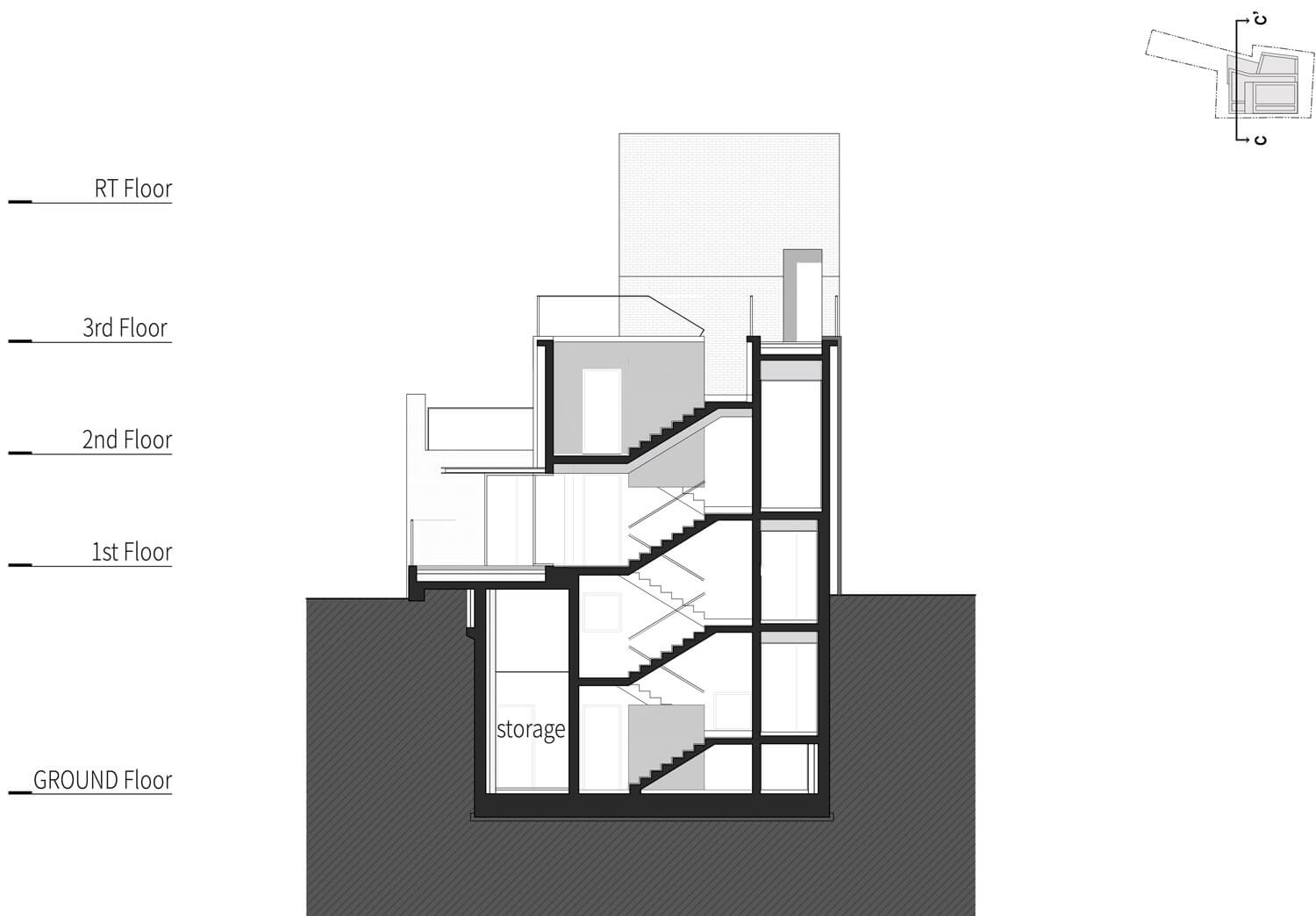
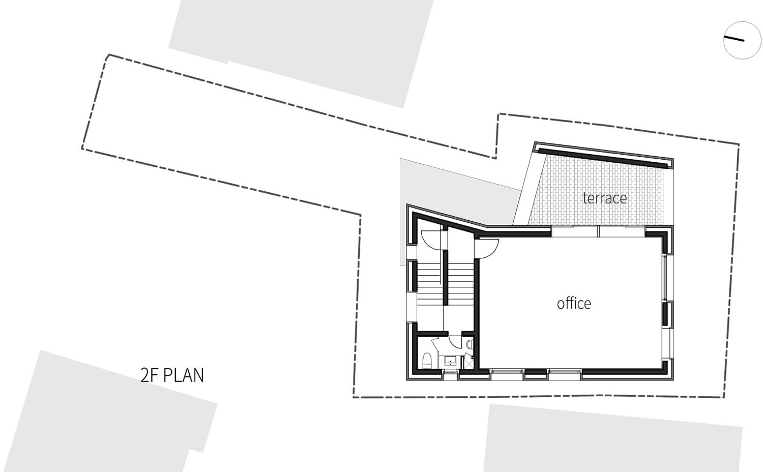
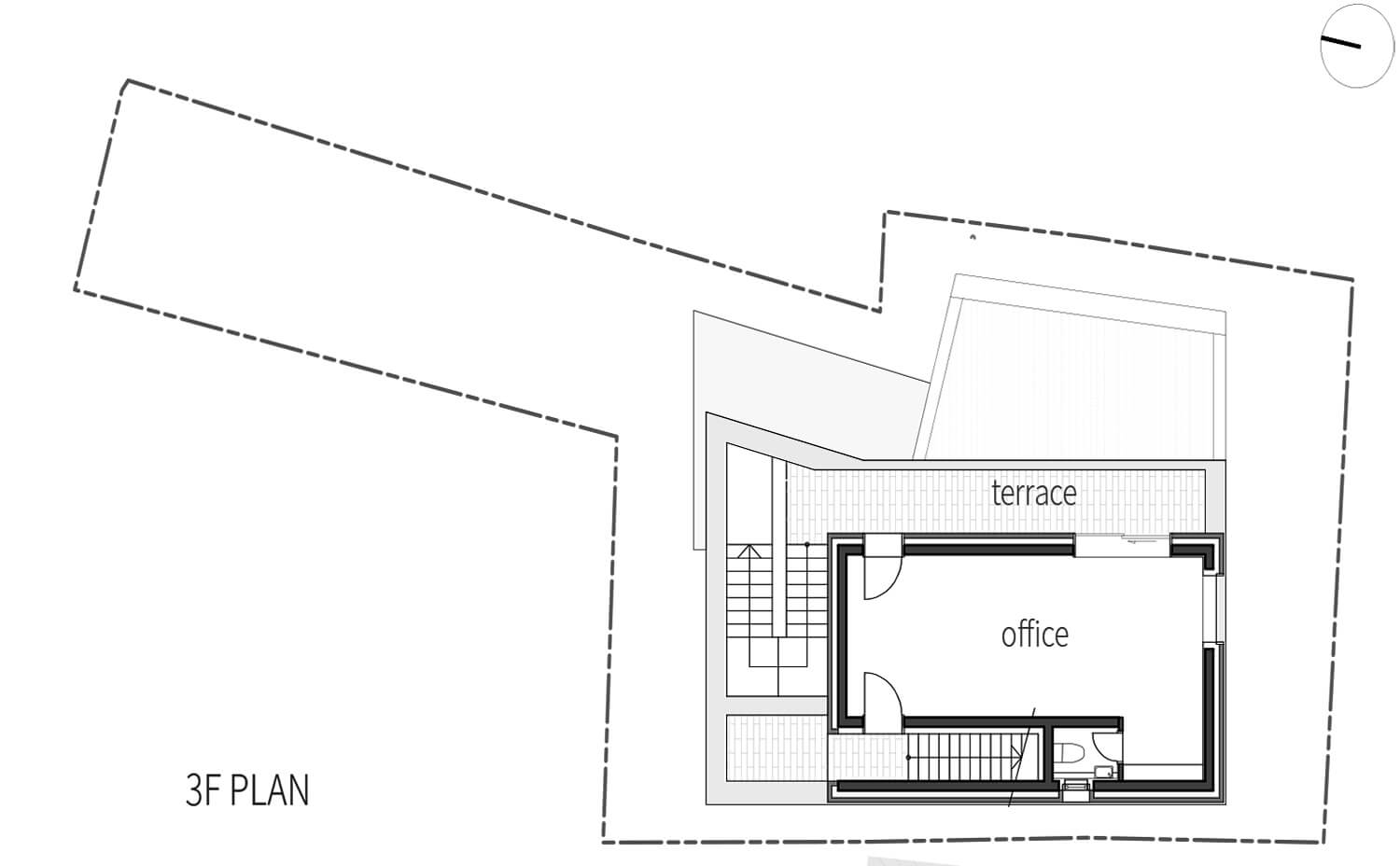
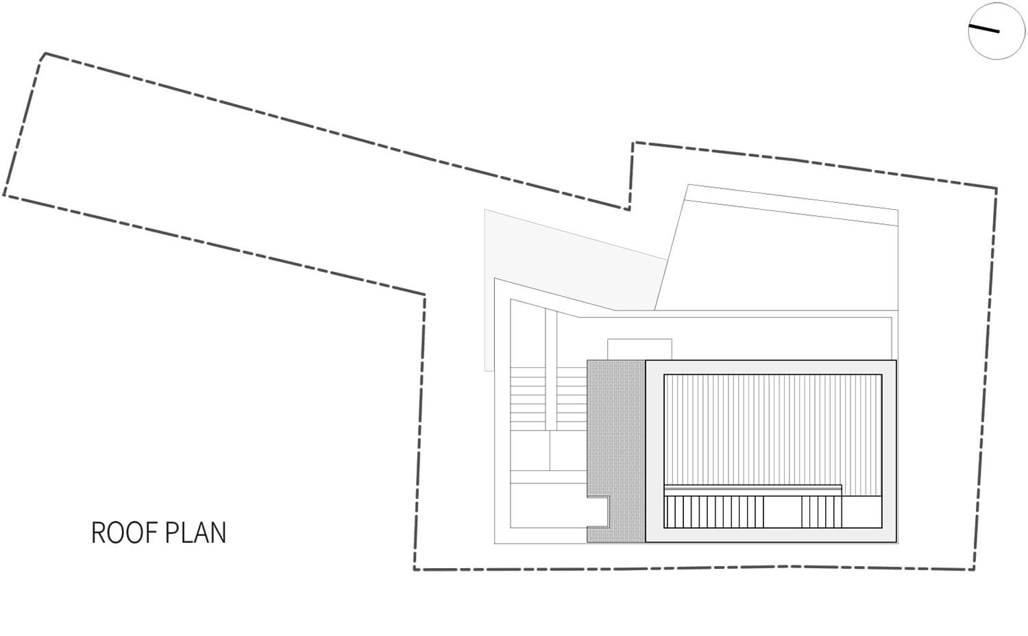
The staircase vertically penetrating the cliff combines every floor from behind. The ground floor on the lower level is the only one which does not have view to the river, but it creates its own unique atmosphere by transforms 6m level difference to its own floor height. The 1st floor of main entrance serves as the connecting part between the narrow approaching path and the viewpoint to the river. Repeating structure of the interior space and the outside terrace on the 3rd and the 4th floor makes its story end on the roof floor, while finally looking down the river and the city altogether.
Drawings
Extra info
Architeture :
designband YOAP
Interior :
designband YOAP + SLA Korea
Project year :
2013-2014
Design phase :
2013.9.-2014.6.
Construction phase :
2014.6.-2014.12.
Site area :
265.48 m2
Building area :
110.48 m2
Total floor area :
334.53 m2
General contractor :
Moowon construction
Civil engineering :
Naun TSI
Structure engineering :
Yongwoo engineering
MEP :
Jungyeon engineering

