K 001 NOTARIAAT / Atelier Vens Vanbelle
K 001 NOTARIAAT / Atelier Vens Vanbelle
Location
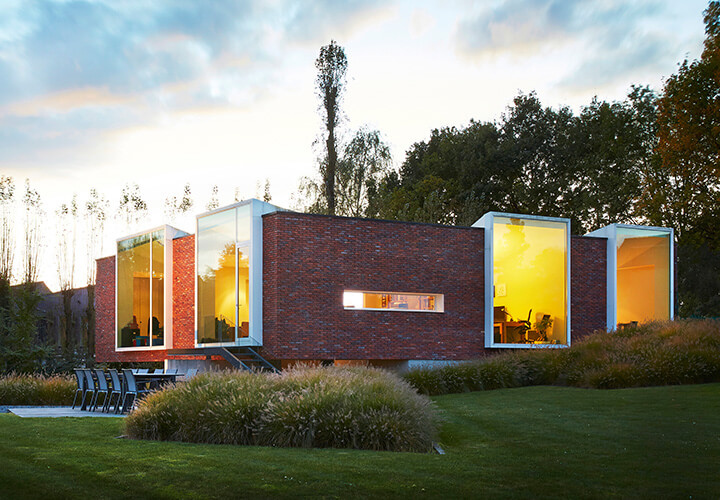
The building site is situated at the end of a small street in the small village of Horebeke in the Flemish Ardennes, next to a restaurant. The view from the site is splendid: the landscape slopes slowly and offers an overview to an untouched agricultural area spread over two kilometers.

Concept
This kind of impressive landscapes asks for discrete admiration, just like the design assignment itself. A notary must be a building that establishes itself in a neutral way and it should be accessible for each type of visitor. We believe building in a landscape like this asks for the same kind of neutrality.

Description


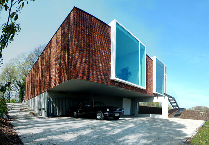
This was translated in a rough brick volume which is semi-closed to the street side and the restaurant. The entrance to the building is marked by a white volume made of steel plates. Walking through this white volume, the visitor enters a corridor looking out over a patio on the right side. The patio lets the daylight enter into the hall and the offices and adds a calm outside room for the surrounding rooms. On the left side the corridor bends to the waiting room which opens cone-shaped to the landscape. The kitchen and the offices open in a similar way to the outside. By detailing the windows in a way the frames seem to disappear, the peaceful landscape is framed like colorful paintings in the white interior. The back of the building cantilevers over the sloping terrain. The staff can park under the building and the cars form no visual obstruction from within the building.

Materials
The choice and combination of the materials is given by the construction on the one hand, on the other hand we have chosen to use regional materials. Belgium has a big tradition in using bricks, so instead of neglecting this we wanted to use this as an advantage. This rough material could contrast with the thin white window frames, as if it were slices of paper inserted in a clay volume. Finally we found a very rough brick, called 'hectic', and we obtained steel windows to make the frames look as light as possible. Due to the huge scale of this windows and the door, the building actually seems smaller than it is.


This materiality was also translated into the interior and the surrounding of the building: On the outside we also wanted a rough but tactile materiality so we've chosen to make the parking, the path towards the front door and the exterior of the basement out of washed concrete. The garden design, and the materials used, have this same roughness and tactility. We also chose not to put a fence around the building site, so it would look like the garden inserts the surrounding landscape (as well as the cows seem to enter the garden). Except from the floors, the entire interior is kept white to make the landscape look like a colorfulness painting. The floors are made of warm materials. In the hall, kitchen and waiting room we've chosen to use an old church floor made of blue stone (Hainaut). In the offices we've used oak to provide a warm and domestic atmosphere to work in. This results in a very peaceful working space in which the employers love to work.

Interior


Drawings