The Curving House / JOHO Architecture
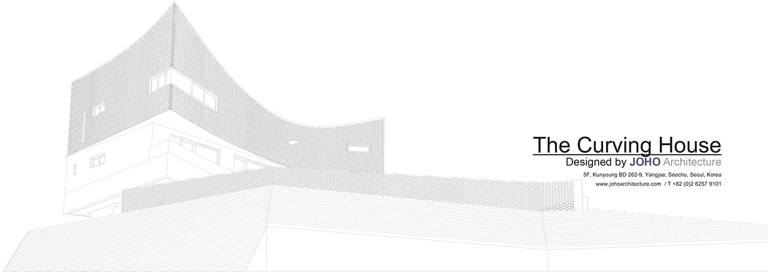
The Curving House / JOHO Architecture
The line penetrates the sky
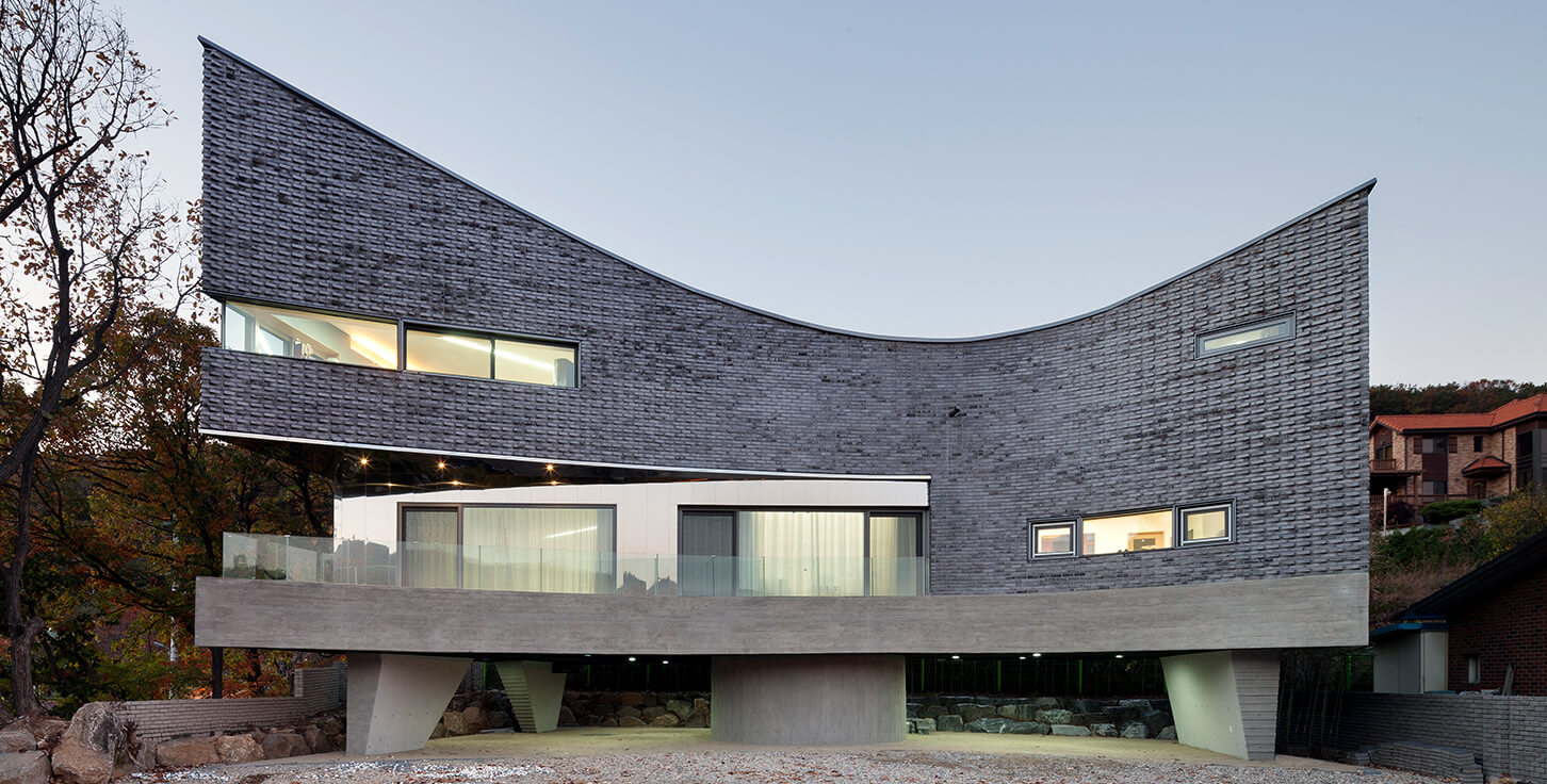
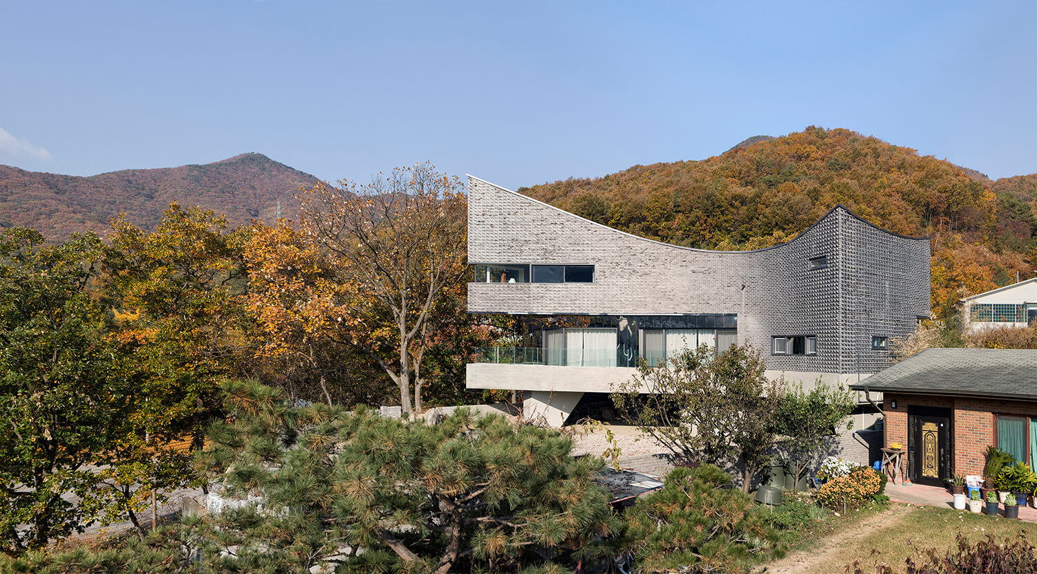
The mountains penetrate the sky and the sky contains the mountains as nature. Here, the mountains form lines and the lines remember the mountains in the land. The terrains of Mt. Gwanggyo flow low above the lot and the lot displays the entire view as if it responds to the graceful flow. At this site, the land is the proof of space and everything about the substance. The shape created here contains the sky as an earthenware jar and displays the potentiality of land as a spatial substance. It draws a shape, but creates a space that shows the sky outside the shape to hide itself in nature. Should the line be hidden in nature or should the nature be displayed in the hidden line? This was the essential challenge of this land and the sincere response to the background. This is directly related to how the topographies should be interpreted in Korean traditional spaces. Korean traditional spaces have pursued the shape that is not completely hidden in nature yet beautifully harmonized with surrounding nature. It is based on the post-dualistic beauty of harmony that proves its existence while hiding in nature rather than dominating nature with its shape and lines.
Mass development
There is No home for Parking
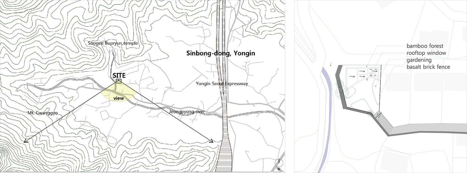
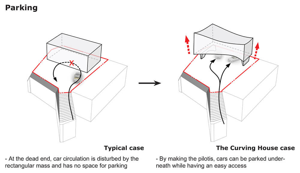
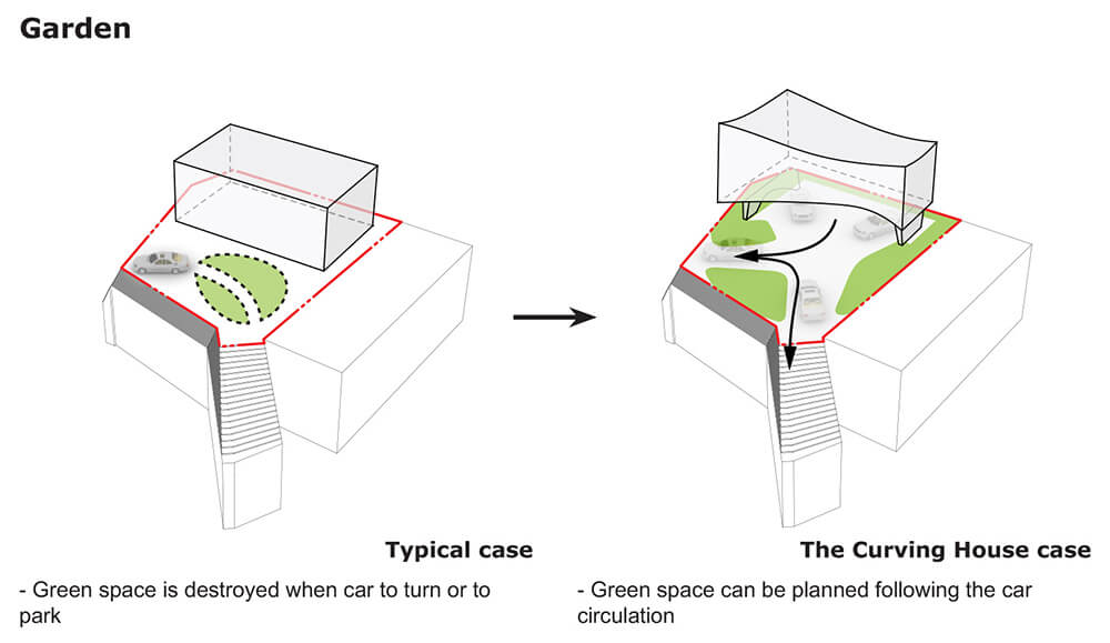
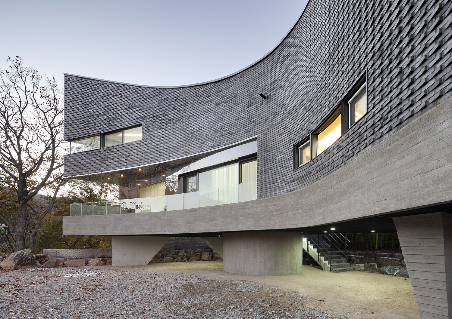
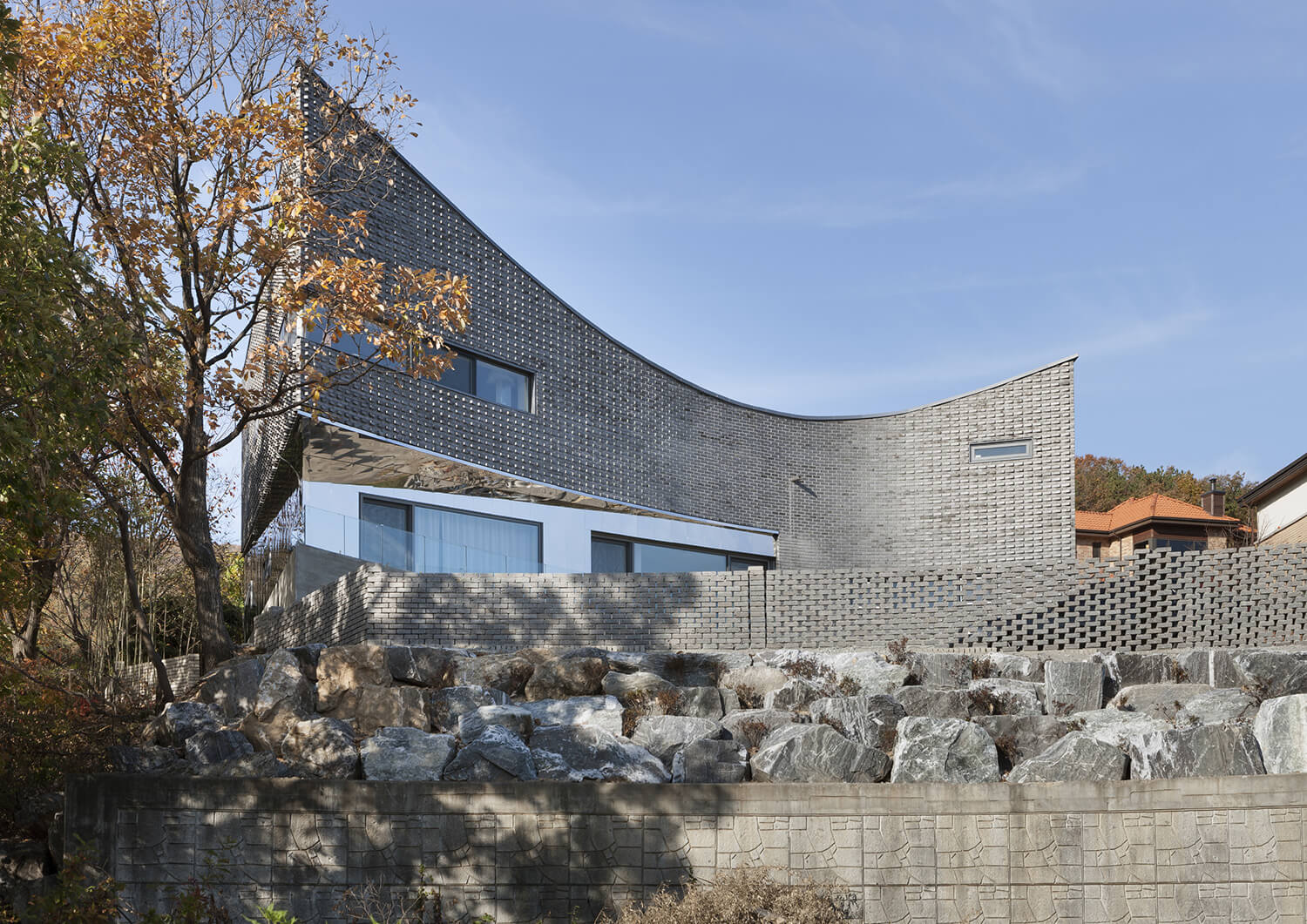
I remember that it was a winter day after snowing when I first visited the site. It was a rare residential lot with an open view to the south at the dead end of a small path beneath Mt. Gwanggyo. What was unique about this lot was that it was very hard to turn the car to come out of the path after more than 2 cars parked, because it was a small path only 4 m in width. Ironically, the fundamental challenge was not only solving the parking problem but also creating a space for both parking and gardening to coexist. It was closely related to the lifestyle of home owner to decide whether to create a garden directly accessible from the living room or to emphasize a visual garden. To resolve this issue, the overall shape was formed to encase the lot with more curves and lifted about 2 m from the ground using pilotis for more efficient parking. The shape of the mass resembling a concave lens was created by the parking needs and the topographical condition of the lot.
Components
Space as a flow of nature
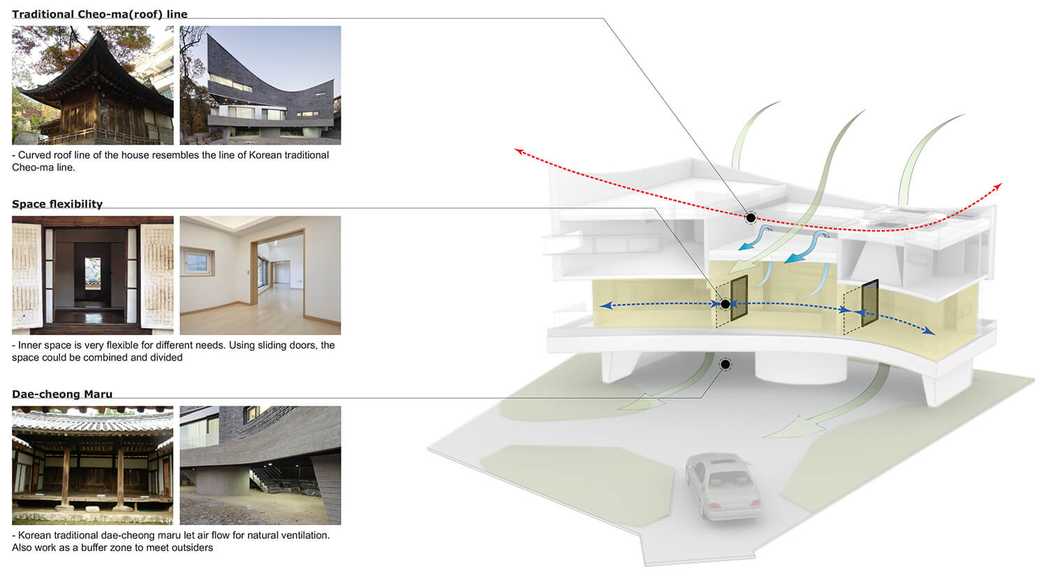
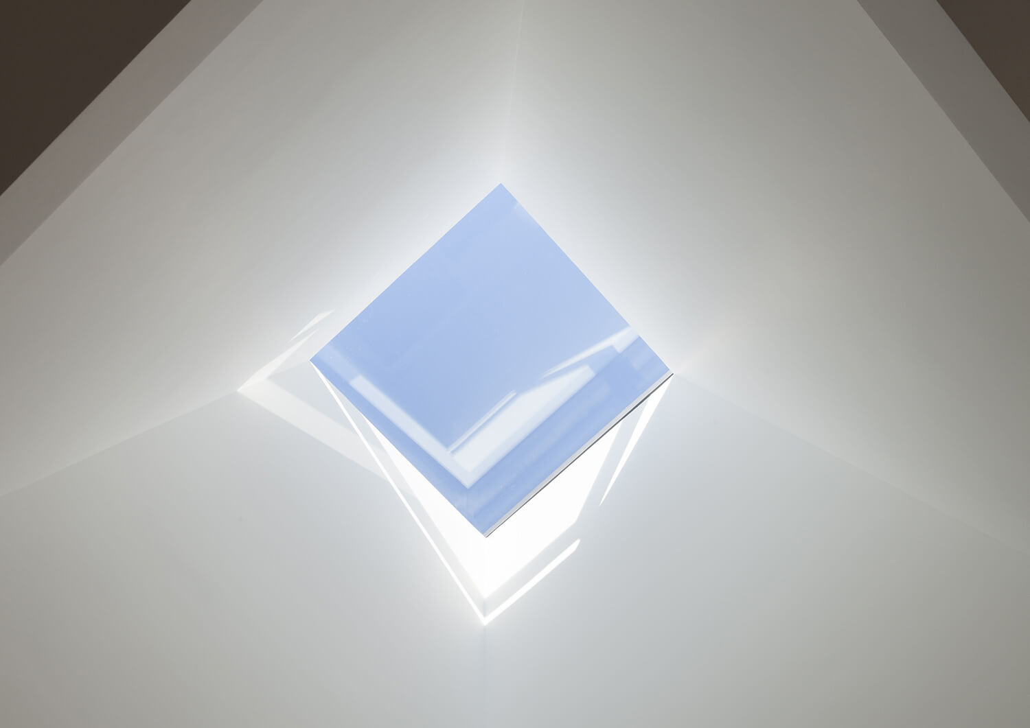
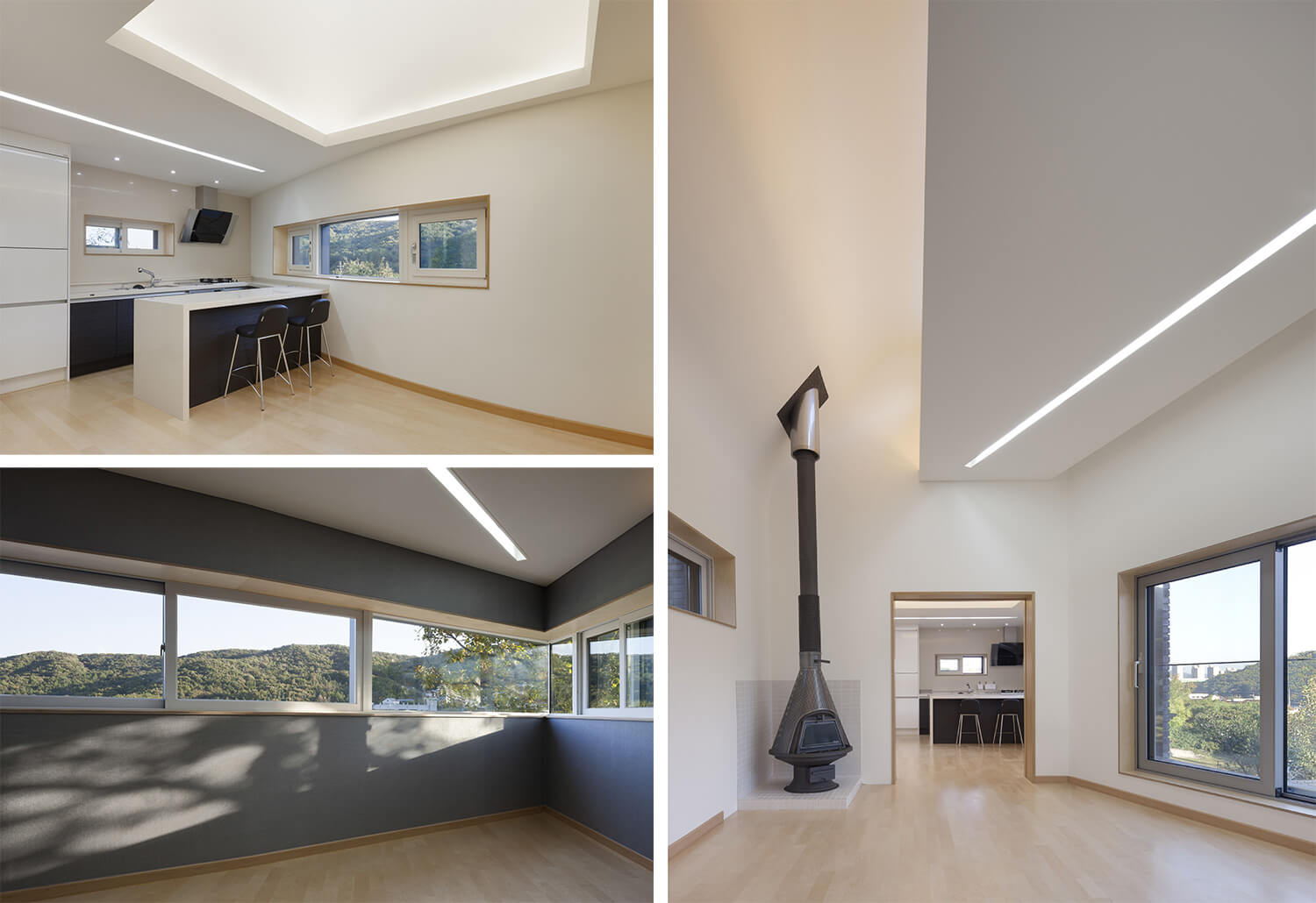
The pilotis for parking naturally serves as an opening for air ventilation. The summer breeze coming down from the mountain ridge circulates the air around the building thus reducing the heat load. Also, each room has windows for cross-ventilation and is planned to allow natural circulation of air. The motorized window on top of the living room can release heated air in summer for air circulation triggered by the difference in temperature known as stack effect. The staircase to the north is planned to serve as a buffer of air against the freezing northwestern winds in winter to minimize heat loss. The front windows facing the south allow sufficient sunlight in winter to maximize energy efficiency with natural sunlight. In particular, the ceiling is also diversified to invite as much natural light as possible into the building to control illumination naturally.
Traditional Components
New technical interpretation of traditional space
The flow of space was borrowed from the method of handling the flow of air in traditional Korean homes. In detail, the pilotis on the bottom expands the surface of volume exposed to outer air to reduce the load of heat energy and allows natural ventilation in summer. This is similar to the principle of open living rooms in Korean traditional spaces. It means that the entire building allows ventilation to keep the building cool. In winter, on the other hand, the concrete floor is made as thick as possible as a thermal mass, similar to Ondol floors of Korean traditional architecture for maximum insulation, to block the cold air from the underground. Also, the interior space of the second floor has an open living room, bedroom, and kitchen which can be divided and combined flexibly with sliding doors for different needs. This is a modern reinterpretation of the variable space of Korean traditional homes that can be used either as a big room or as smaller individual rooms.
Brick Facade variation
The flow of light contained in silver scale
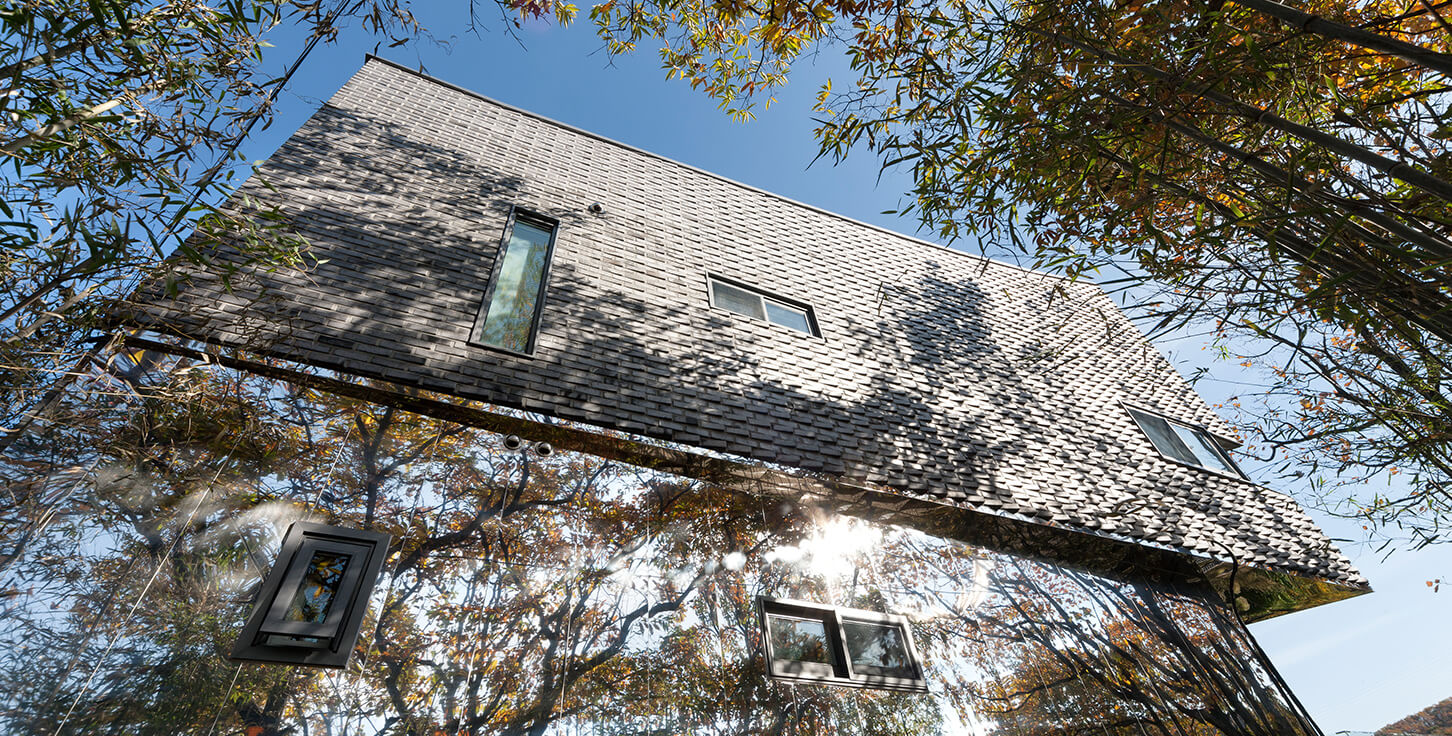
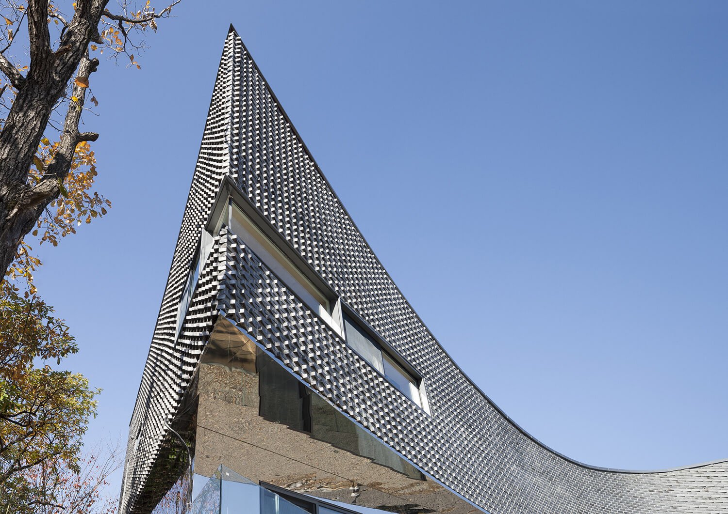
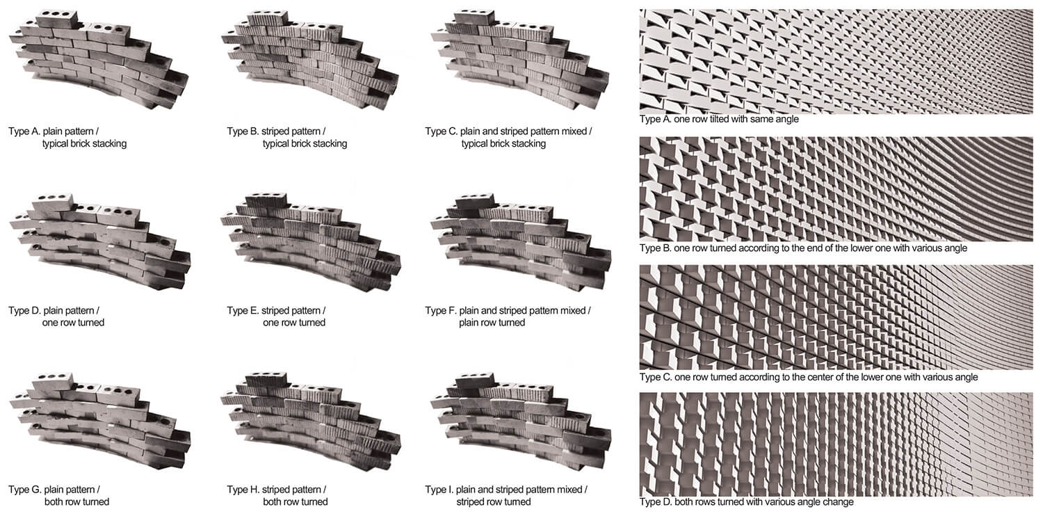
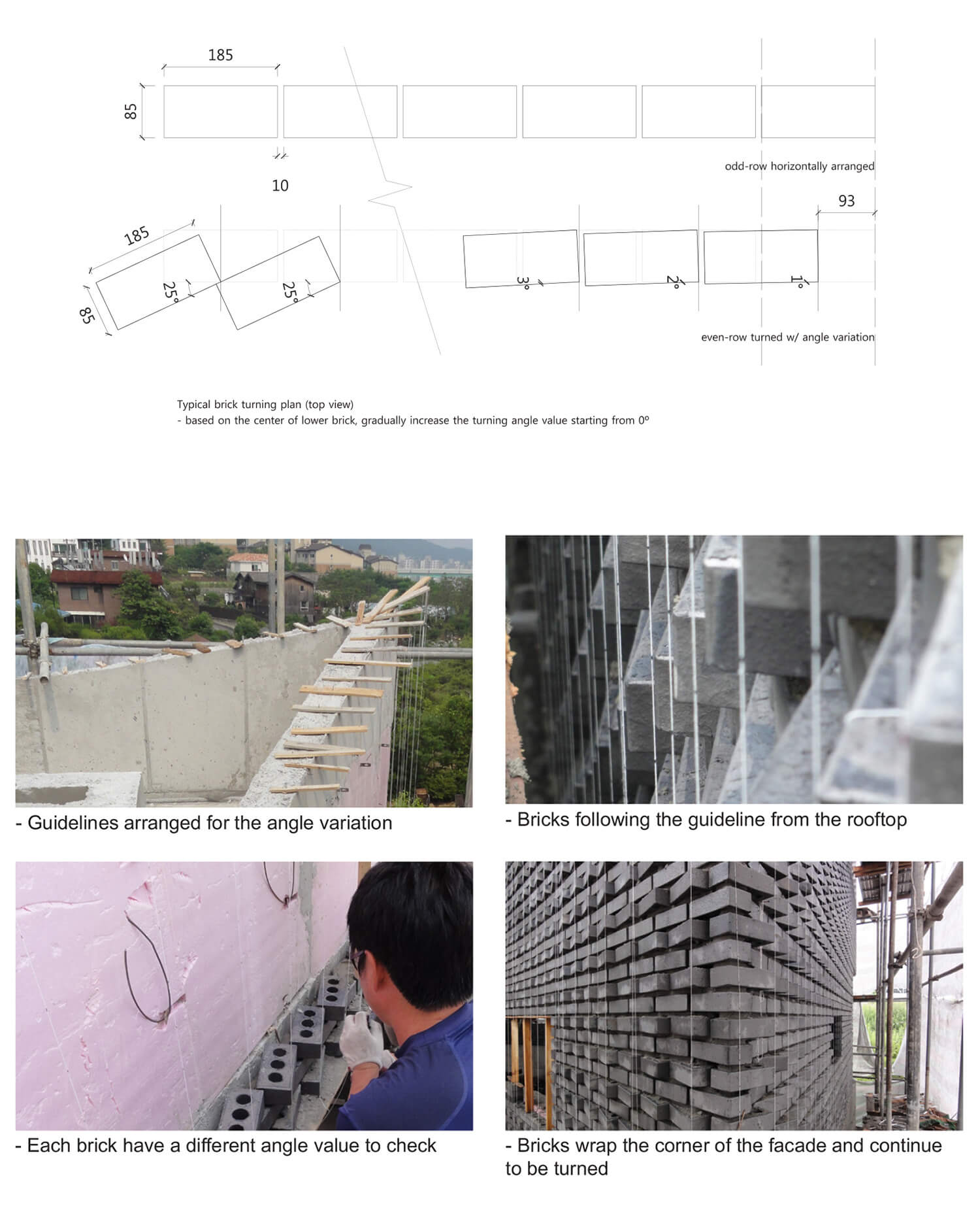
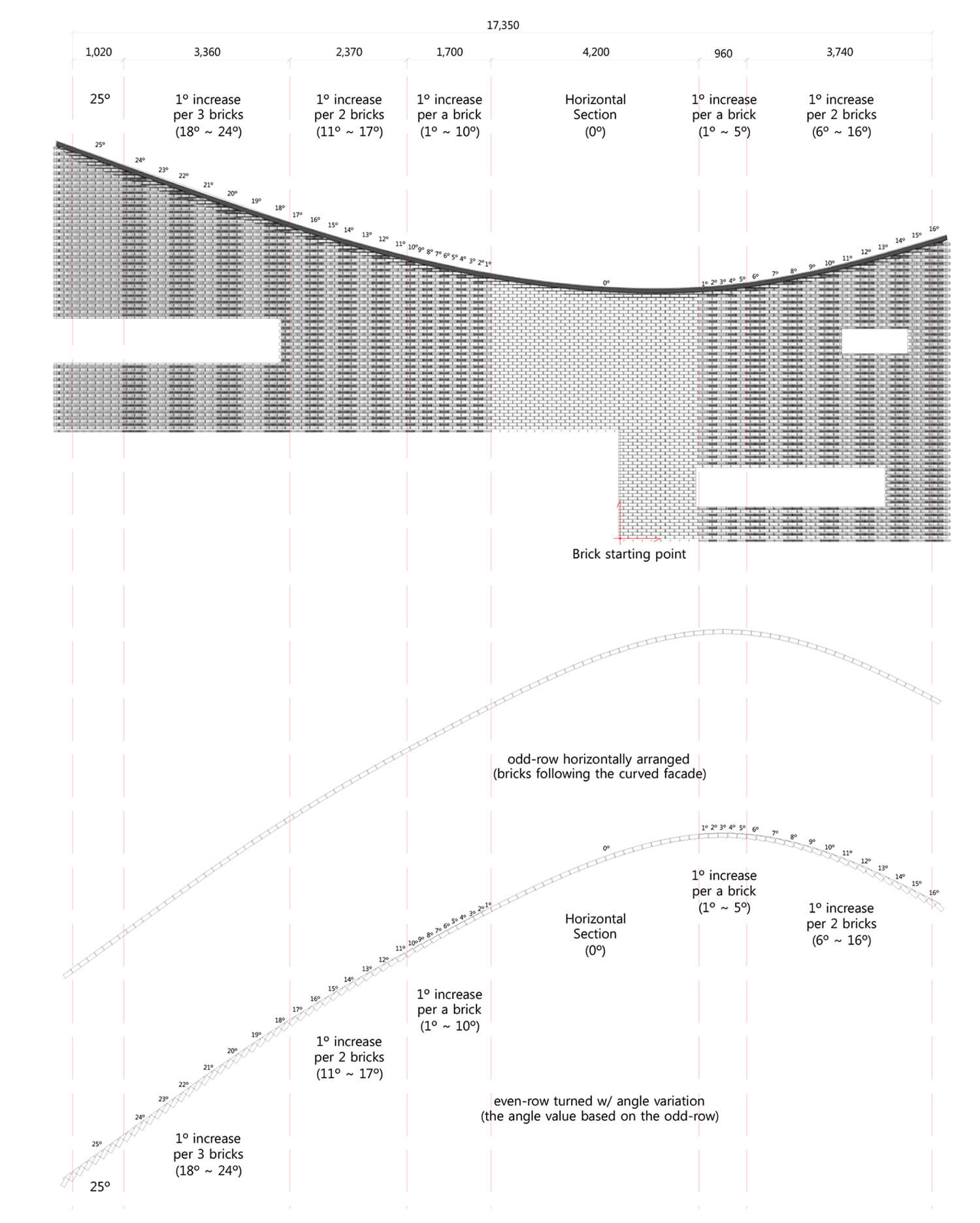
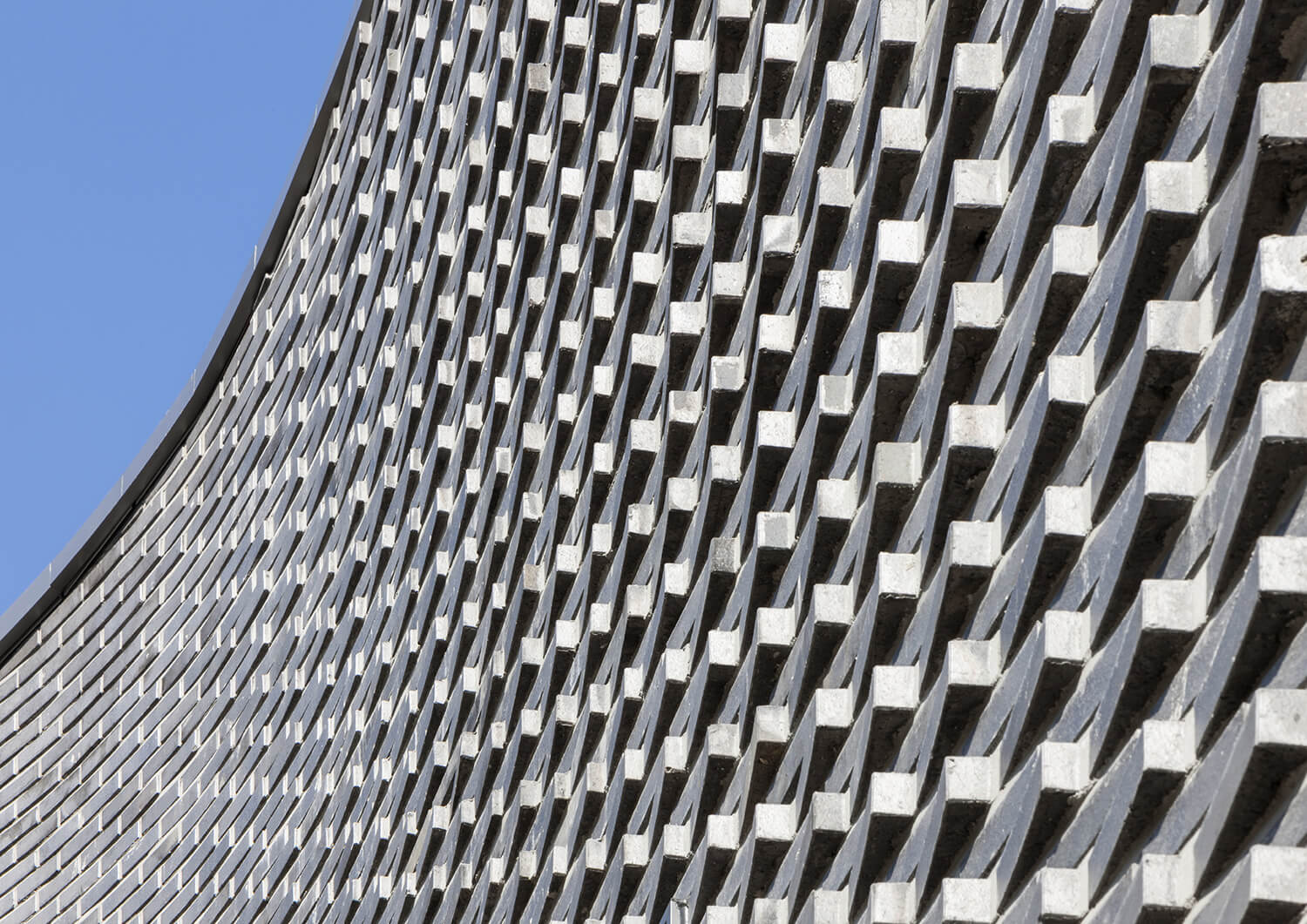
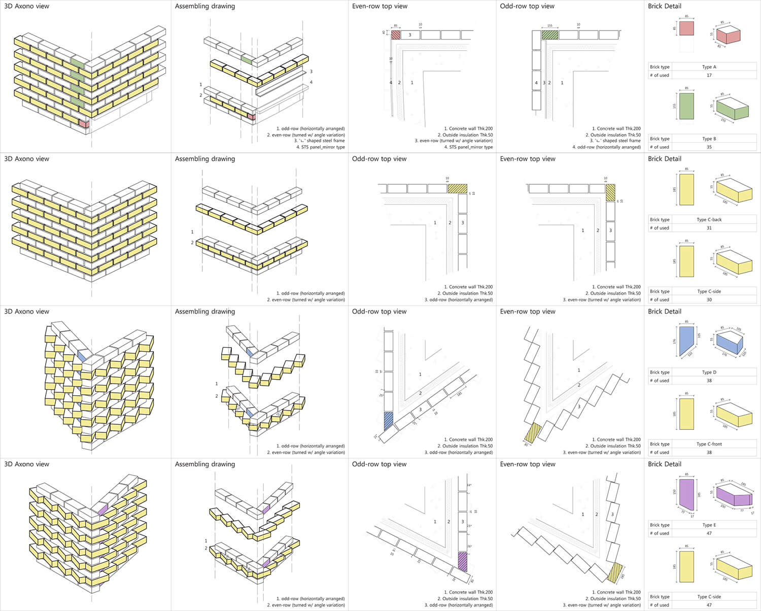
The ash-colored bricks (traditional bricks) embrace the concrete surface as fish scale while slightly altering the angles. The traditional bricks used for this project have silver water-repellent coating on the surface and show sentimentality different from the rough surfaces of their tops and bottoms. The bricks with two different surfaces were piled to form a certain pattern from angles 1° through 25°. In other words, the variation of angle is another way how the outer skin in the shape of a concave lens facing south defines its existence. The shadow of the brick wall caste as the Sun moves converts the flow of lines into the subtle change of the outer skin. The variation of the brick surface is intended to read the entire mass differently according to the perspective of incomer and the perspective of viewing the images from the mountains.
Brick Main Facade
Brick Corner Detail
Contrast and harmony of texture
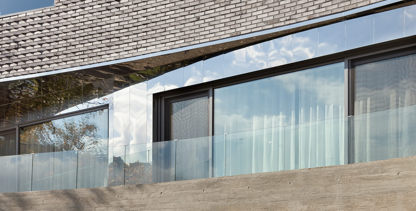
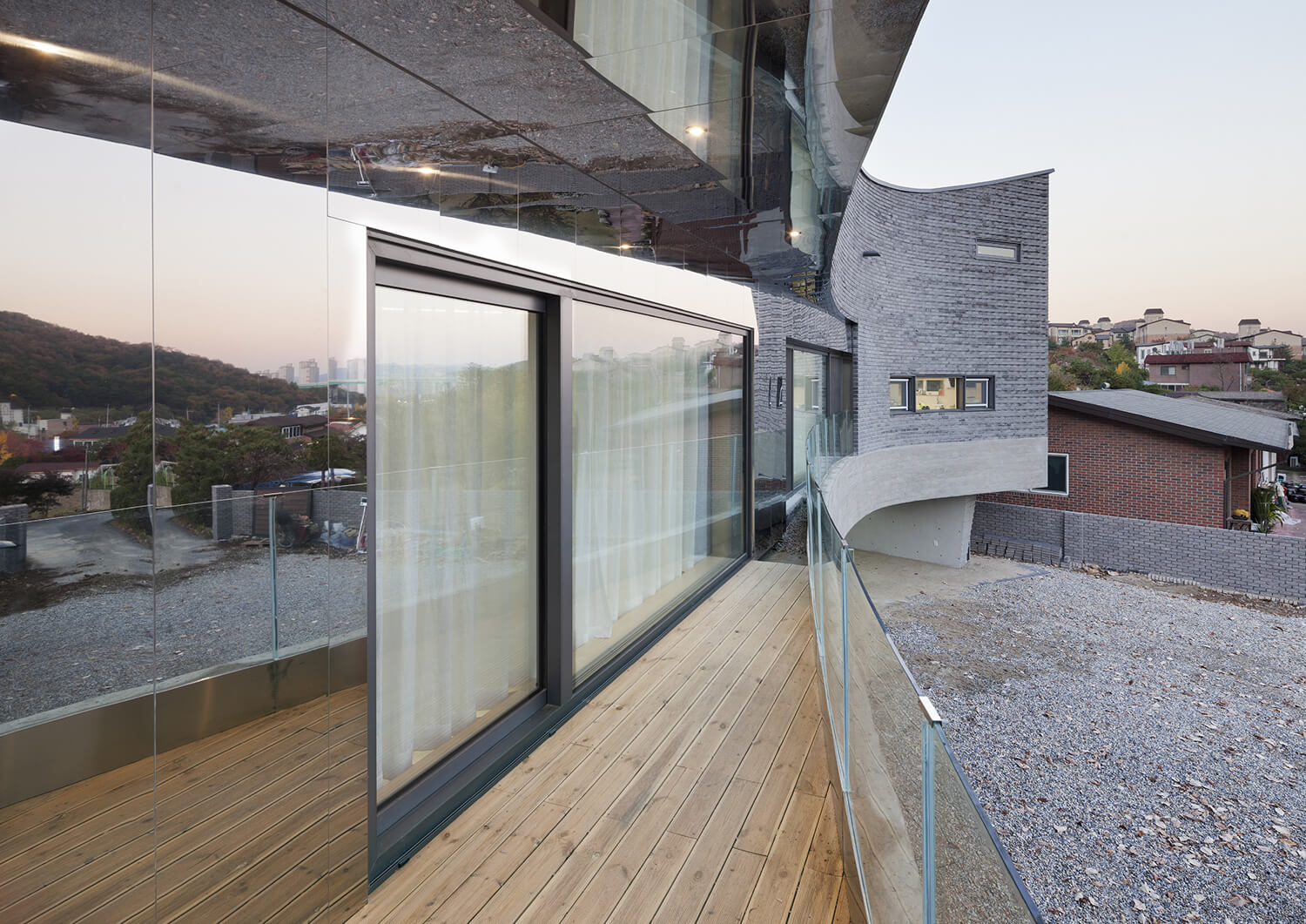
The rough texture of the traditional bricks interprets the lot in a different way in combination with the property of highly reflective stainless steel. The skies and nature reflected on the stainless steel surface distort what the true substance is to break the boundaries between shapes and texture. Unlike the rough texture of ceramic bricks, the stainless steel used on the front and on the side reflects the surrounding landscapes to make itself disappear. If the bricks reveal themselves by the change of light and shadow, the stainless steel de-materializes itself by making itself disappear in nature. Such contrasting textures have different properties and confront each other in a single mass, but they ultimately establish balance through the extinction and reflection of light.
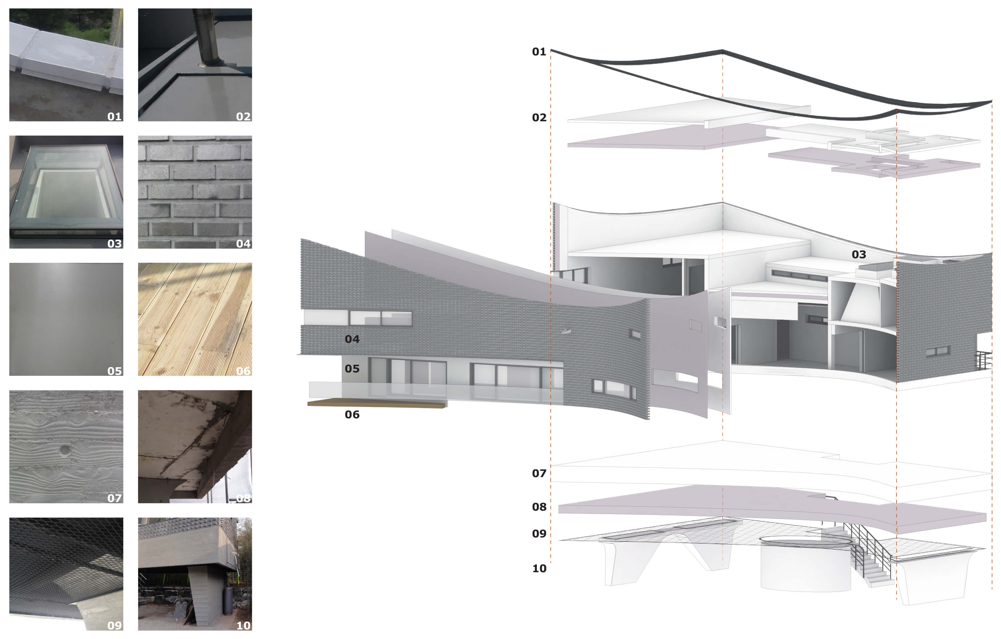
Materials
- AL. Cap AL. cap placed on top of the brick facade to highlight the curve.
- Roof Conc. + insulation + Conc. + Waterproof paint.
- Rooftop window Different size of rooftop windows bring warmth and light.
- Ash-colored brick Brick reflects the light. Carefully arranged scales shine.
- STS panel (mirror type) The STS holds the sky and reflects the four sesason changes.
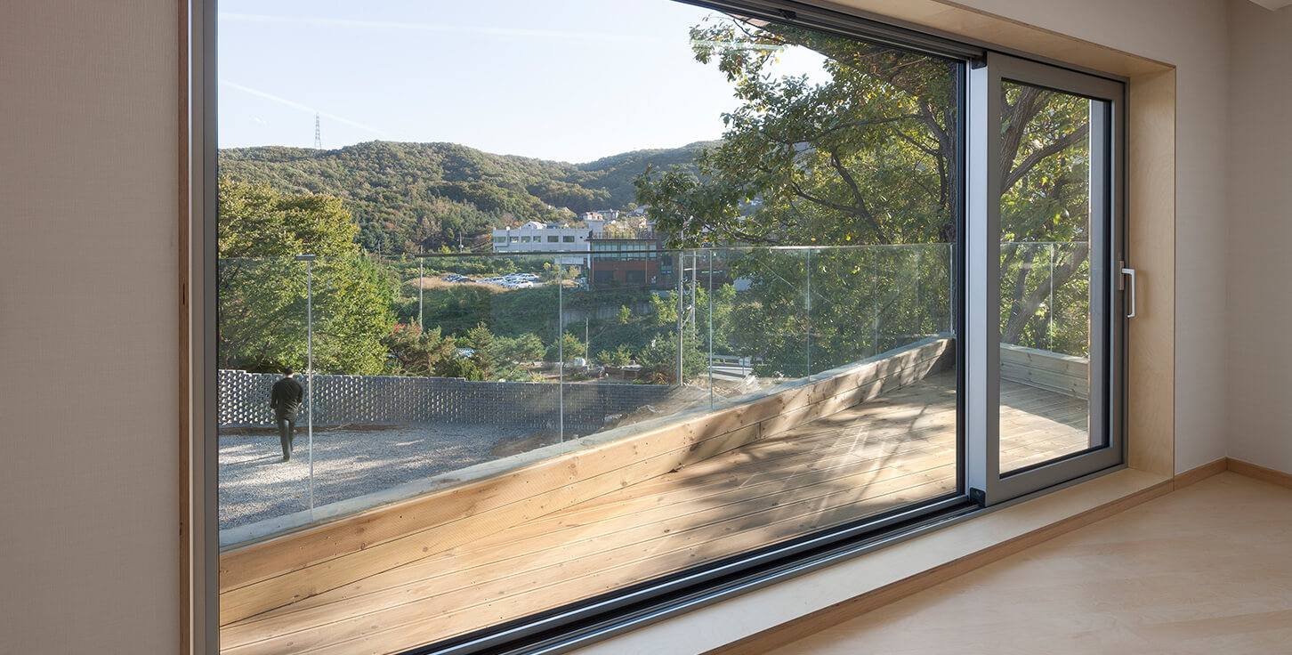
- Outter deck The balcony can work as the extension of the livingroom.
- Patterned exposed Conc. Pine board pattern gives a warm feeling to cold gray conc.
- Slab insulation Super insulation at the bottom slab.
- Mesh Mesh applied on top of the parking place.
- Base structure Base structure to create pilotis and parking space.
Interior
Extra info
Design Team:
JOHO Architecture(Il-Sang Yoon, Gae-hee Cho)
Completion:
2012.10
Construction:
Dong-jin Chea(DL donglim construction)
Client:
Im-jeong Choi
Material:
Exposed Concrete + Ashed-color Brick + STS panel(mirror type)
Site area:
529.00 sqm
Building area:
140.57 sqm
Building to land ratio:
26.57% (<40%)
Floor area ratio:
35.22% (<100%)
Building scope:
3F

